flutter_card_swiper
Pub Version
Pub Points
Pub Likes
Pub popularity
Tests
codecov
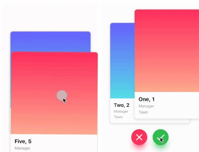
This is a Flutter package for a Tinder-like card swiper. ✨
It allows you to swipe left, right, up, and down and define your own business logic for each direction.
Very smooth animations supporting Android, iOS, Web & Desktop.
Why?
We built this package because we wanted to:
- Have a fully customizable slider
- Swipe in any direction
- Undo swipes as many times as you want
- Choose your own settings such as duration, angle, padding and more
- Trigger swipes in any direction with the controller
- Add callbacks while swiping, on end, or when the swiper is disabled
- Detect the direction (left, right, top, bottom) the card was swiped
Show Cases
| Swipe in any direction |
Trigger swipes |
Unswipe the cards |
| https://github.com/ricardodalarme/flutter_card_swiper/blob/main/images/swiping.gif?raw=true |
https://github.com/ricardodalarme/flutter_card_swiper/blob/main/images/swipe_left_right.gif?raw=true |
https://github.com/ricardodalarme/flutter_card_swiper/blob/main/images/unswipe.gif?raw=true |
| Fully customizable |
| https://github.com/ricardodalarme/flutter_card_swiper/blob/main/images/angle.gif?raw=true https://github.com/ricardodalarme/flutter_card_swiper/blob/main/images/treshold.gif?raw=true |
Installation
Add this to your package's pubspec.yaml file:
card_swiper: ...
OR run
flutter pub add flutter_card_swiper
in your project's root directory.
Usage
You can place your CardSwiper inside of a Scaffold like we did here. Optional parameters can be defined to enable different features. See the following example:
import 'package:flutter_card_swiper/flutter_card_swiper.dart';
import 'package:flutter/material.dart';

class Example extends StatelessWidget {
  List<Container> cards = [
    Container(
      alignment: Alignment.center,
      child: const Text('1'),
      color: Colors.blue,
    ),
    Container(
      alignment: Alignment.center,
      child: const Text('2'),
      color: Colors.red,
    ),
    Container(
      alignment: Alignment.center,
      child: const Text('3'),
      color: Colors.purple,
    )
  ];

  @override
  Widget build(BuildContext context) {
    return Scaffold(
      body: Flexible(
        child: CardSwiper(
          cardsCount: cards.length,
          cardBuilder: (context, index, percentThresholdX, percentThresholdY) => cards[index],
        ),
      ),
    );
  }
}
Constructor
Basic
| Parameter |
Default |
Description |
Required |
| cardBuilder |
- |
Widget builder for rendering cards |
true |
| cardsCount |
- |
Number of cards |
true |
| controller |
- |
Controller to trigger swipe actions |
false |
| duration |
200 milliseconds |
The duration that every animation should last |
false |
| initialIndex |
0 |
Index of the first card when the swiper is initialized |
false |
| isDisabled |
false |
Set to true if swiping should be disabled, has no impact when triggered from the outside |
false |
| isLoop |
true |
Set to true if the stack should loop |
false |
| maxAngle |
30 |
Maximum angle that the card can reach during swiping |
false |
| allowedSwipeDirection |
AllowedSwipeDirection.all |
Sets the direction in which the card can be swiped. It can be set to any combination of left, right up or down. |
false |
| numberOfCardsDisplayed |
2 |
Number of cards displayed at the same time |
false |
| onEnd |
- |
Callback when there are no more cards left to swipe |
false |
| onSwipe |
- |
Callback when the user swipes a card. If the function returns false, the swipe action is canceled. If it returns true, the swipe action is performed as expected |
false |
| onTapDisabled |
- |
Callback when a card is tapped and isDisabled is true |
false |
| onUndo |
- |
Callback when the controller calls undo. If the function returns false, the undo action is canceled. If it returns true, the undo action is performed as expected |
false |
| padding |
EdgeInsets.symmetric(horizontal: 20, vertical: 25) |
The padding around the swiper |
false |
| scale |
0.9 |
Scale of the card that is behind the front card |
false |
| threshold |
50 |
Threshold from which the card is swiped away |
false |
| onSwipeDirectionChange |
- |
A callback containing the horizontal and vertical swipe direction |
false |
| showBackCardOnUndo |
- |
If true, the previous card will be shown in the background when swiping, and the swipe action will trigger an undo |
false |
| undoSwipeThreshold |
50 |
The horizontal swipe distance threshold, in pixels, after which the back card switches to the previous card. Only active when showBackCardOnUndo is true |
false |
| undoDirection |
UndoDirection.left |
The direction of the swipe to trigger an undo |
false |
Controller
The Controller is used to swipe the card from outside of the widget. You can create a controller called CardSwiperController and save the instance for further usage. Please have a closer look at our Example for the usage.
| Method |
Description |
| swipe |
Swipes the card to a specific direction. |
| undo |
Bring back the last card that was swiped away. |
| moveTo |
Change the top card to a specific index. |
Credits
- Ricardo Dalarme (Package maintainer)
- Appinio GmbH (Original project creator)


 v7.2.0