
 v1.0.4
progress_state_button
Flutter Android, IOS और Web के लिए एक कस्टमाइज़ करने योग्य प्रगति बटन विजेट।
373लाइक 2.3 हज़ार30-दिन डाउनलोड130Pub अंक
AndroidiOSWebmacOSWindowsLinux
Flutter Android, iOS और Web के लिए एक कस्टमाइज़ करने योग्य प्रगति बटन विजेट।

{"sdk":"flutter"}{"sdk":"flutter"}यह अंग्रेज़ी मूल स्नैपशॉट है। नवीनतम सामग्री GitHub पर देखें।
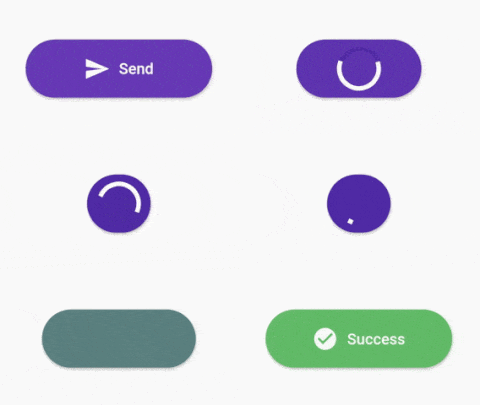
A customizable progress button for Flutter
https://raw.githubusercontent.com/slm/progress-state-button/HEAD/media/success.gif
Test with DartPad
https://pub.dev/packages/progress_state_button
progress_state_button: "^1.0.4"
https://raw.githubusercontent.com/slm/progress-state-button/HEAD/media/failed.gif
ProgressButton.icon(iconedButtons: {
      ButtonState.idle:
        IconedButton(
            text: "Send",
            icon: Icon(Icons.send,color: Colors.white),
            color: Colors.deepPurple.shade500),
      ButtonState.loading:
        IconedButton(
            text: "Loading",
            color: Colors.deepPurple.shade700),
      ButtonState.fail:
        IconedButton(
            text: "Failed",
            icon: Icon(Icons.cancel,color: Colors.white),
            color: Colors.red.shade300),
      ButtonState.success:
        IconedButton(
            text: "Success",
            icon: Icon(Icons.check_circle,color: Colors.white,),
            color: Colors.green.shade400)
    },
    onPressed: onPressed,
    state: ButtonState.idle);
https://raw.githubusercontent.com/slm/progress-state-button/HEAD/media/custom.gif
ProgressButton(
      stateWidgets: {
        ButtonState.idle: Text("Idle",style: TextStyle(color: Colors.white, fontWeight: FontWeight.w500),),
        ButtonState.loading: Text("Loading",style: TextStyle(color: Colors.white, fontWeight: FontWeight.w500),),
        ButtonState.fail: Text("Fail",style: TextStyle(color: Colors.white, fontWeight: FontWeight.w500),),
        ButtonState.success: Text("Success",style: TextStyle(color: Colors.white, fontWeight: FontWeight.w500),)
      },
      stateColors: {
        ButtonState.idle: Colors.grey.shade400,
        ButtonState.loading: Colors.blue.shade300,
        ButtonState.fail: Colors.red.shade300,
        ButtonState.success: Colors.green.shade400,
      },
      onPressed: onPressed,
      state: ButtonState.idle,
    );
stateWidgets - Widgets of states
stateColors - Background color oof states
state = ButtonState.idle` - Current state of button
onPressed - onPressed function same like MaterialButton
onAnimationEnd - onAnimatedEnd function calls like that onAnimatedEnd(AnimationStatus animationStatus,ButtonState currentState).
minWidth = 200.0 - Loading state width
maxWidth = 400.0 - failed,success,idle states width
radius = 16.0 - Button radius
height = 53.0 - Button height
circularProgressIndicator - CircularProgressIndicator widget, default is instating with current state color.
progressIndicatorAlignment = MainAxisAlignment.spaceBetween` - ProgressIndicator aligment
progressIndicatorSize = 35.0 - size of progress indicator
padding = EdgeInsets.zero - Padding of button
minWidthStates = List of min width states, loading is the default. If you want to make small only icon states define them on this.
animationDuration = Transition animation duration.
Map<ButtonState, IconedButton> iconedButtons- State and IconedButton map
double iconPadding: 4.0 - Padding of icon
TextStyle textStyle - TextStyle of all of states
This project is licensed under the MIT License - see the LICENSE.md file for details