सार्वजनिक जानकारी से बना चयन मार्गदर्शन। केवल संदर्भ हेतु।
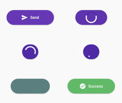
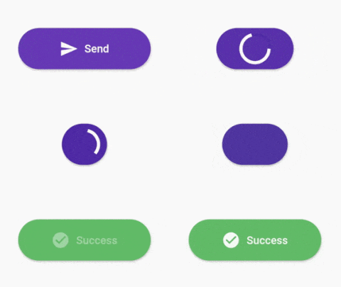
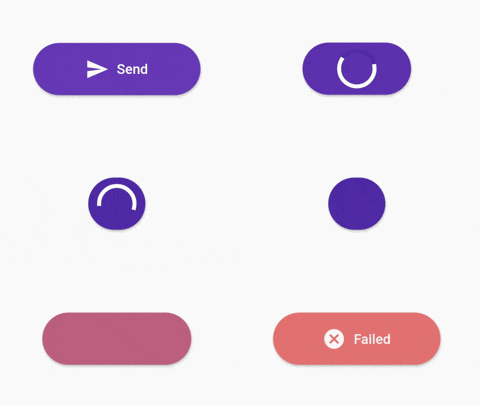
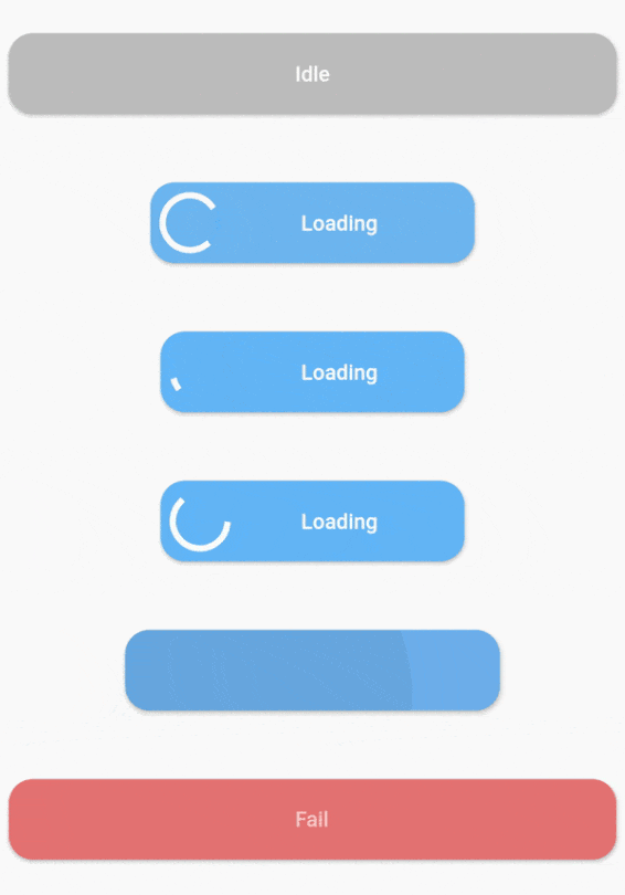
Flutter के लिए एक कस्टमाइज़ेबल प्रगति बटन विजेट जो Android, iOS, Web, macOS, Windows और Linux का समर्थन करता है। यह डेवलपर्स को लोडिंग, सफलता, त्रुटि और आराम की तरह गतिशील अवस्थाओं वाले बटन बनाने की अनुमति देता है, जिससे फॉर्म सबमिशन या API कॉल के दौरान उपयोगकर्ता प्रतिक्रिया में सुधार होता है। विजेट बहुत अनुकूलनीय है, जिससे रंग, लेबल, आइकन और एनीमेशन के अनुकूलन की अनुमति मिलती है। यह मौजूदा Flutter ऐप्स में बिना किसी दिक्कत के एकीकृत होता है और प्लेटफॉर्म के बीच एक सुसंगत अनुभव प्रदान करता है।
उपयोग
लोडिंग स्थिति के साथ फॉर्म सबमिशन
प्रमाणीकरण प्रवाह प्रगति
फ़ाइल अपलोड सूचकांक
भुगतान प्रसंस्करण UI
ऑनबोर्डिंग विज़ार्ड चरण
मुख्य विशेषताएँ
बहु-अवस्था समर्थन (आराम, लोडिंग, सफलता, त्रुटि)
कस्टमाइज़ किए गए दिखावट और व्यवहार
क्रॉस-प्लेटफॉर्म संगतता
अवस्थाओं के बीच एनीमेटेड संक्रमण
निर्धारित लेबल और प्रतीक
मौजूदा विजेट्स के साथ आसान एकीकरण
इनके लिए उपयुक्त
इंटरैक्टिव फॉर्म बनाने वाले डेवलपर्स
यूजर अनुभव सामंजस्य प्राथमिकता देने वाली टीमें
वास्तविक समय प्रतिक्रिया की आवश्यकता वाले ऐप
क्रॉस-प्लेटफ़ॉर्म मोबाइल और वेब एप्लिकेशन
जटिल उपयोगकर्ता कार्य प्रवाह वाले प्रोजेक्ट्स
विचार योग्य बातें
Flutter राज्य प्रबंधन की समझ आवश्यक है
जटिल डिजाइन के लिए अतिरिक्त स्टाइलिंग की आवश्यकता हो सकती है
बटन-विशिष्ट उपयोग केस तक सीमित
अन्योपयोगी अनिर्देशित तत्वों के लिए
प्लेटफॉर्म-विशिष्ट रेंडरिंग व्यवहार पर निर्भर करता है
मूल README
संबंधित सोर्स रिपॉज़िटरी के मूल README का स्नैपशॉट। नवीनतम सामग्री के लिए रिपॉज़िटरी देखें।
stateWidgets - Widgets of states
stateColors - Background color oof states
state = ButtonState.idle` - Current state of button
onPressed - onPressed function same like MaterialButton
onAnimationEnd - onAnimatedEnd function calls like that onAnimatedEnd(AnimationStatus animationStatus,ButtonState currentState).
minWidth = 200.0 - Loading state width
maxWidth = 400.0 - failed,success,idle states width
radius = 16.0 - Button radius
height = 53.0 - Button height
circularProgressIndicator - CircularProgressIndicator widget, defaultis instating with current state color.
progressIndicatorAlignment = MainAxisAlignment.spaceBetween` - ProgressIndicator aligment
progressIndicatorSize = 35.0 - size of progress indicator
padding = EdgeInsets.zero - Padding of button
minWidthStates = List of min width states, loading is the default. If you want to make small only icon states define them onthis.
animationDuration = Transition animation duration.
ProgressButton.icon() specific constructors
Map<ButtonState, IconedButton> iconedButtons- State and IconedButton map
double iconPadding: 4.0 - Padding of icon
TextStyle textStyle - TextStyle of all of states
License
This project is licensed under the MIT License - see the LICENSE.md file for details