
 v2.1.0
animated_segmented_tab_control
タブビューと併用できるカスタマイズ可能なセグメントコントロールです。
100いいね 201030日間ダウンロード150Pub ポイント
AndroidiOSWebmacOSWindowsLinux
アニメーション付きセグメントタブコントロール

{"sdk":"flutter"}{"sdk":"flutter"}^1.0.0以下は英語原文のスナップショットです。最新版は GitHub をご覧ください。
A customizable segment tab control. Can be used with or without TabView.
Made in lanars.com.
The package provides an advanced segmented control widget based on the TabController.
The package contains a SegmentedTabControl widget that requires a SegmentTab list.
SegmentedTabControl(
  tabs: [
    SegmentTab(
      label: 'Home',
    ),
  ],
)
SegmentedTabControl also requires a TabController. You can provide it with a DefaultTabController or instantiate a TabController instead.
DefaultTabController(
  length: 2,
  child: SegmentedTabControl(
    tabs: [
      SegmentTab(
        label: 'Home',
      ),
      SegmentTab(
        label: 'Account',
      ),
    ],
  ),
)
You can style the whole widget, an individual tab, or both. A value on the currently selected SegmentTab
overrides the corresponding value on SegmentedTabControl.
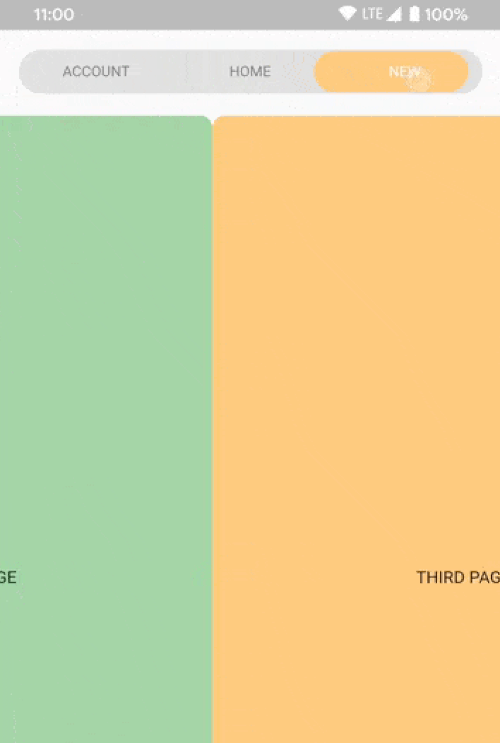
SegmentedTabControl(
  barDecoration: BoxDecoration(
    color: Colors.grey.shade300,
    borderRadius: BorderRadius.circular(10),
  ),
  indicatorDecoration: BoxDecoration(
    color: Colors.orange.shade200,
    borderRadius: BorderRadius.circular(10),
  ),
  tabTextColor: Colors.black45,
  selectedTabTextColor: Colors.white,
  tabs: [
    SegmentTab(
      label: 'ACCOUNT',
      color: Colors.red.shade200,
    ),
    SegmentTab(
      label: 'HOME',
      backgroundColor: Colors.blue.shade100,
      selectedTextColor: Colors.black45,
      textColor: Colors.black26,
    ),
    const SegmentTab(label: 'NEW'),
  ],
)
Note that the text colors are read from the selected tab and applied to the whole bar, so
textColor and selectedTextColor set the bar's label colors while that tab is selected rather than
coloring only that one tab.
Change tracking logic is identical to TabBar logic.
DefaultTabController.of(context).index
or
_controller.index
Use SegmentTab.labelBuilder to show any widget like an icon.
The selected-tab highlight is produced by painting the tab row twice and clipping the upper copy to the
indicator, so the builder is called once per layer and receives the color of the layer it is painting.
Plain Icon and Text children inherit that color. Use color for anything that does not inherit it, such as a
border or an SVG:
SegmentTab(
  label: 'NEW',
  labelBuilder: (context, color) => Container(
    padding: const EdgeInsets.symmetric(horizontal: 8, vertical: 2),
    decoration: BoxDecoration(
      border: Border.all(color: color),
      borderRadius: BorderRadius.circular(20),
    ),
    child: Text('NEW'),
  ),
)
Interactive children are not supported.
If you have any ideas or are running into a bug, please submit an issue on github page: https://github.com/LanarsInc/animated-segmented-tab-control/issues