パッケージ、リポジトリ、アプリカテゴリを検索

animated_segmented_tab_control のカバー
パッケージ詳細v2.2.0

animated_segmented_tab_control

タブビューと併用できるカスタマイズ可能なセグメントコントロールです。

AndroidiOSWebmacOSWindowsLinux
30日間ダウンロード
4130
いいね数
100
Pub ポイント
160

パッケージをインストール

flutter pub add animated_segmented_tab_control

パッケージ概要

公開情報に基づく選定ガイドです。参考としてご利用ください。

FlutterアプリケーションにおけるTabViewとシームレスに連携するように設計されたカスタマイズ可能なアニメーションセグメントコントロールです。セグメント間のスムーズな遷移を提供し、さまざまなスタイルオプションをサポートし、動的な視覚フィードバックによりユーザーインタラクションを強化します。モダンな美学を持つ直感的なタブナビゲーションを必要とするアプリに最適です。このパッケージは、Android、iOS、Web、macOS、Windows、Linuxなどすべての主要プラットフォームで互換性があります。

用途

  • インタラクティブなタブナビゲーション
  • ダイナミックUIトランジション
  • カスタマイズ可能なタブインターフェース
  • クロスプラットフォームタブコントロール
  • ダッシュボードにおけるユーザー体験の向上
  • フォームセクションの切り替え

主な機能

  • スムーズなアニメーションの遷移
  • 非常にカスタマイズ可能な外観
  • TabView に対する組み込みサポート
  • 複数プラットフォームにわたる応答性のあるデザイン
  • 既存のFlutterプロジェクトとの簡単な統合
  • 水平および垂直レイアウトの両方をサポートしています

適している対象

  • クロスプラットフォームアプリを開発する開発者
  • 現代のUIコンポーネントを探しているデザイナー
  • 複数のコンテンツセクションを持つアプリ
  • インタラクティブなタブ体験を必要とするプロジェクト
  • デバイス間で一貫したUXを重視するチーム

注意事項

  • 複雑なテーマには追加のスタイリングが必要になる場合があります
  • 多数のセグメントによるパフォーマンスへの影響
  • 限定された組み込みアクセシビリティ機能
  • 外部のTabView実装に依存
  • 非常に高い頻度の更新には最適化されていません

元の README

関連するソースリポジトリの README 原文のスナップショットです。最新の内容はリポジトリをご覧ください。

A customizable segment tab control. Can be used with or without TabView.

Made in lanars.com.

pub package

Features

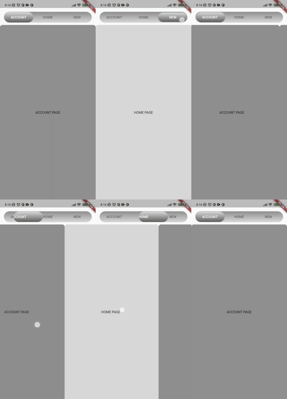
The package provides an advanced segmented control widget based on the TabController.

Usage

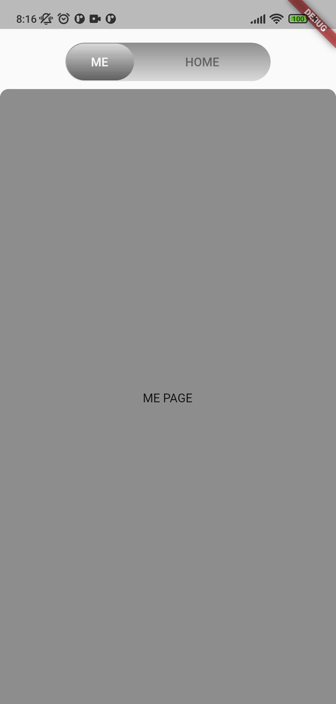
The package contains a SegmentedTabControl widget that requires a SegmentTab list.

SegmentedTabControl(
  tabs: [
    SegmentTab(
      label: 'Home',
    ),
  ],
)

SegmentedTabControl also requires a TabController. You can provide it with a DefaultTabController or instantiate a TabController instead.

DefaultTabController(
  length: 2,
  child: SegmentedTabControl(
    tabs: [
      SegmentTab(
        label: 'Home',
      ),
      SegmentTab(
        label: 'Account',
      ),
    ],
  ),
)

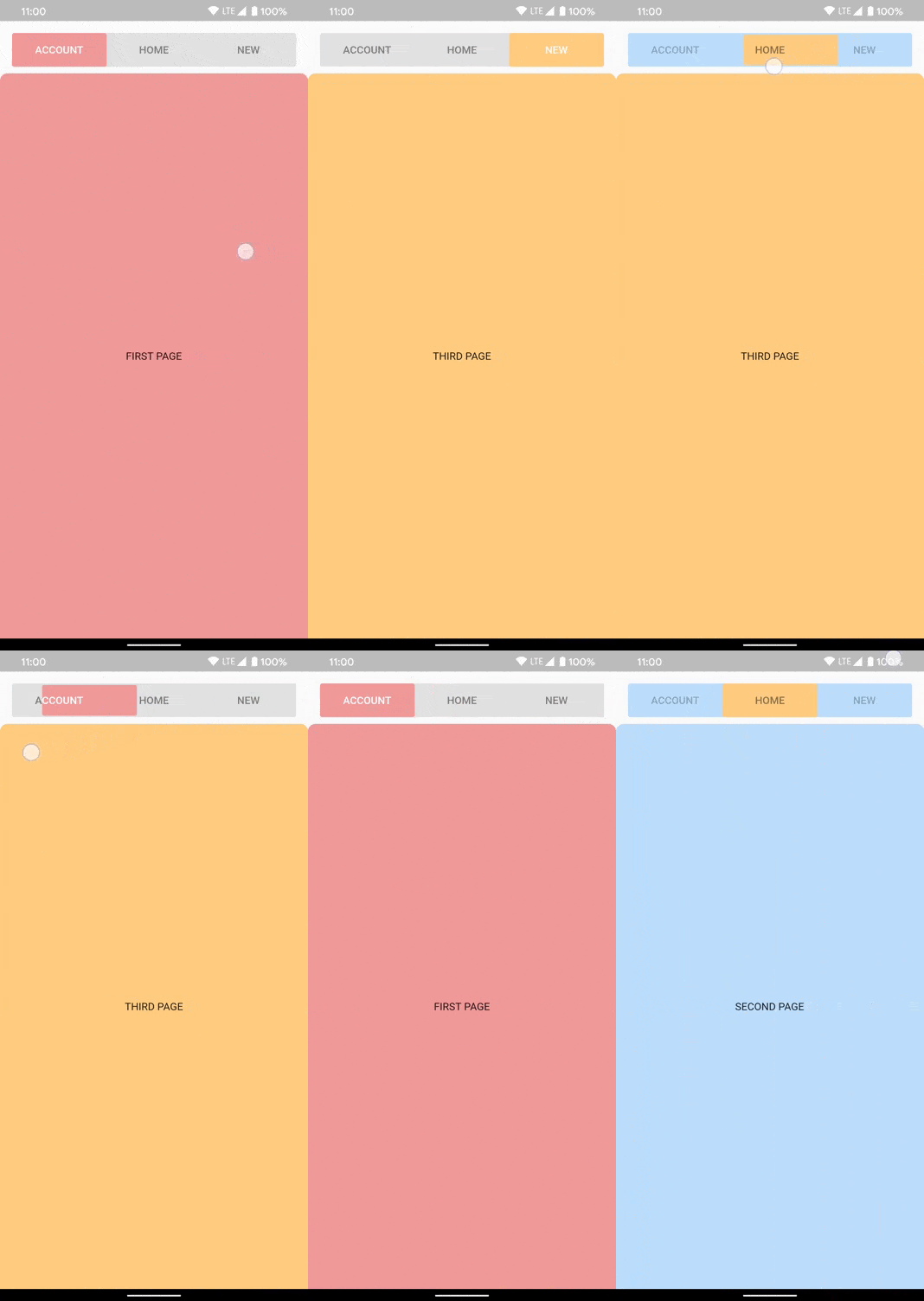
You can style the whole widget, an individual tab, or both. A value on the currently selected SegmentTab overrides the corresponding value on SegmentedTabControl.

SegmentedTabControl(
  barDecoration: BoxDecoration(
    color: Colors.grey.shade300,
    borderRadius: BorderRadius.circular(10),
  ),
  indicatorDecoration: BoxDecoration(
    color: Colors.orange.shade200,
    borderRadius: BorderRadius.circular(10),
  ),
  tabTextColor: Colors.black45,
  selectedTabTextColor: Colors.white,
  tabs: [
    SegmentTab(
      label: 'ACCOUNT',
      color: Colors.red.shade200,
    ),
    SegmentTab(
      label: 'HOME',
      backgroundColor: Colors.blue.shade100,
      selectedTextColor: Colors.black45,
      textColor: Colors.black26,
    ),
    const SegmentTab(label: 'NEW'),
  ],
)

Note that the text colors are read from the selected tab and applied to the whole bar, so textColor and selectedTextColor set the bar's label colors while that tab is selected rather than coloring only that one tab.

Change tracking logic is identical to TabBar logic.

DefaultTabController.of(context).index

or

_controller.index

Сustom tab content

Use SegmentTab.labelBuilder to show any widget like an icon.

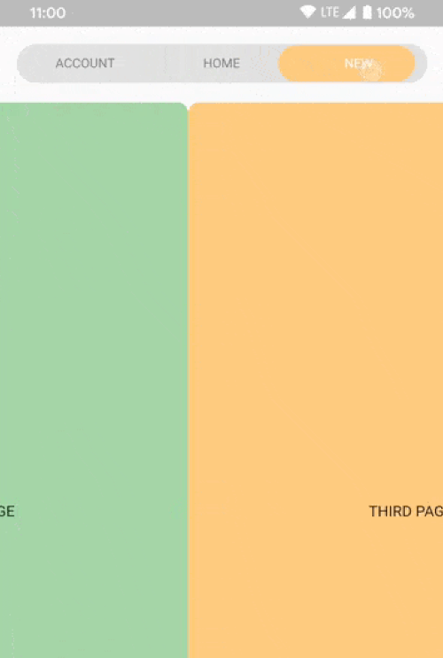
The selected-tab highlight is produced by painting the tab row twice and clipping the upper copy to the indicator, so the builder is called once per layer and receives the color of the layer it is painting. Plain Icon and Text children inherit that color. Use color for anything that does not inherit it, such as a border or an SVG:

SegmentTab(
  label: 'NEW',
  labelBuilder: (context, color) => Container(
    padding: const EdgeInsets.symmetric(horizontal: 8, vertical: 2),
    decoration: BoxDecoration(
      border: Border.all(color: color),
      borderRadius: BorderRadius.circular(20),
    ),
    child: Text('NEW'),
  ),
)

Interactive children are not supported.

Additional information

If you have any ideas or are running into a bug, please submit an issue on github page: https://github.com/LanarsInc/animated-segmented-tab-control/issues

カテゴリー

依存関係

依存関係一覧 1 件

ソースリポジトリ

このパッケージを使用しているプロジェクト

データはまだありません。