

 v0.1.3
flexible_scrollbar
Flutter用の柔軟なスクロールバー。このパッケージを使用すると、さまざまな事前に定義された動作を持つカスタムスクロールバーを作成できます。
29いいね 152030日間ダウンロード150Pub ポイント
AndroidiOSWebmacOSWindowsLinux
カスタムスクロールバー用の柔軟なソリューション

以下は英語原文のスナップショットです。最新版は GitHub をご覧ください。

A flexible solution for custom scroll bars.
 |
 |
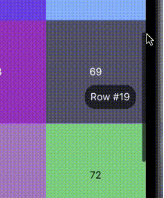
A package has been designed to allow the creation of complex scroll bars. You can customize the scroll thumb, scroll line and add a label, that is positioned by the center of the scroll thumb by default, but you can customize its position as well. As those three things are created by builders called every time the scroll state is changed, you can add custom animations.
The usage is as simple as a built-in Scrollbar, only you can customize it a lot more.
To install this package simply add the flexible_scrollbar to your dependencies in pubspec.yaml
# pubspec.yaml
dependencies:
  flexible_scrollbar:
import 'package:flexible_scrollbar/flexible_scrollbar.dart';
To get a scrollbar simply wrap a scrollable widget with FlexibleScrollbar and pass a ScrollController to both FlexibleScrollbar and a scrollable widget:
FlexibleScrollbar(
     controller: scrollController,
     child: GridView.builder(
        controller: scrollController,
You will get a defaul scroll thumb and settings:

But it's very simple and we are here to make complex scroll bars so let's see how.
For the main customization the FlexibleScrollbar widget has three builders: scrollThumbBuilder, scrollLineBuilder and scrollLabelBuilder. Each one of them has a ScrollbarInfo as a parameter and rebuild each time any of the fields of the ScrollbarInfo model has changed.
ScrollbarInfo model has the following properties:
| Properties | Description |
|---|---|
bool isScrolling |
Changes when the user starts/strops the scroll body scrolling. The isDragging is not affected by it. |
bool isDragging |
Changes when the user starts/strops to drag the scroll thumb. The isScrolling is not affected by it. |
double thumbMainAxisSize |
Contains the calculated depending on the scroll body size thumb length. |
double thumbMainAxisOffset |
Contains the offset in pixels of the scroll thumb from the starting position. |
AxisDirection scrollDirection |
Has the scroll body scroll direction in it (up/down/left/right) |
| Using those builders you can make custom scrollbars such as the one shown in the example at the beginning. The scroll thumb from the example has been created with the following code: |
scrollThumbBuilder: (ScrollbarInfo info) {
     return AnimatedContainer(
       width: info.isDragging
           ? thumbDragWidth
           : thumbWidth,
       height: info.thumbMainAxisSize,
       decoration: BoxDecoration(
         borderRadius: BorderRadius.circular(5),
         color: Colors.black.withOpacity(info.isDragging ? 1 : 0.6),
       ),
       duration: animationDuration,
     );
},
There is some more customization that you can do with the other than builders properties of the FlexibleScrollbar:
| Properties | Description |
|---|---|
bool alwaysVisible |
Default value is false. If true prevents the scroll thumb from disappearing after the set time. |
bool jumpOnScrollLineTapped |
Default value is true. If false prevents the scroll position change on the scroll line tap. |
bool draggable |
Default value is true. If false prevents user from dragging the scroll thumb. |
bool autoPositionLabel |
Default value is true. If false the label is set to (0, 0) position and can be moved using Positioned widget. |
double? scrollLineOffset |
The offset in pixels of the scroll line from the side defined by the barPosition and the scroll direction. |
double? thumbMainAxisMinSize |
The minimal size of the scroll thumb in case you are using the ScrollbarInfo thumbMainAxisSize and the scroll body is too big. |
double? scrollLineCrossAxisSize |
The cross axis size of the scroll line. Defaults to the scroll thumb size. The scroll thumb cross axis size can not be bigger then this field. |
double? scrollLabelOffset |
The offset in pixels of the label from the side defined by the barPosition and the scroll direction. |
Duration? thumbFadeStartDuration |
Defines the time after which the scroll thumb will start its fade animation. |
Duration? thumbFadeDuration |
The time that takes the scroll thumb to completely fade. |
BarPosition barPosition |
Defines whether the scroll line position at the start or the end of the scroll body cross axis. |
ValueChanged<DragStartDetails>? onDragStart |
This callback is called when the user starts dragging the scroll thumb. |
ValueChanged<DragEndDetails>? onDragEnd |
This callback is called when the user ends dragging the scroll thumb. |
ValueChanged<DragUpdateDetails>? onDragUpdate |
This callback is called during the user's scroll thumb drag process. |
This package is licensed under the Apache License 2.0 - see the LICENSE file for details.
依存関係一覧 3 件
{"sdk":"flutter"}{"sdk":"flutter"}^1.3.1用途で絞り込み、開発状況を比較し、採用前に元のリポジトリで要件を確認しましょう。
“A repository is the most basic element of GitHub.”
GitHub Docs — About repositories ↗