パッケージ、リポジトリ、アプリカテゴリを検索

flexible_scrollbar のカバー
パッケージ詳細v0.1.3

flexible_scrollbar

Flutter用の柔軟なスクロールバー。このパッケージを使用すると、さまざまな事前に定義された動作を持つカスタムスクロールバーを作成できます。

AndroidiOSWebmacOSWindowsLinux
30日間ダウンロード
1520
いいね数
29
Pub ポイント
150

パッケージをインストール

flutter pub add flexible_scrollbar

パッケージ概要

公開情報に基づく選定ガイドです。参考としてご利用ください。

開発者が事前定義された動作を持つカスタマイズ可能なスクロールバーを作成できるFlutterパッケージです。スタイルと機能の柔軟性を提供し、さまざまなプラットフォームで独自のスクロールバー設計が可能です。カスタマイズされたスクロール体験が必要なアプリに最適で、Android、iOS、Web、macOS、Windows、Linuxなどすべての主要プラットフォームをサポートしています。スクロール中に視覚フィードバックを提供することでユーザーインタラクションを向上させつつ、クリーンで応答性のあるインターフェースを維持します。

用途

  • Webアプリケーションにおけるカスタムスクロールバーのデザイン
  • モバイルスクロール可能なリストにおけるUXの向上
  • デスクトップアプリ用のスクロールインジケーターの調整
  • 長期間コンテンツ画面のアクセシビリティ向上
  • プラットフォーム固有のスクロールバーのスタイルを作成する
  • スクロール可能なウィジェットに視覚フィードバックを追加する

主な機能

  • カスタマイズ可能なスクロールバーの外観
  • 事前定義された動作モード
  • クロスプラットフォーム互換性
  • カスタムアニメーションのサポート
  • ScrollView との簡単な統合
  • デバイス間での応答性デザイン

適している対象

  • 視覚的なカスタマイズを求めるUIデザイナー
  • スクロールが多く含まれるインターフェースを開発する開発者
  • 複数のプラットフォームをターゲットにするアプリ
  • アクセシブルなスクロールが必要なプロジェクト
  • 洗練されたユーザー体験に注力するチーム

注意事項

  • 最適なパフォーマンスを実現するには、追加のスタイリングが必要になる場合があります
  • 動作のカスタマイズには ScrollController の理解が必要です
  • スクロールフィードバックのないミニマリストデザインには適していません
  • ネストされたスクロールビュー内の可能性のあるレイアウトの衝突
  • ネイティブのスクロールバーと比べて、組み込みテーマが限られている

元の README

関連するソースリポジトリの README 原文のスナップショットです。最新の内容はリポジトリをご覧ください。

A Flexible Scrollbar for Flutter

pub package
A flexible solution for custom scroll bars.


Foreword

A package has been designed to allow the creation of complex scroll bars. You can customize the scroll thumb, scroll line and add a label, that is positioned by the center of the scroll thumb by default, but you can customize its position as well. As those three things are created by builders called every time the scroll state is changed, you can add custom animations.

How to use

The usage is as simple as a built-in Scrollbar, only you can customize it a lot more.

Install

To install this package simply add the flexible_scrollbar to your dependencies in pubspec.yaml

# pubspec.yaml
dependencies:
  flexible_scrollbar:
import 'package:flexible_scrollbar/flexible_scrollbar.dart';

Basic usage

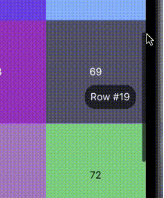
To get a scrollbar simply wrap a scrollable widget with FlexibleScrollbar and pass a ScrollController to both FlexibleScrollbar and a scrollable widget:

FlexibleScrollbar(
     controller: scrollController,
     child: GridView.builder(
        controller: scrollController,

You will get a defaul scroll thumb and settings:

But it's very simple and we are here to make complex scroll bars so let's see how.

Customization

For the main customization the FlexibleScrollbar widget has three builders: scrollThumbBuilder, scrollLineBuilder and scrollLabelBuilder. Each one of them has a ScrollbarInfo as a parameter and rebuild each time any of the fields of the ScrollbarInfo model has changed.

ScrollbarInfo model has the following properties:

Properties Description
bool isScrolling Changes when the user starts/strops the scroll body scrolling. The isDragging is not affected by it.
bool isDragging Changes when the user starts/strops to drag the scroll thumb. The isScrolling is not affected by it.
double thumbMainAxisSize Contains the calculated depending on the scroll body size thumb length.
double thumbMainAxisOffset Contains the offset in pixels of the scroll thumb from the starting position.
AxisDirection scrollDirection Has the scroll body scroll direction in it (up/down/left/right)

Using those builders you can make custom scrollbars such as the one shown in the example at the beginning. The scroll thumb from the example has been created with the following code:
scrollThumbBuilder: (ScrollbarInfo info) {
     return AnimatedContainer(
       width: info.isDragging
           ? thumbDragWidth
           : thumbWidth,
       height: info.thumbMainAxisSize,
       decoration: BoxDecoration(
         borderRadius: BorderRadius.circular(5),
         color: Colors.black.withOpacity(info.isDragging ? 1 : 0.6),
       ),
       duration: animationDuration,
     );
},
Other parameters

There is some more customization that you can do with the other than builders properties of the FlexibleScrollbar:

Properties Description
bool alwaysVisible Default value is false. If true prevents the scroll thumb from disappearing after the set time.
bool jumpOnScrollLineTapped Default value is true. If false prevents the scroll position change on the scroll line tap.
bool draggable Default value is true. If false prevents user from dragging the scroll thumb.
bool autoPositionLabel Default value is true. If false the label is set to (0, 0) position and can be moved using Positioned widget.
double? scrollLineOffset The offset in pixels of the scroll line from the side defined by the barPosition and the scroll direction.
double? thumbMainAxisMinSize The minimal size of the scroll thumb in case you are using the ScrollbarInfo thumbMainAxisSize and the scroll body is too big.
double? scrollLineCrossAxisSize The cross axis size of the scroll line. Defaults to the scroll thumb size. The scroll thumb cross axis size can not be bigger then this field.
double? scrollLabelOffset The offset in pixels of the label from the side defined by the barPosition and the scroll direction.
Duration? thumbFadeStartDuration Defines the time after which the scroll thumb will start its fade animation.
Duration? thumbFadeDuration The time that takes the scroll thumb to completely fade.
BarPosition barPosition Defines whether the scroll line position at the start or the end of the scroll body cross axis.
ValueChanged<DragStartDetails>? onDragStart This callback is called when the user starts dragging the scroll thumb.
ValueChanged<DragEndDetails>? onDragEnd This callback is called when the user ends dragging the scroll thumb.
ValueChanged<DragUpdateDetails>? onDragUpdate This callback is called during the user's scroll thumb drag process.

License

This package is licensed under the Apache License 2.0 - see the LICENSE file for details.

カテゴリー

ソースリポジトリ

このパッケージを使用しているプロジェクト