

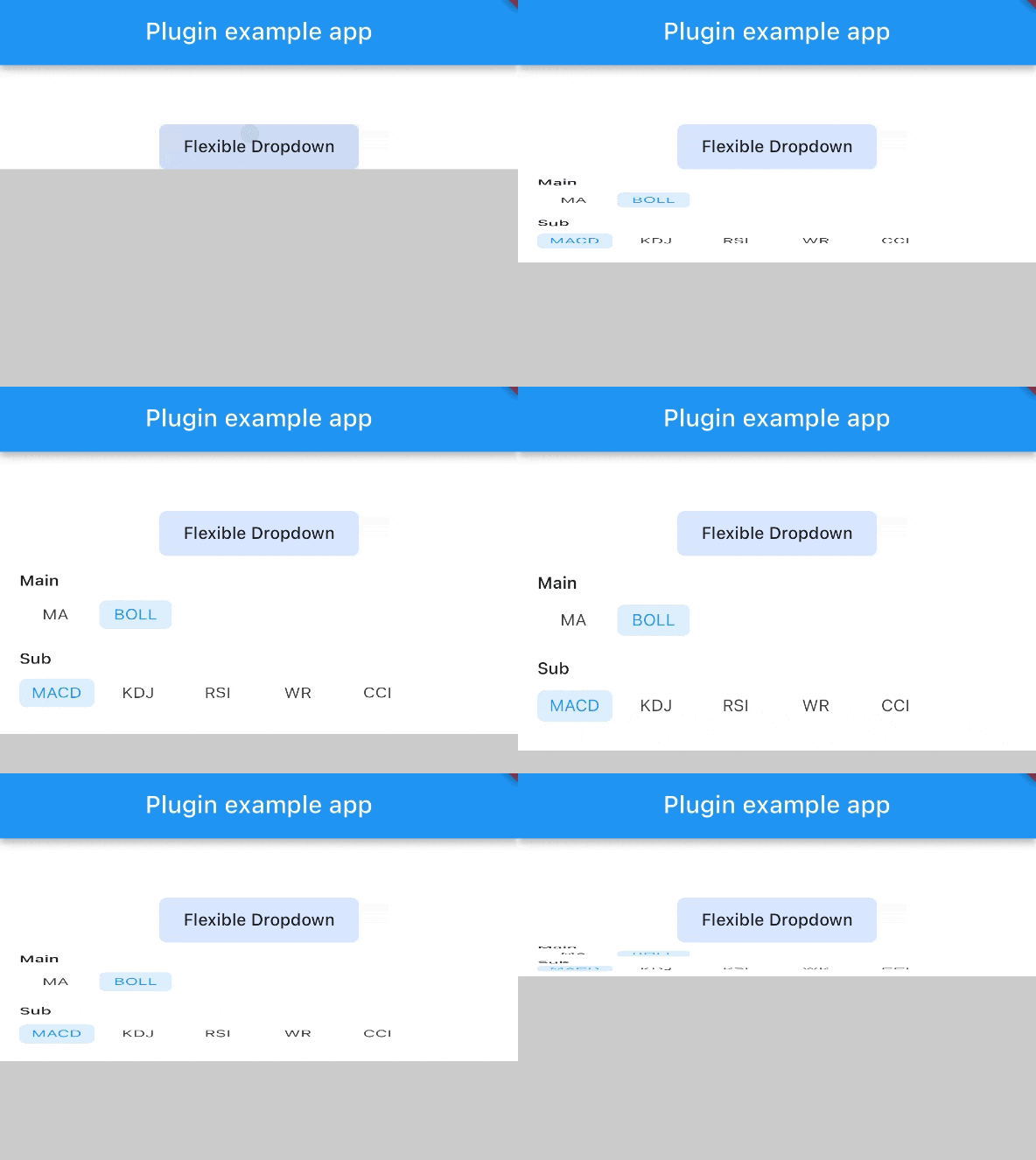
 v1.0.8
flexible_dropdown
スクリムをタップまたはスワイプしてドロップダウンを閉じることができ、ヘッダー(バリア)を透明に設定します
15いいね 10830日間ダウンロード150Pub ポイント
AndroidiOSWebmacOSWindowsLinux
TrangLeQuynh/flexible_dropdown open-source repository details.

以下は英語原文のスナップショットです。最新版は GitHub をご覧ください。


Customize dropdown
Auto scroll to selected item position
Support BarrierShape.headerTrans to highlight the content above the flexible dropdown button
Allows the dropdown to be dismissed by tapping | panning the scrim or by pressing the escape key on the keyboard.
Allow to choose the Animation Type
First, add flexible_dropdown as a dependency in your pubspec.yaml file.
dependencies:
  flexible_dropdown: ^1.0.7
FlexibleDropdown(
  overlayChild: Container(
    height: 160,
    width: double.infinity,
    color: Colors.deepPurple,
  ),
  barrierColor: Colors.black38.withOpacity(.2),
  barrierShape: BarrierShape.headerTrans,
  textDirection: TextDirection.ltr,
  offset: Offset.zero,
  duration: const Duration(milliseconds: 400),
  animationType: AnimationType.size,
  animationAlignment: Alignment.topCenter,
  child: Container(
    decoration: BoxDecoration(
      borderRadius: BorderRadius.circular(6),
      color: Colors.blueAccent.withOpacity(.2),
    ),
    child: Padding(
      padding: const EdgeInsets.symmetric(vertical: 10, horizontal: 20),
      child: Text(
        title,
        style: const TextStyle(fontSize: 14, fontWeight: FontWeight.w500),
      ),
    ),
  ),
)
Usage to close the flexible dropdown:
Navigator.pop(context);
| scale | scaleX | scaleY |
|---|---|---|
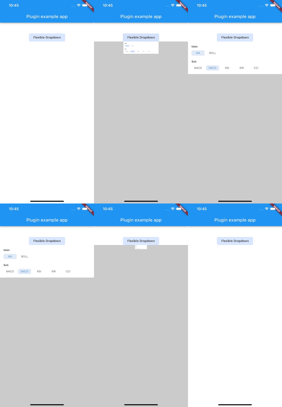 |
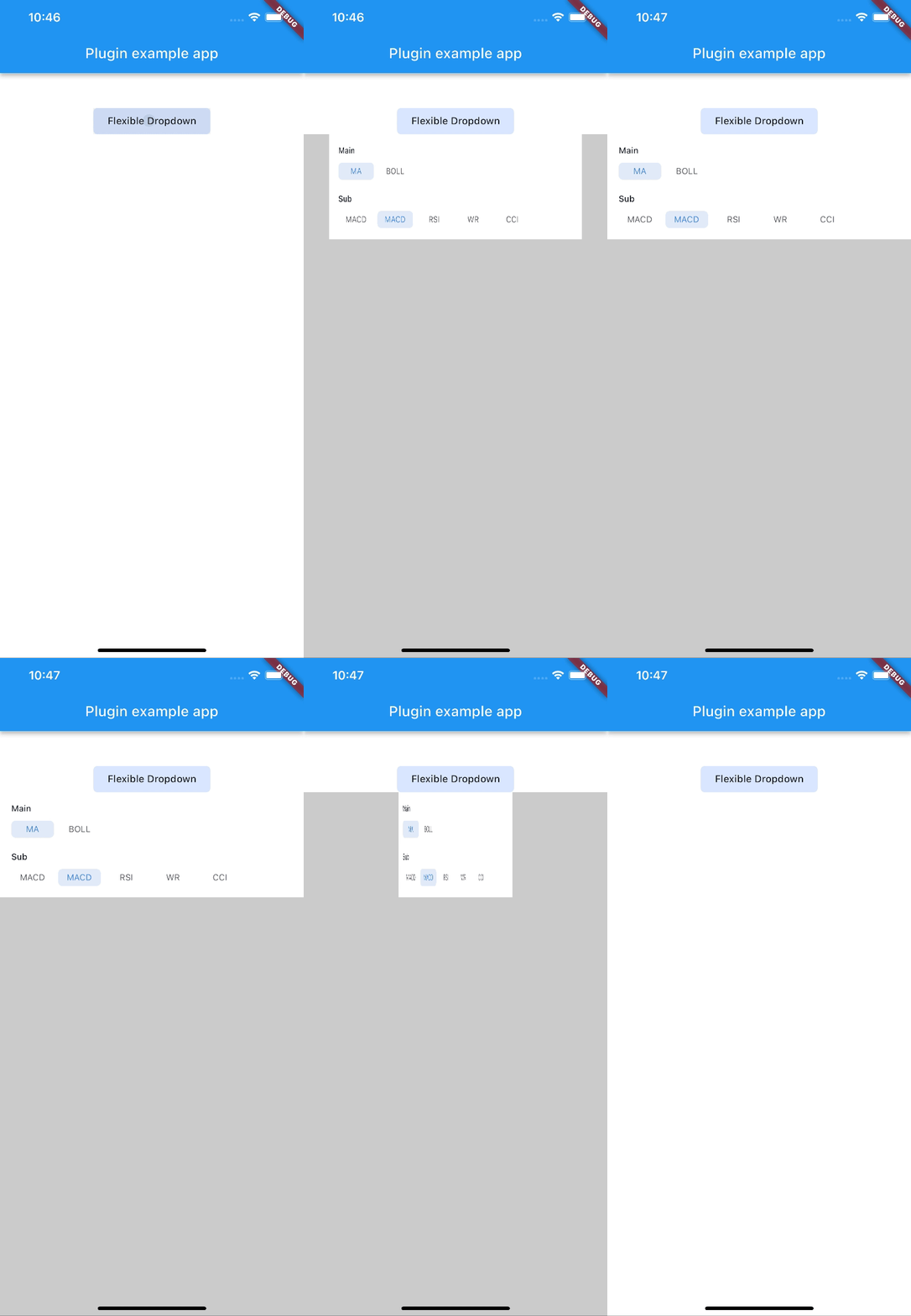 |
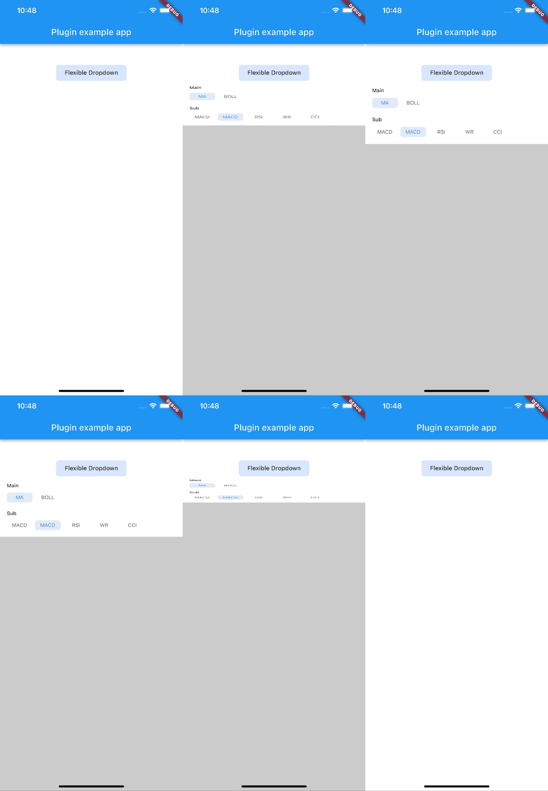 |
| size | slide | fade |
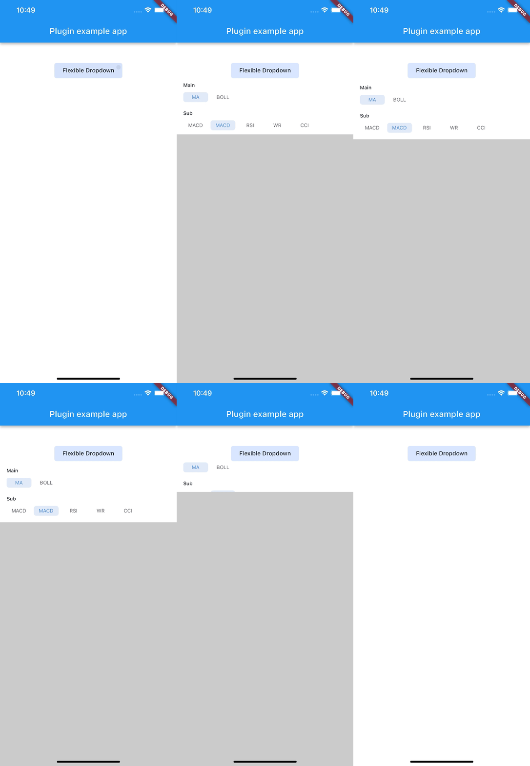 |
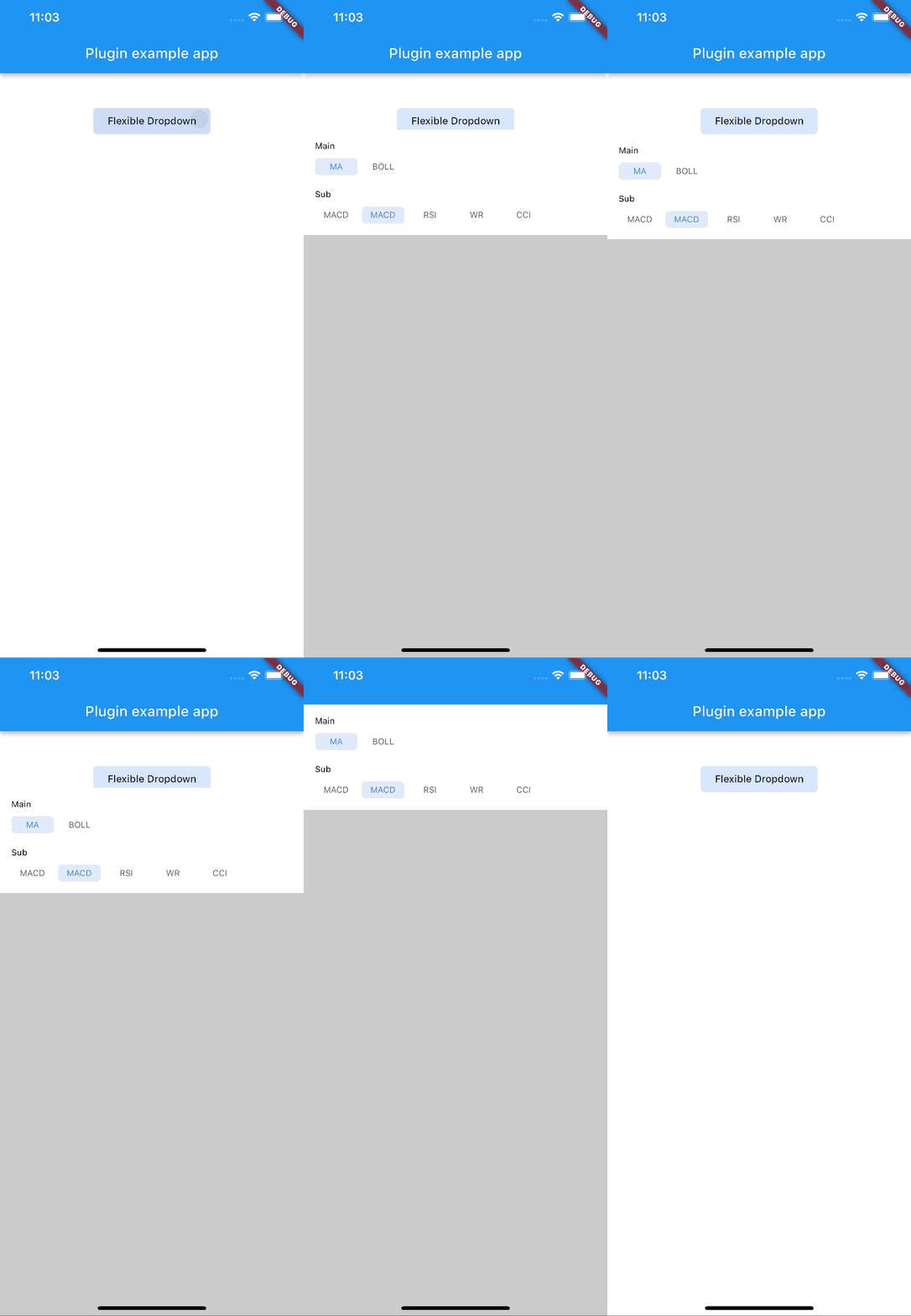 |
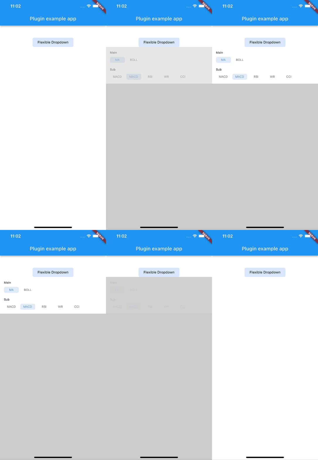 |
| rotate | ||
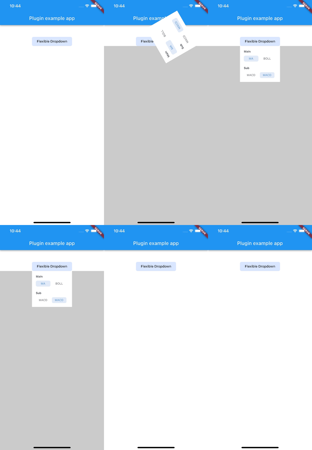 |
Note:
AnimationType.sizeis only suitable for width ofoverlayChildis full screen width.
依存関係一覧 4 件
{"sdk":"flutter"}^2.0.2{"sdk":"flutter"}^2.0.0用途で絞り込み、開発状況を比較し、採用前に元のリポジトリで要件を確認しましょう。
“A repository is the most basic element of GitHub.”
GitHub Docs — About repositories ↗