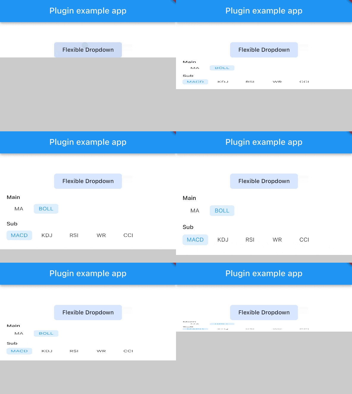
Flexible Dropdown Package
Features
-
Customize dropdown
-
Auto scroll to selected item position
-
Support BarrierShape.headerTrans to highlight the content above the flexible dropdown button
-
Allows the dropdown to be dismissed by tapping | panning the scrim or by pressing the escape key on the keyboard.
-
Allow to choose the Animation Type
Installation
First, add flexible_dropdown as a dependency in your pubspec.yaml file.
dependencies:
  flexible_dropdown: ^1.0.7
Usage
FlexibleDropdown(
  overlayChild: Container(
    height: 160,
    width: double.infinity,
    color: Colors.deepPurple,
  ),
  barrierColor: Colors.black38.withOpacity(.2),
  barrierShape: BarrierShape.headerTrans,
  textDirection: TextDirection.ltr,
  offset: Offset.zero,
  duration: const Duration(milliseconds: 400),
  animationType: AnimationType.size,
  animationAlignment: Alignment.topCenter,
  child: Container(
    decoration: BoxDecoration(
      borderRadius: BorderRadius.circular(6),
      color: Colors.blueAccent.withOpacity(.2),
    ),
    child: Padding(
      padding: const EdgeInsets.symmetric(vertical: 10, horizontal: 20),
      child: Text(
        title,
        style: const TextStyle(fontSize: 14, fontWeight: FontWeight.w500),
      ),
    ),
  ),
)
Usage to close the flexible dropdown:
Navigator.pop(context);
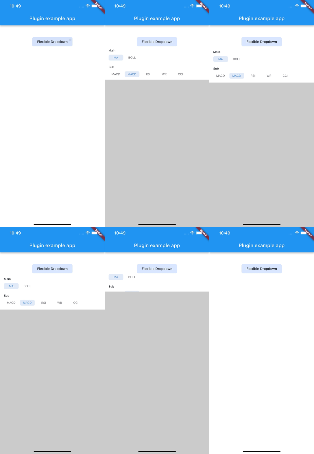
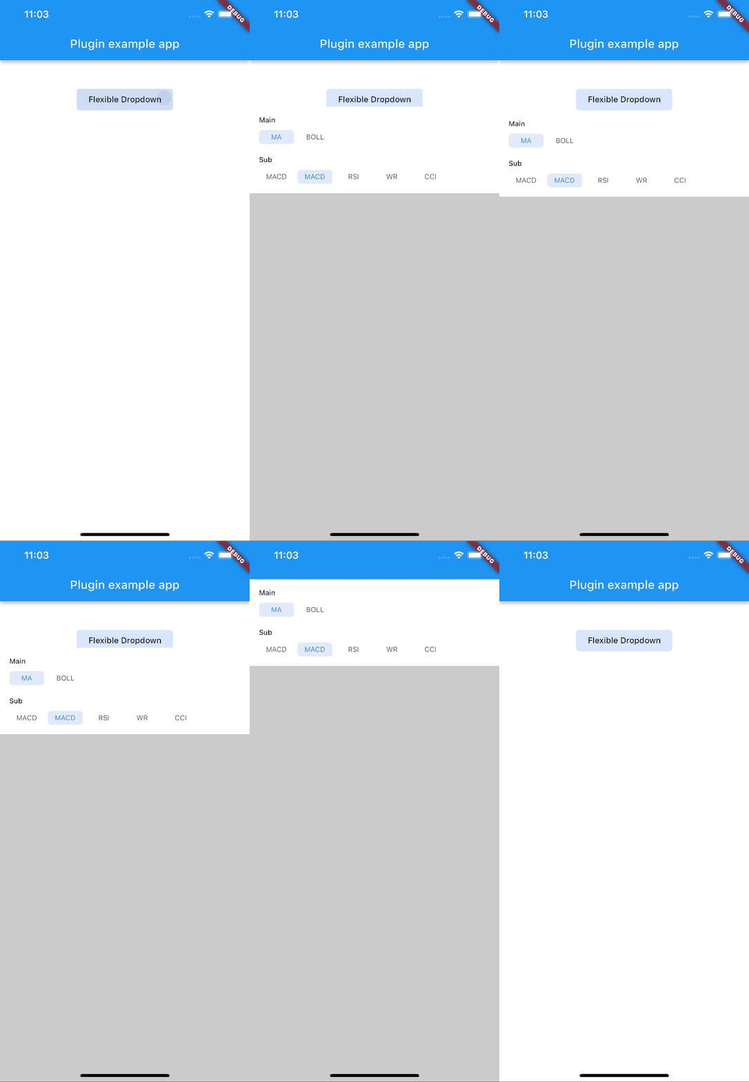
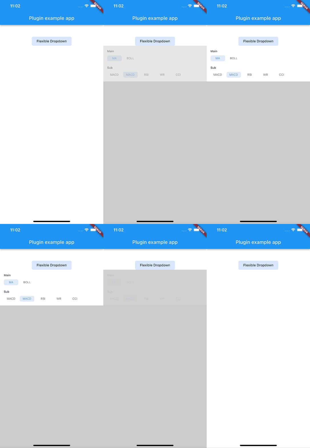
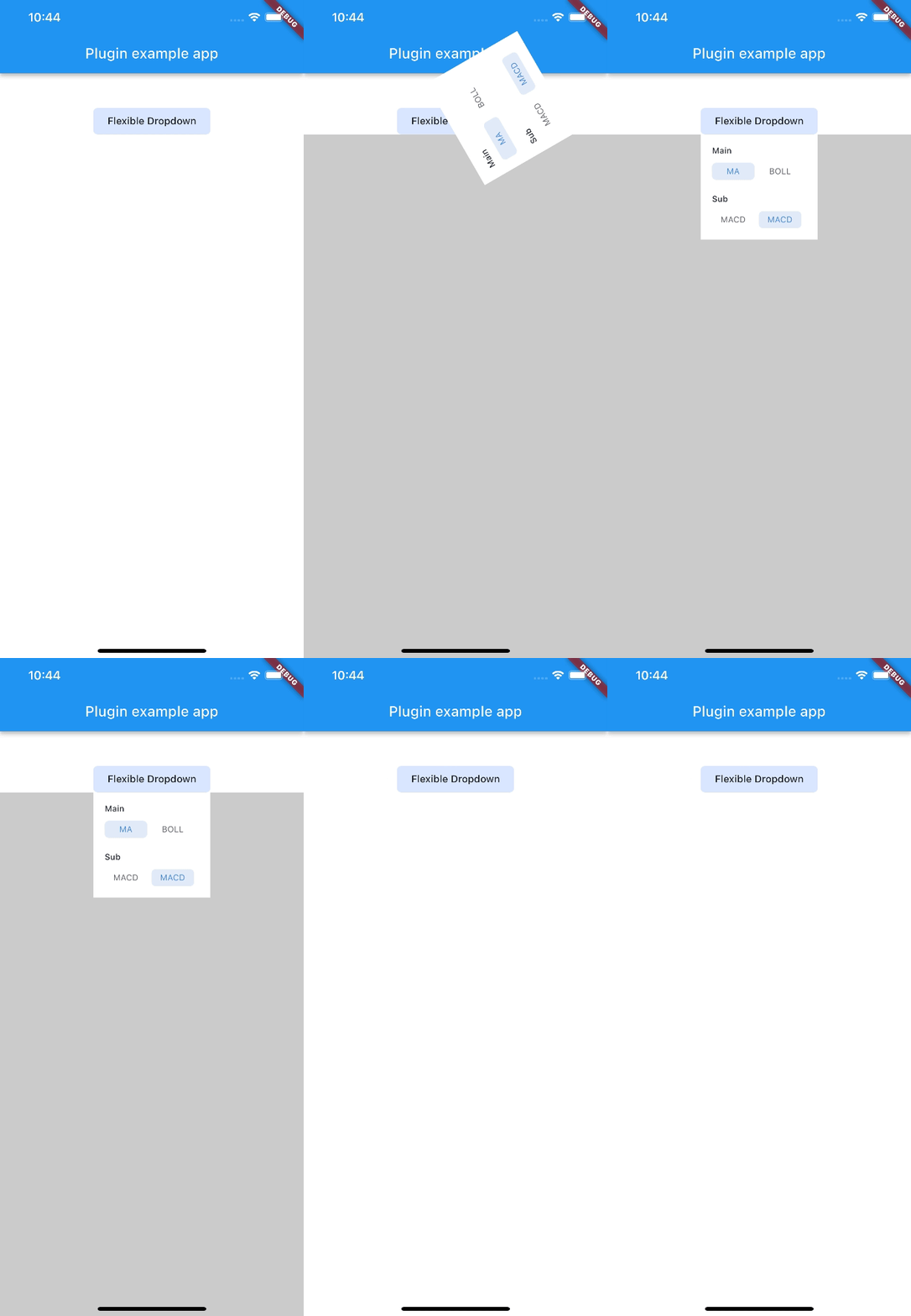
Animation Type
| scale |
scaleX |
scaleY |
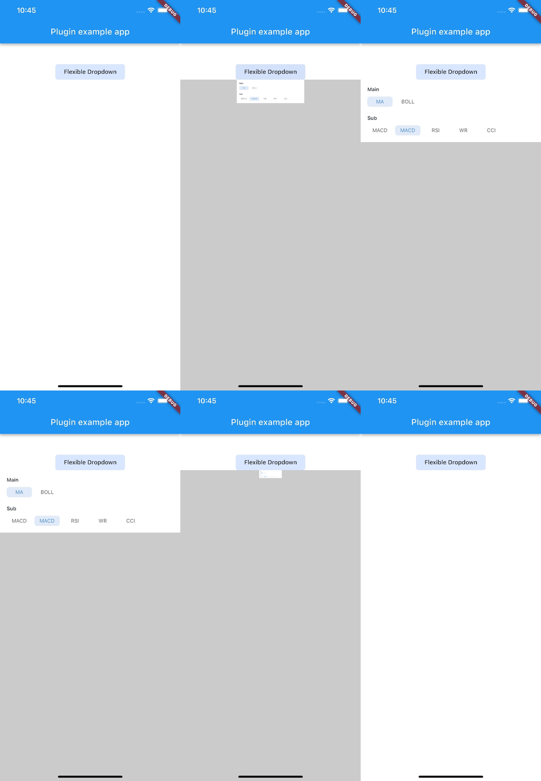 |
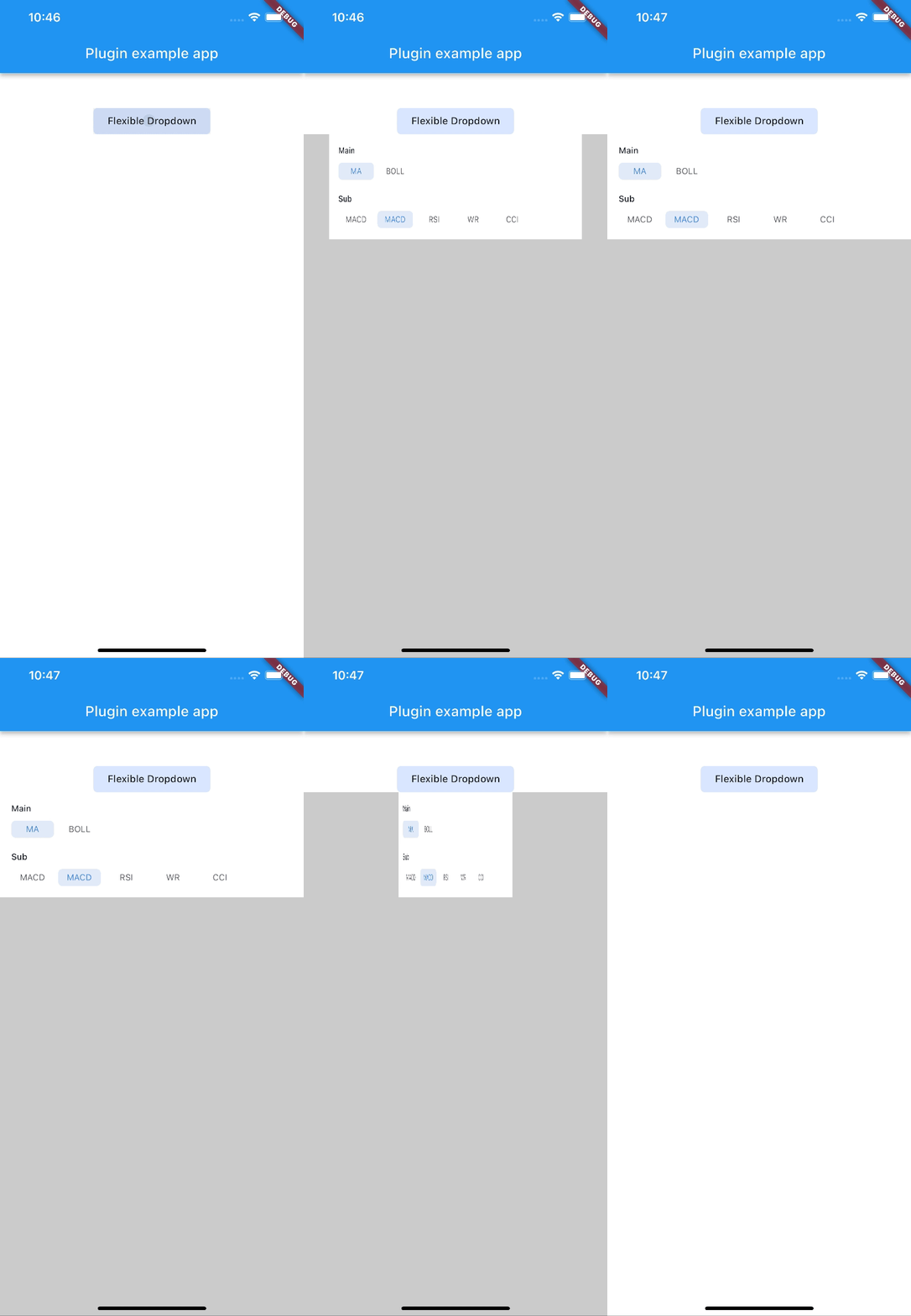 |
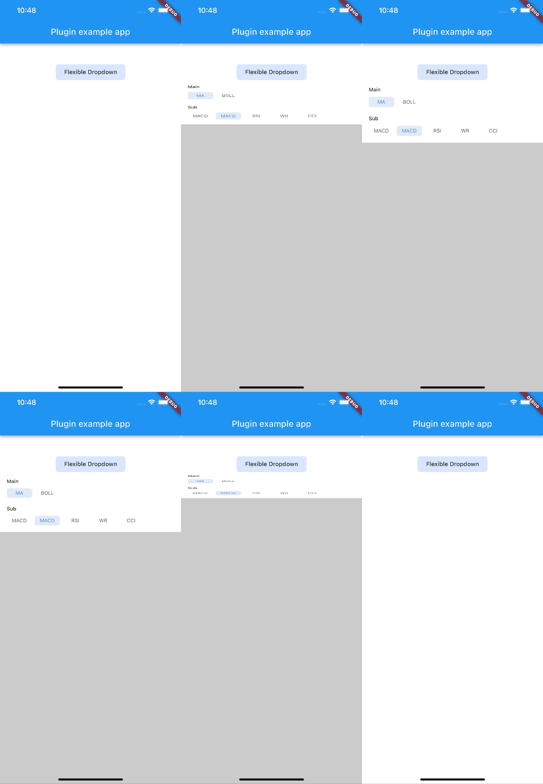 |
| size |
slide |
fade |
 |
 |
 |
| rotate |
|
|
 |
|
|
Note: AnimationType.size is only suitable for width of overlayChild is full screen width.