

 v0.1.5
flutter_scrolling_fab_animated
スクロールダウン時にサイズが変化するフローティングボタンを追加するパッケージ
68いいね 48430日間ダウンロード160Pub ポイント
AndroidiOSWebmacOSWindowsLinux
ajomuch92/flutter-scrolling-fab-animated open-source repository details.

以下は英語原文のスナップショットです。最新版は GitHub をご覧ください。
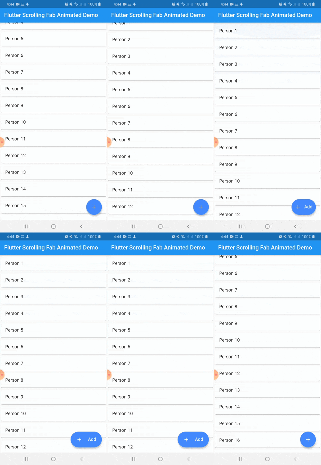
This package is a floating button whose change of size when scroll down and return to its original size when on top again. It's useful with ListView widget and other scrollable widgets.
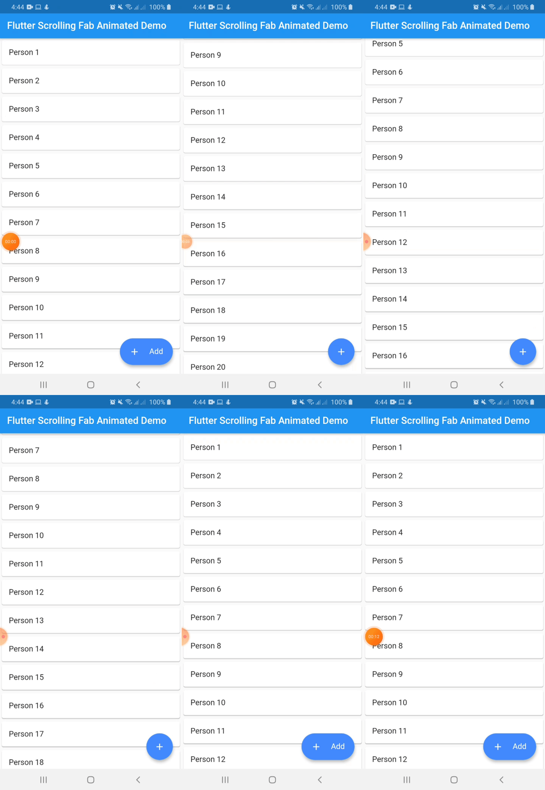
With animated icon
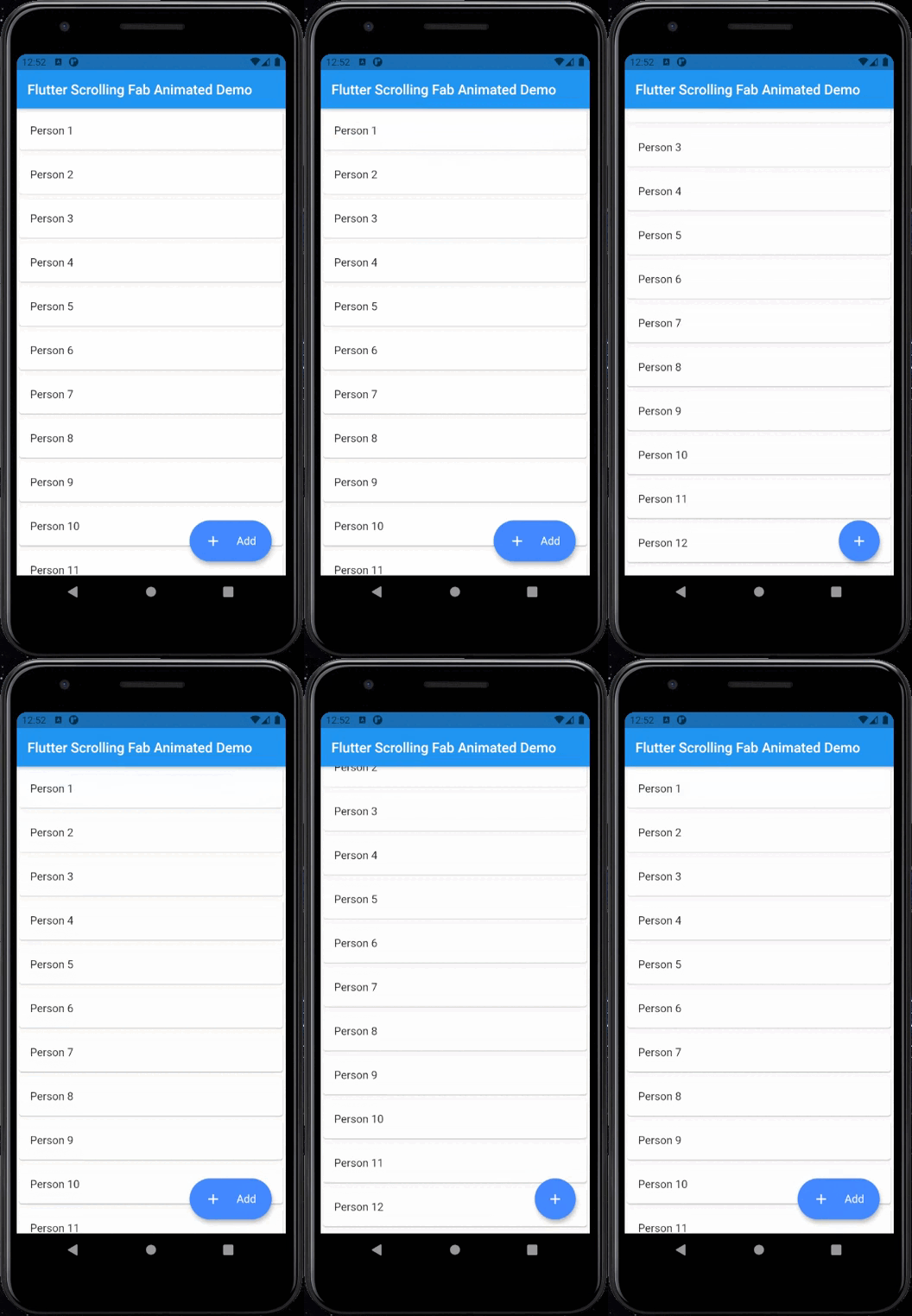
Include flutter_scrolling_fab_animated in your pubspec.yaml file:
dependencies:
  flutter:
    sdk: flutter
  flutter_scrolling_fab_animated: version
To use this package, just import it into your file and enjoy it.
import 'package:bottom_sheet_expandable_bar/bottom_sheet_bar_icon.dart';
import 'package:flutter_scrolling_fab_animated/flutter_scrolling_fab_animated.dart';

...

  @override
  Widget build(BuildContext context) {
    return Scaffold(
      appBar: AppBar(
        title: Text('Flutter Scrolling Fab Animated Demo'),
      ),
      body: Container(
        child: new ListView.builder(
          controller: _scrollController,
          itemCount: items.length,
          itemBuilder: (BuildContext ctxt, int index) {
            return new Card(
              child: ListTile(
                title: Text(items[index]),
              )
            );
          }
        ),
      ),
      floatingActionButton: ScrollingFabAnimated(
        icon: Icon(Icons.add, color: Colors.white,),
        text: Text('Add', style: TextStyle(color: Colors.white, fontSize: 16.0),),
        onPress: (){},
        scrollController: _scrollController,
        gradient: const LinearGradient(colors: [Color(0xff0CA2E6),Color(0xff2E3D97),],begin: Alignment.topCenter, end: Alignment.bottomCenter),
        animateIcon: true,
        inverted: false,
        radius: 10.0,
      )
    );
  }

...
Example with a GridView
import 'package:bottom_sheet_expandable_bar/bottom_sheet_bar_icon.dart';
import 'package:flutter_scrolling_fab_animated/flutter_scrolling_fab_animated.dart';

...

  @override
  Widget build(BuildContext context) {
    return Scaffold(
      appBar: AppBar(
        title: Text('Flutter Scrolling Fab Animated Demo'),
      ),
      body: Container(
        child: new GridView.builder(
          gridDelegate: SliverGridDelegateWithFixedCrossAxisCount(crossAxisCount: 2),
          controller: _scrollController,
          itemCount: items.length,
          itemBuilder: (BuildContext ctxt, int index) {
            return new Card(
              child: ListTile(
                title: Center(child: Text(items[index])),
              )
            );
          }),
      ),
      floatingActionButton: ScrollingFabAnimated(
        icon: Icon(Icons.add, color: Colors.white,),
        text: Text('Add', style: TextStyle(color: Colors.white, fontSize: 16.0),),
        onPress: (){},
        scrollController: _scrollController,
        animateIcon: true,
        inverted: false,
        radius: 10.0,
      )
    );
  }

...
| Name | Description | Required | Default |
|---|---|---|---|
| icon | Widget to use as button icon | True | |
| text | Widget to use as button text when button is expanded | True | |
| onPress | Function to use when press the button | True | |
| scrollController | ScrollController to use to determine when user is on top or not | True | |
| elevation | Double value to set the button elevation | False | 5.0 |
| shadowColor | Color value to set the button shadow color | False | ThemeData.shadowColor |
| width | Double value to set the button width when is expanded | False | 120.0 |
| height | Double value to set the button height | False | 60.0 |
| duration | Value to set the duration for animation | False | 250 milliseconds |
| curve | Value to set the curve for animation | False | Curves.easeInOut |
| limitIndicator | Double value to set the boundary value when scroll animation is triggered | False | 10.0 |
| color | Color to set the button background color | False | Colors.blueAccent |
| gradient | Color to set the button background gradient | False | null |
| animateIcon | Value to indicate if animate or not the icon | False | true |
| inverted | Value to inverte the behavior of the animation | False | false |
| radius | Double value to set the button radius | False | null |
依存関係一覧 2 件
{"sdk":"flutter"}{"sdk":"flutter"}用途で絞り込み、開発状況を比較し、採用前に元のリポジトリで要件を確認しましょう。
“A repository is the most basic element of GitHub.”
GitHub Docs — About repositories ↗