Flutter Scrolling Fab Animated
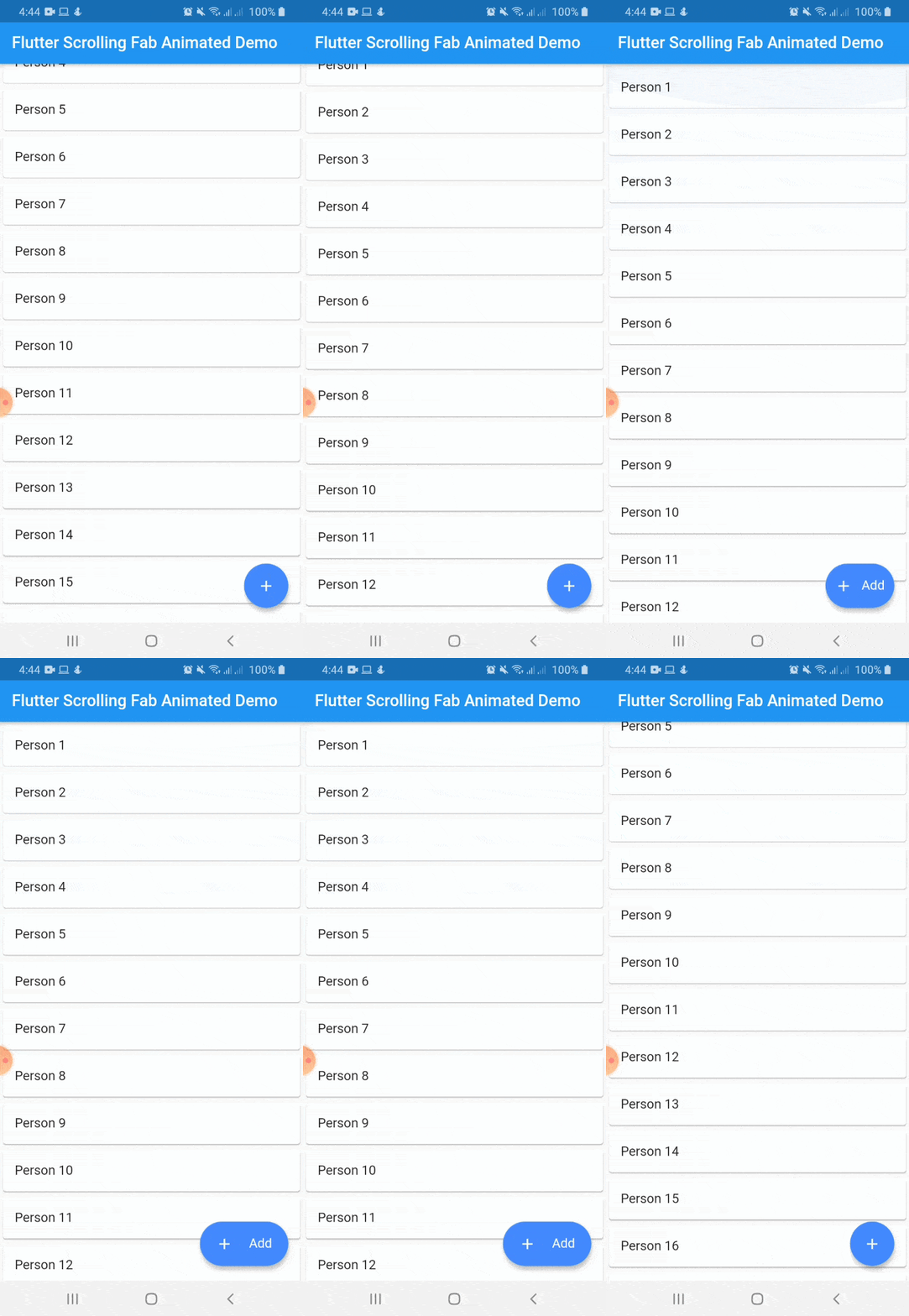
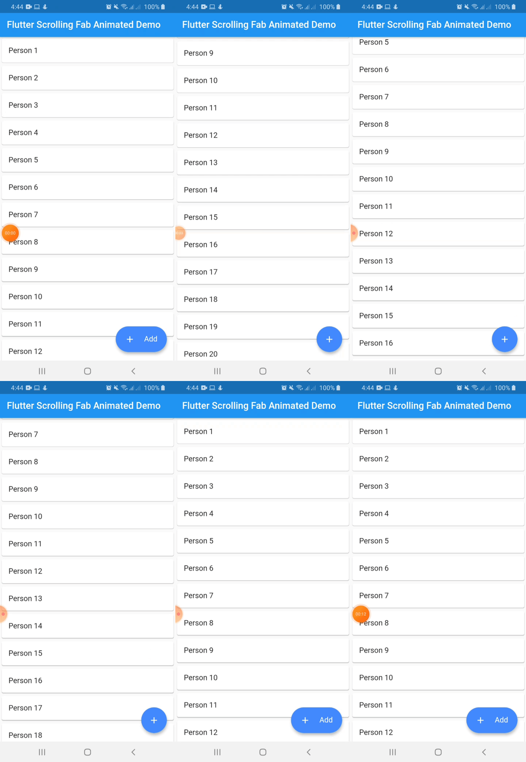
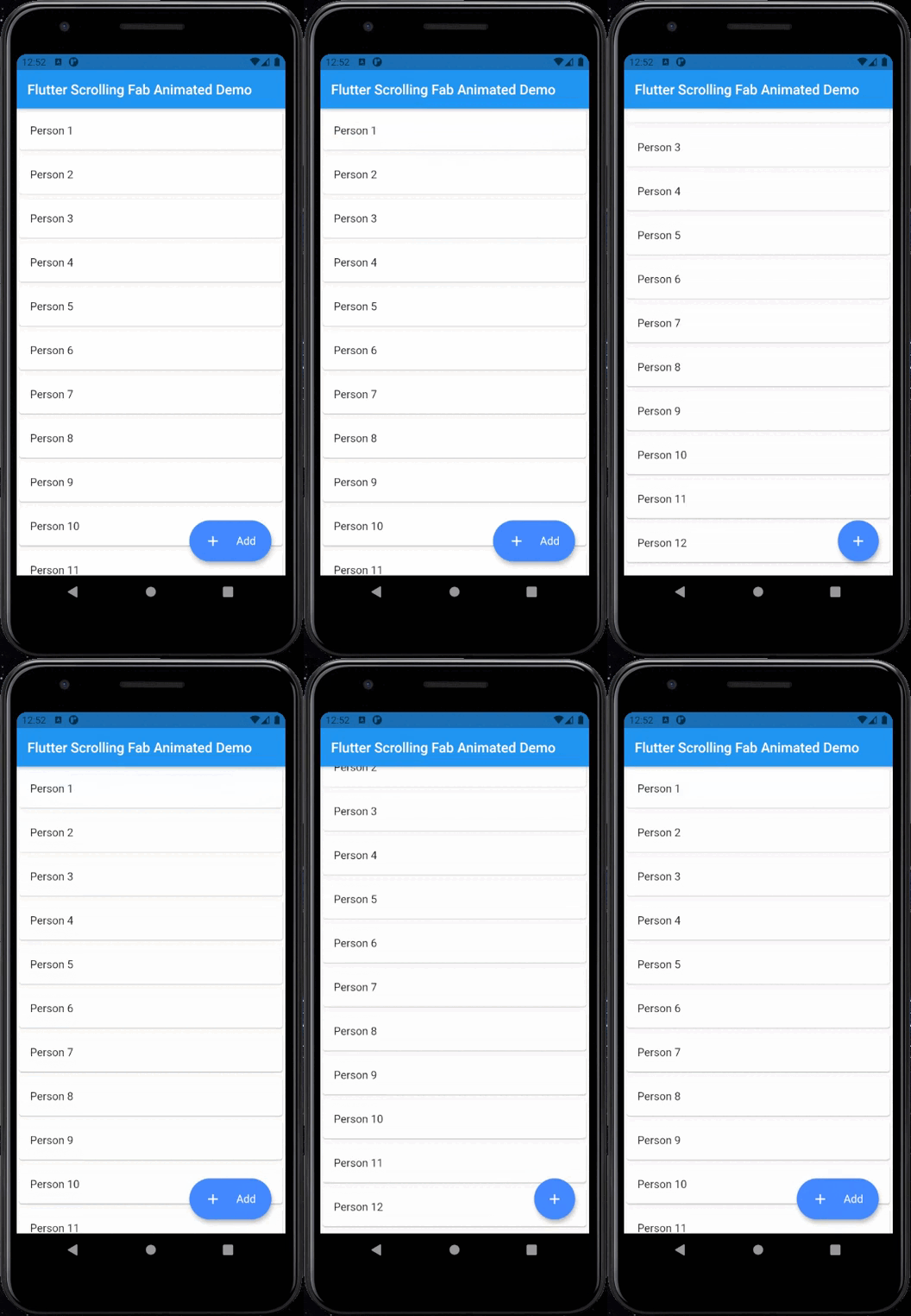
This package is a floating button whose change of size when scroll down and return to its original size when on top again. It's useful with ListView widget and other scrollable widgets.
With animated icon
New Features 💥
Adding on long press support
Adding ripple effect for the button
Removing square shadow around the button when pressing it
Added gradient background
Instalation
Include flutter_scrolling_fab_animated in your pubspec.yaml file:
dependencies:
  flutter:
    sdk: flutter
  flutter_scrolling_fab_animated: version
Usage
To use this package, just import it into your file and enjoy it.
import 'package:bottom_sheet_expandable_bar/bottom_sheet_bar_icon.dart' ;
import 'package:flutter_scrolling_fab_animated/flutter_scrolling_fab_animated.dart' ;
...
@override
Widget build (BuildContext context) {
return Scaffold (
appBar: AppBar (
title: Text ('Flutter Scrolling Fab Animated Demo' ),
),
body: Container (
child: new ListView .builder (
controller: _scrollController,
itemCount: items.length,
itemBuilder: (BuildContext ctxt, int index) {
return new Card (
child: ListTile (
title: Text (items[index]),
)
);
}
),
),
floatingActionButton: ScrollingFabAnimated (
icon: Icon (Icons .add, color: Colors .white,),
text: Text ('Add' , style: TextStyle (color: Colors .white, fontSize: 16.0 ),),
onPress: (){},
scrollController: _scrollController,
gradient: const LinearGradient (colors: [Color (0xff0CA2E6 ),Color (0xff2E3D97 ),],begin: Alignment .topCenter, end: Alignment .bottomCenter),
animateIcon: true ,
inverted: false ,
radius: 10.0 ,
)
);
}
...
Example with a GridView
import 'package:bottom_sheet_expandable_bar/bottom_sheet_bar_icon.dart' ;
import 'package:flutter_scrolling_fab_animated/flutter_scrolling_fab_animated.dart' ;
...
@override
Widget build (BuildContext context) {
return Scaffold (
appBar: AppBar (
title: Text ('Flutter Scrolling Fab Animated Demo' ),
),
body: Container (
child: new GridView .builder (
gridDelegate: SliverGridDelegateWithFixedCrossAxisCount (crossAxisCount: 2 ),
controller: _scrollController,
itemCount: items.length,
itemBuilder: (BuildContext ctxt, int index) {
return new Card (
child: ListTile (
title: Center (child: Text (items[index])),
)
);
}),
),
floatingActionButton: ScrollingFabAnimated (
icon: Icon (Icons .add, color: Colors .white,),
text: Text ('Add' , style: TextStyle (color: Colors .white, fontSize: 16.0 ),),
onPress: (){},
scrollController: _scrollController,
animateIcon: true ,
inverted: false ,
radius: 10.0 ,
)
);
}
...
Properties
Name
Description
Required
Default
icon
Widget to use as button icon
True
text
Widget to use as button text when button is expanded
True
onPress
Function to use when press the button
True
scrollController
ScrollController to use to determine when user is on top or not
True
elevation
Double value to set the button elevation
False
5.0
shadowColor
Color value to set the button shadow color
False
ThemeData.shadowColor
width
Double value to set the button width when is expanded
False
120.0
height
Double value to set the button height
False
60.0
duration
Value to set the duration for animation
False
250 milliseconds
curve
Value to set the curve for animation
False
Curves.easeInOut
limitIndicator
Double value to set the boundary value when scroll animation is triggered
False
10.0
color
Color to set the button background color
False
Colors.blueAccent
gradient
Color to set the button background gradient
False
null
animateIcon
Value to indicate if animate or not the icon
False
true
inverted
Value to inverte the behavior of the animation
False
false
radius
Double value to set the button radius
False
null