
 v1.0.0+1
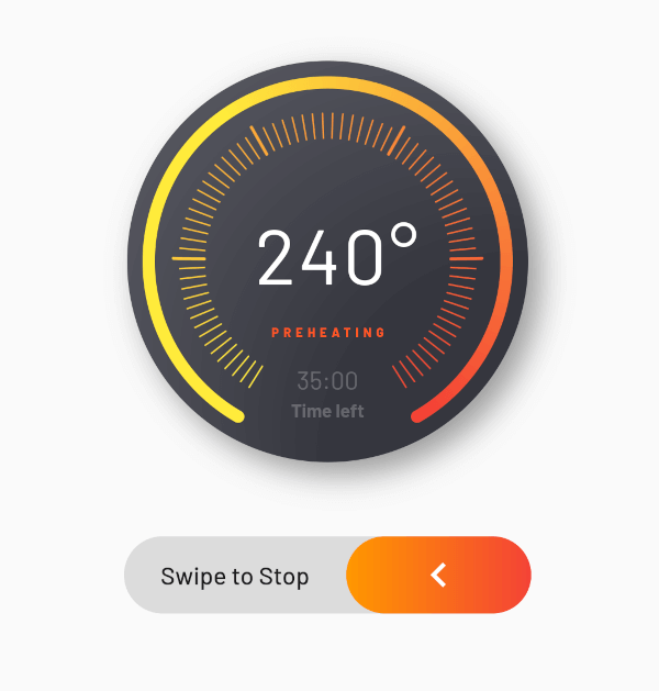
flutter_advanced_progress
多数のプロパティで完全にカスタマイズ可能な高度なプログレスウィジェットです。ぜひお試しください、楽しんでください!
38いいね 630日間ダウンロード150Pub ポイント
AndroidiOSWebmacOSWindowsLinux
https://pub.dev/packages/flutter_advanced_progress

{"sdk":"flutter"}^2.1.0{"sdk":"flutter"}以下は英語原文のスナップショットです。最新版は GitHub をご覧ください。
An advanced progress widget, that can be fully customized with bunch of properties, just try it and enjoy!
| State 1 | State 2 |
|---|---|
| Flutter Advanced Progress Light | Flutter Advanced Progress Dark |
| Parameter | Description | Type | Default |
|---|---|---|---|
primaryValue |
Value for primary progress. | double | |
secondaryValue |
Value for secondary progress. | double | |
secondaryWidth |
Secondary progress width. | double | 10.0 |
radius |
Total radius for whole widget. | double | |
startAngle |
Progress start angle. | double | 120.0 |
maxDegrees |
Progress degrees from [startAngle]. | double | 300.0 |
progressGap |
Gap between primary and secondary progress. | double | 0.0 |
division |
Primary progress division. | int | 10 |
levelAmount |
Amount of levels on primary progress. | int | |
levelLowWidth |
Width of levels on primary progress. | double | 1.0 |
levelLowHeight |
Height of low levels on primary progress. | double | 8.0 |
levelHighWidth |
Height of high levels managed by [division] on primary progress. | double | 2.0 |
levelHighHeight |
Width of levels on primary progress. | double | 16.0 |
levelHighBeginEnd |
True if need to begin and end with high level. | bool | false |
primaryColor |
Primary color that used as a color for progress of first in gradient. | Color | |
secondaryColor |
Secondary color that used last in gradient. | Color | |
tertiaryColor |
Tertiary color that used for inactive part of progress. | Color | |
child |
Child widget. | Widget |