flutter_advanced_progress
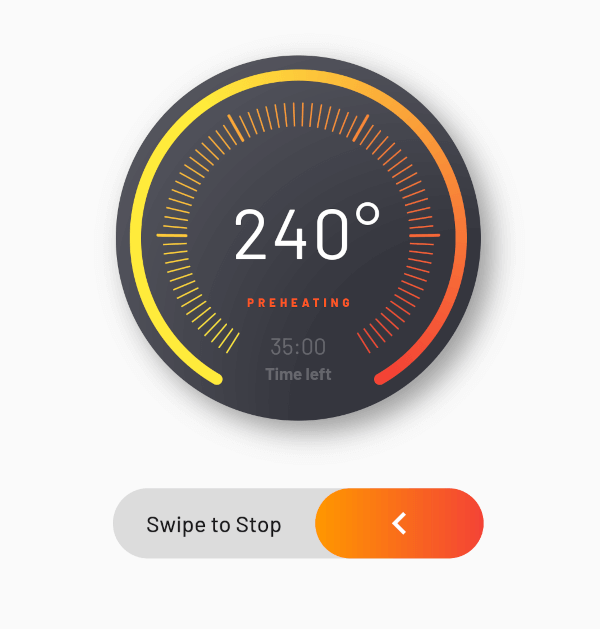
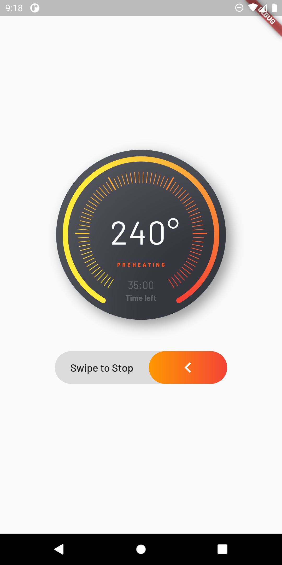
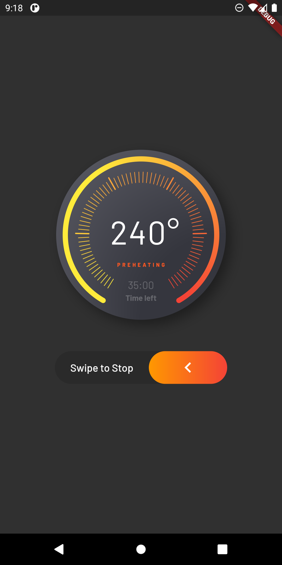
An advanced progress widget, that can be fully customized with bunch of properties, just try it and enjoy!
AdvancedProgress Parameters
| Parameter |
Description |
Type |
Default |
primaryValue |
Value for primary progress. |
double |
|
secondaryValue |
Value for secondary progress. |
double |
|
secondaryWidth |
Secondary progress width. |
double |
10.0 |
radius |
Total radius for whole widget. |
double |
|
startAngle |
Progress start angle. |
double |
120.0 |
maxDegrees |
Progress degrees from [startAngle]. |
double |
300.0 |
progressGap |
Gap between primary and secondary progress. |
double |
0.0 |
division |
Primary progress division. |
int |
10 |
levelAmount |
Amount of levels on primary progress. |
int |
|
levelLowWidth |
Width of levels on primary progress. |
double |
1.0 |
levelLowHeight |
Height of low levels on primary progress. |
double |
8.0 |
levelHighWidth |
Height of high levels managed by [division] on primary progress. |
double |
2.0 |
levelHighHeight |
Width of levels on primary progress. |
double |
16.0 |
levelHighBeginEnd |
True if need to begin and end with high level. |
bool |
false |
primaryColor |
Primary color that used as a color for progress of first in gradient. |
Color |
|
secondaryColor |
Secondary color that used last in gradient. |
Color |
|
tertiaryColor |
Tertiary color that used for inactive part of progress. |
Color |
|
child |
Child widget. |
Widget |
|