
 v0.0.8
square_progress_indicator
ネイティブなFlutterのCircularProgressIndicatorウィジェットに似た、カスタマイズ可能な正方形のプログレスインジケーターを作成できます。
30いいね 504030日間ダウンロード160Pub ポイント
AndroidiOSWebmacOSWindowsLinux
ネイティブのFlutter CircularProgressIndicatorウィジェットのように、完全にカスタマイズ可能な正方形または長方形のプログレスインジケーターを作成するためのライブラリです!

{"sdk":"flutter"}{"sdk":"flutter"}^5.0.0以下は英語原文のスナップショットです。最新版は GitHub をご覧ください。
Create fully customizable square or rectangle progress indicators like native flutter CircularProgressIndicator widget!
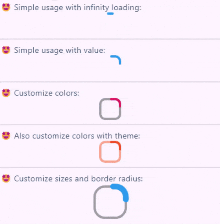
Full example of SquareProgressIndicator
You can check the example project web export on this link: https://amir14a.github.io/square_progress_indicator/ Thanks to Github!❤️
Simple usage:
const SquareProgressIndicator(),
Customize usage:
SquareProgressIndicator(
    value: _value,
    width: 100,
    height: 100,
    borderRadius: 0,
    startPosition: StartPosition.leftCenter,
    strokeCap: StrokeCap.square,
    clockwise: true,
    color: Colors.purple,
    emptyStrokeColor: Colors.purple.withOpacity(.5),
    strokeWidth: 16,
    emptyStrokeWidth: 16,
    strokeAlign: SquareStrokeAlign.center,
    child: Text("${(_value * 100).toStringAsFixed(0)}%"),
),
| Parameter | Type | Default | Info |
|---|---|---|---|
value |
double? | null |
The value of the progress, it should be between 0 and 1. don't pass it to use Indeterminate mode |
width |
double | 38 |
The width of rectangle that the progress line is drawn around it. |
height |
double | 38 |
The height of rectangle that the progress line is drawn around it. |
borderRadius |
double | 8 |
The border radius of the rectangle, it is applied to all four corners. |
color |
Color? | progressIndicatorTheme.color |
The color of the progress line. |
emptyStrokeColor |
Color? | progressIndicatorTheme.circularTrackColor |
The color of the line behind the progress line which show for reminding progress. |
strokeWidth |
double | 4 |
The width of the progress line. |
emptyStrokeWidth |
double | 4 |
The width of the line behind the progress line which show for reminding progress. |
clockwise |
boolean | true |
The direction of turn of progress line, if you pass false, the progress line will be reversed, default value is true. |
startPosition |
double | 0 (StartPosition.topCenter) |
Start position of progress line relative to the topCenter, you can pass a value from [StartPosition] class or custom double value you need. |
strokeAlign |
SquareStrokeAlign | SquareStrokeAlign.inside |
The stroke align of the progress line, pass a value from [SquareStrokeAlign] and read it's documents. see: https://api.flutter.dev/flutter/painting/BorderSide/strokeAlign.html |
strokeCap |
StrokeCap? | StrokeCap.round |
The stroke cap of the progress line and empty line, see: https://api.flutter.dev/flutter/dart-ui/StrokeCap.html |
child |
Widget? | null |
The child widget, it can be a text or everything you need. |
Feel free to create issue or pull requests in github repository!