パッケージ、リポジトリ、アプリカテゴリを検索

square_progress_indicator のカバー
パッケージ詳細v0.0.8

square_progress_indicator

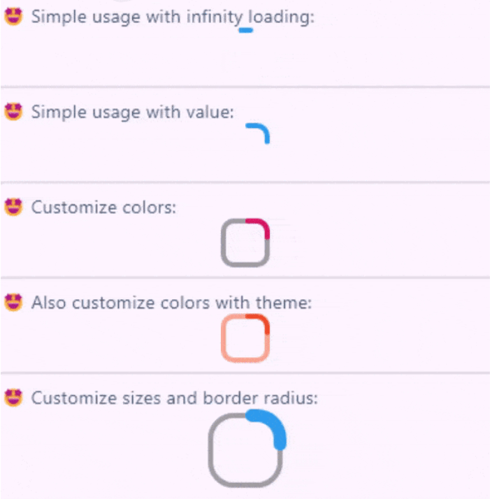
ネイティブなFlutterのCircularProgressIndicatorウィジェットに似た、カスタマイズ可能な正方形のプログレスインジケーターを作成できます。

AndroidiOSWebmacOSWindowsLinux
30日間ダウンロード
5280
いいね数
30
Pub ポイント
160

パッケージをインストール

flutter pub add square_progress_indicator

パッケージ概要

公開情報に基づく選定ガイドです。参考としてご利用ください。

Flutter用のカスタマイズ可能な四角形プログレスインジケーターウィジェットで、ネイティブのCircularProgressIndicatorからインスパイアされています。カスタムカラー、ストローク幅、アニメーションをサポートし、円形プログレスインジケーターの現代的でコンパクトな代替品を提供します。UIに四角形デザインがより適しているアプリのローディング状態に最適です。このパッケージは軽量で、Android、iOS、Web、macOS、Windows、Linuxを含むすべての主要プラットフォームと互換性があります。

用途

  • フォーム内の読み込みインジケーター
  • ダッシュボードで進行状況を表示する
  • モバイルアプリにおけるカスタムローディングアニメーション
  • 円形プログレスバーを四角形に置き換える
  • マテリアルデザインアプリにおけるUIの一貫性の向上

主な機能

  • 四角形デザイン
  • カスタマイズ可能な色と線の太さ
  • スムーズなアニメーション
  • クロスプラットフォーム互換性
  • Flutter との簡単な統合
  • 拡張可能なスタイルオプション

適している対象

  • 代替の進行状況インジケーターを探している開発者
  • 四角形テーマのインターフェースに焦点を当てたUIデザイナー
  • 一貫した読み込みビジュアルを必要とするアプリ
  • 複数のプラットフォームをターゲットとするFlutterプロジェクト
  • モダンな美学を備えた Material Design のプロジェクト

注意事項

  • 正方形の幾何に制限
  • 複雑なアニメーションには追加のスタイリングが必要になる場合があります
  • 円形プログレスのニーズには適していません
  • Flutter のレンダリングパフォーマンスに依存します
  • 正方形の形状がデザイン言語と一致する文脈で最も効果的に使用される

元の README

関連するソースリポジトリの README 原文のスナップショットです。最新の内容はリポジトリをご覧ください。

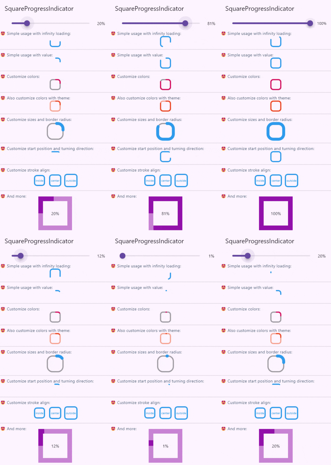
Create fully customizable square or rectangle progress indicators like native flutter CircularProgressIndicator widget!

Features

Full example of SquareProgressIndicator

Live demo

You can check the example project web export on this link: https://amir14a.github.io/square_progress_indicator/ Thanks to Github!❤️

Usage

Simple usage:

const SquareProgressIndicator(),

Customize usage:

SquareProgressIndicator(
    value: _value,
    width: 100,
    height: 100,
    borderRadius: 0,
    startPosition: StartPosition.leftCenter,
    strokeCap: StrokeCap.square,
    clockwise: true,
    color: Colors.purple,
    emptyStrokeColor: Colors.purple.withOpacity(.5),
    strokeWidth: 16,
    emptyStrokeWidth: 16,
    strokeAlign: SquareStrokeAlign.center,
    child: Text("${(_value * 100).toStringAsFixed(0)}%"),
),

Additional information

Parameter Type Default Info
value double? null The value of the progress, it should be between 0 and 1. don't pass it to use Indeterminate mode
width double 38 The width of rectangle that the progress line is drawn around it.
height double 38 The height of rectangle that the progress line is drawn around it.
borderRadius double 8 The border radius of the rectangle, it is applied to all four corners.
color Color? progressIndicatorTheme.color The color of the progress line.
emptyStrokeColor Color? progressIndicatorTheme.circularTrackColor The color of the line behind the progress line which show for reminding progress.
strokeWidth double 4 The width of the progress line.
emptyStrokeWidth double 4 The width of the line behind the progress line which show for reminding progress.
clockwise boolean true The direction of turn of progress line, if you pass false, the progress line will be reversed, default value is true.
startPosition double 0 (StartPosition.topCenter) Start position of progress line relative to the topCenter, you can pass a value from [StartPosition] class or custom double value you need.
strokeAlign SquareStrokeAlign SquareStrokeAlign.inside The stroke align of the progress line, pass a value from [SquareStrokeAlign] and read it's documents. see: https://api.flutter.dev/flutter/painting/BorderSide/strokeAlign.html
strokeCap StrokeCap? StrokeCap.round The stroke cap of the progress line and empty line, see: https://api.flutter.dev/flutter/dart-ui/StrokeCap.html
child Widget? null The child widget, it can be a text or everything you need.

Feel free to create issue or pull requests in github repository!

カテゴリー

ソースリポジトリ

このパッケージを使用しているプロジェクト