
 v1.0.2
flutter_multiselect
iOS および Android と互換性があり、ニュートラルデザインを使用するマルチセレクトUIウィジェット用のFlutterパッケージ。
51いいね 41130日間ダウンロード150Pub ポイント
AndroidiOSWebmacOSWindowsLinux
マルチセレクトUIウィジェット用のFlutterパッケージ

{"sdk":"flutter"}{"sdk":"flutter"}^5.0.7以下は英語原文のスナップショットです。最新版は GitHub をご覧ください。
Flutter package for multi-select UI widget
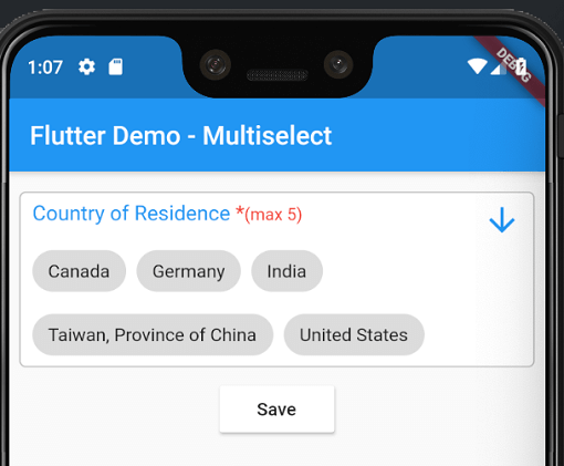
Android and iOS screenshot- screenshot
pubspec.yamldependencies:
flutter_multiselect:
import 'package:flutter_multiselect/flutter_multiselect.dart';
By default, there is no UI control for multi-select in iOS and Android, and my widget can be used to bridge this gap.
child: MultiSelect(
  autovalidate: false,
  titleText: "Countries",
  validator: (value) {
    if (value == null) {
      return 'Please select one or more option(s)';
    }
  },
  errorText: 'Please select one or more option(s)',
  dataSource: [
    {
      "display": "Australia",
      "value": 1,
    },
    {
      "display": "Canada",
      "value": 2,
    },
    {
      "display": "India",
      "value": 3,
    },
    {
      "display": "United States",
      "value": 4,
    }
  ],
  textField: 'display',
  valueField: 'value',
  filterable: true,
  required: true,
  value: null,
  onSaved: (value) {
    print('The saved values are $value');
  }
),
https://raw.githubusercontent.com/cerberodev/flutter_multiselect/HEAD/example/screenshoots/0.jpg https://raw.githubusercontent.com/cerberodev/flutter_multiselect/HEAD/example/screenshoots/1.jpg https://raw.githubusercontent.com/cerberodev/flutter_multiselect/HEAD/example/screenshoots/2.jpg
Check the colors and text to see the changes that it makes to the modal interface
child: MultiSelect(
    //--------customization selection modal-----------
    buttonBarColor: Colors.red,
    cancelButtonText: "Exit",
    titleText: "Custom Title",
    checkBoxColor: Colors.black,
    selectedOptionsInfoText: "Selected custom text (tap to remove)",
    selectedOptionsBoxColor: Colors.green,
    autovalidate: true,
    maxLength: 5, // optional
    //--------end customization selection modal------------
    validator: (dynamic value) {
      if (value == null) {
        return 'Please select one or more option(s)';
      }
      return null;
    },
    errorText: 'Please select one or more option(s)',
    dataSource: [
      {"name": "Afghanistan", "code": "AF"},
      {"name": "Åland Islands", "code": "AX"},
      {"name": "Albania", "code": "AL"},
    ],
    textField: 'name',
    valueField: 'code',
    filterable: true,
    required: true,
    onSaved: (value) {
      print('The saved values are $value');
    }),
    change: (value) {
      print('The selected values are $value');
    })
and of course you can check the full list of the parameters to personalize your modal!
| Type | Parameter |
|---|---|
| Color | buttonBarColor |
| String | cancelButtonText |
| IconData | cancelButtonIcon |
| Color | cancelButtonColor |
| Color | cancelButtonTextColor |
| String | saveButtonText |
| IconData | saveButtonIcon |
| Color | saveButtonColor |
| Color | saveButtonTextColor |
| String | clearButtonText |
| IconData | clearButtonIcon |
| Color | clearButtonColor |
| Color | clearButtonTextColor |
| String | deleteButtonTooltipText |
| IconData | deleteIcon |
| Color | deleteIconColor |
| Color | selectedOptionsBoxColor |
| String | selectedOptionsInfoText |
| Color | selectedOptionsInfoTextColor |
| IconData | checkedIcon |
| IconData | uncheckedIcon |
| Color | checkBoxColor |
| Color | searchBoxColor |
| String | searchBoxHintText |
| Color | searchBoxFillColor |
| IconData | searchBoxIcon |
| String | searchBoxToolTipText |
| Size | responsiveDialogSize |