flutter_multiselect
Flutter package for multi-select UI widget

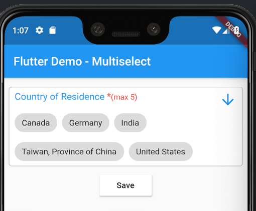
Android and iOS screenshot-

Getting Started
- Add the package into
pubspec.yaml
dependencies:
  flutter_multiselect:
import 'package:flutter_multiselect/flutter_multiselect.dart';
Why? :wrench:
By default, there is no UI control for multi-select in iOS and Android, and my widget can be used to bridge this gap.
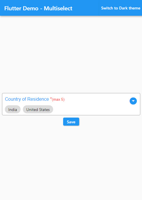
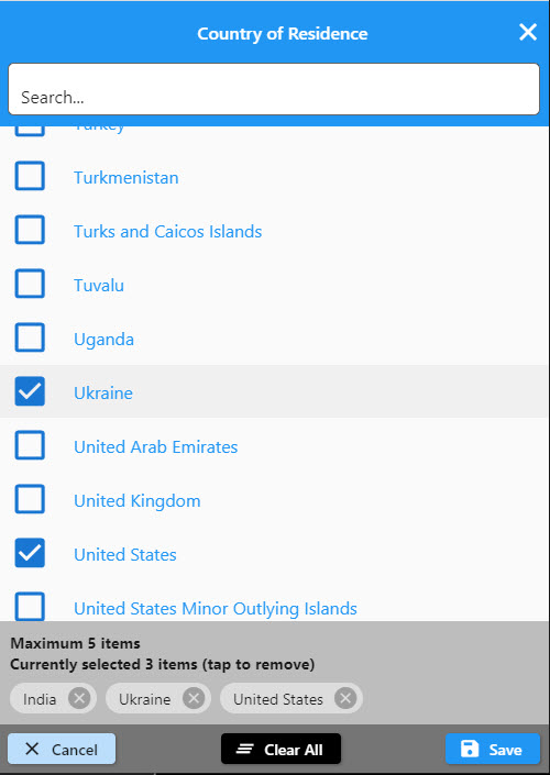
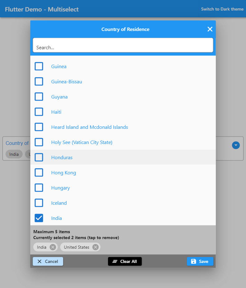
Example without customization :one:
child: MultiSelect(
  autovalidate: false,
  titleText: "Countries",
  validator: (value) {
    if (value == null) {
      return 'Please select one or more option(s)';
    }
  },
  errorText: 'Please select one or more option(s)',
  dataSource: [
    {
      "display": "Australia",
      "value": 1,
    },
    {
      "display": "Canada",
      "value": 2,
    },
    {
      "display": "India",
      "value": 3,
    },
    {
      "display": "United States",
      "value": 4,
    }
  ],
  textField: 'display',
  valueField: 'value',
  filterable: true,
  required: true,
  value: null,
  onSaved: (value) {
    print('The saved values are $value');
  }
),
Example with customization :two:
Check the colors and text to see the changes that it makes to the modal interface
child: MultiSelect(
buttonBarColor: Colors.red,
cancelButtonText: "Exit",
titleText: "Custom Title",
checkBoxColor: Colors.black,
selectedOptionsInfoText: "Selected custom text (tap to remove)",
selectedOptionsBoxColor: Colors.green,
autovalidate: true,
maxLength: 5,
validator: (dynamic value) {
if (value == null) {
return 'Please select one or more option(s)';
}
return null;
},
errorText: 'Please select one or more option(s)',
dataSource: [
{"name": "Afghanistan", "code": "AF"},
{"name": "Åland Islands", "code": "AX"},
{"name": "Albania", "code": "AL"},
],
textField: 'name',
valueField: 'code',
filterable: true,
required: true,
onSaved: (value) {
print('The saved values are $value');
}),
change: (value) {
print('The selected values are $value');
})
and of course you can check the full list of the parameters to personalize your modal!
Here, the complete list of parameters to modify the selection modal :clipboard:
| Type |
Parameter |
| Color |
buttonBarColor |
| String |
cancelButtonText |
| IconData |
cancelButtonIcon |
| Color |
cancelButtonColor |
| Color |
cancelButtonTextColor |
| String |
saveButtonText |
| IconData |
saveButtonIcon |
| Color |
saveButtonColor |
| Color |
saveButtonTextColor |
| String |
clearButtonText |
| IconData |
clearButtonIcon |
| Color |
clearButtonColor |
| Color |
clearButtonTextColor |
| String |
deleteButtonTooltipText |
| IconData |
deleteIcon |
| Color |
deleteIconColor |
| Color |
selectedOptionsBoxColor |
| String |
selectedOptionsInfoText |
| Color |
selectedOptionsInfoTextColor |
| IconData |
checkedIcon |
| IconData |
uncheckedIcon |
| Color |
checkBoxColor |
| Color |
searchBoxColor |
| String |
searchBoxHintText |
| Color |
searchBoxFillColor |
| IconData |
searchBoxIcon |
| String |
searchBoxToolTipText |
| Size |
responsiveDialogSize |