
 v0.2.0
cupertino_progress_bar
非対話型のプログレスバーには、既知の期間を持つタスクの進行状況を示すために左から右に充填されるトラックが含まれます。
18いいね 517030日間ダウンロード150Pub ポイント
AndroidiOSWebmacOSWindowsLinux
Flutter用のCupertinoプログレスバー

{"sdk":"flutter"}{"sdk":"flutter"}以下は英語原文のスナップショットです。最新版は GitHub をご覧ください。
pub license: BSD build codecov
A progress bar includes a track that fills from left to right to show the progression of a task with a known duration. Progress bars are non-interactive, although they are often accompanied by a button for canceling the corresponding operation.
| Light | Dark |
|---|---|
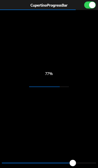
| Light CupertinoProgressBar | Dark CupertinoProgressBar |
CupertinoProgressBar(
  value: 0.77,
)
Always report progress accurately. Don’t display inaccurate progress information just to make your app appear busy. Only use progress bars for tasks that are quantifiable. Otherwise, use an activity indicator.
Use progress bars for tasks with a well-defined duration. Progress bars are great for showing the status of a task, especially when it helps convey how much longer the task needs to complete.
Hide the unfilled portion of track in navigation bars and toolbars. By default, a progress bar’s track includes both filled and unfilled portions. When used in a navigation bar or toolbar, such as to denote a page loading, a progress bar should be configured to hide the unfilled portion of the track.
Consider customizing a progress bar’s appearance to match your app. A progress bar’s appearance can be adjusted to match your app’s design. You can specify, for example, a custom color for both the track and fill.
See also:
To use this package, add cupertino_progress_bar as a dependency in your pubspec.yaml file.