
 v2.1.0
date_time_picker
日付または時計のダイアログを表示するための日時フォームフィールドを表示するFlutterウィジェットです。
375いいね 588030日間ダウンロード130Pub ポイント
AndroidiOSWebmacOSWindowsLinux
日付または時計のダイアログを表示するテキストフォームフィールドを表示するためのFlutterウィジェットです。このウィジェットはTextFieldを拡張しており、TextFormFieldと同様の動作をします。

{"sdk":"flutter"}^0.17.0{"sdk":"flutter"}以下は英語原文のスナップショットです。最新版は GitHub をご覧ください。
A Flutter widget to show a text form field to display a date or clock dialog.
This widget extend TextField and has a similar behavior as TextFormField
In the pubspec.yaml of your flutter project, add the following dependency:
dependencies:
  ...
  date_time_picker: "^2.1.0"
In your library add the following import:
import 'package:date_time_picker/date_time_picker.dart';
For help getting started with Flutter, view the online documentation.
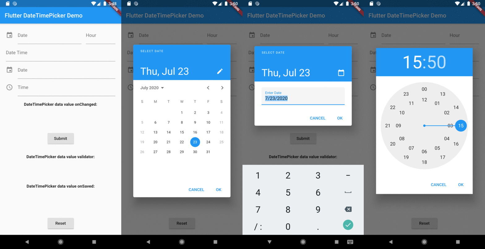
There are four presentations for DateTimePicker and can be defined in the type parameter:
DateTimePickerType.date will present a text field with the action tap showing a datePicker dialog box;DateTimePickerType.time will present a text field with the action tap showing a timePicker dialog box;DateTimePickerType.dateTime will present a text field with the action tap showing a datePicker dialog box then a timePicker dialog box;DateTimePickerType.dateTimeSeparated will display two text fields side by side, the first for date and the second for time. Each displaying their respective dialog box, datePicker and timePicker in the tap action;DateTimePicker(
type: date, // options: [date | time | dateTime | dateTimeSeparated], default is date
...
)
initialValue or controller.text can be null, empty or a DateTime string otherwise it will throw an error.
DateTimePicker(
  initialValue: '',
  firstDate: DateTime(2000),
  lastDate: DateTime(2100),
  dateLabelText: 'Date',
  onChanged: (val) => print(val),
  validator: (val) {
    print(val);
    return null;
  },
  onSaved: (val) => print(val),
);
More complete example:
DateTimePicker(
  type: DateTimePickerType.dateTimeSeparate,
  dateMask: 'd MMM, yyyy',
  initialValue: DateTime.now().toString(),
  firstDate: DateTime(2000),
  lastDate: DateTime(2100),
  icon: Icon(Icons.event),
  dateLabelText: 'Date',
  timeLabelText: "Hour",
  selectableDayPredicate: (date) {
    // Disable weekend days to select from the calendar
    if (date.weekday == 6 || date.weekday == 7) {
      return false;
    }

    return true;
  },
  onChanged: (val) => print(val),
  validator: (val) {
    print(val);
    return null;
  },
  onSaved: (val) => print(val),
);
The result of val in onChanged, validator and onSaved will be a DateTime String or just a Time String:
Overview