date_time_picker


A Flutter widget to show a text form field to display a date or clock dialog.
This widget extend TextField and has a similar behavior as TextFormField
Usage
In the pubspec.yaml of your flutter project, add the following dependency:
dependencies:
  ...
  date_time_picker: "^2.1.0"
In your library add the following import:
import 'package:date_time_picker/date_time_picker.dart';
For help getting started with Flutter, view the online documentation.
Example
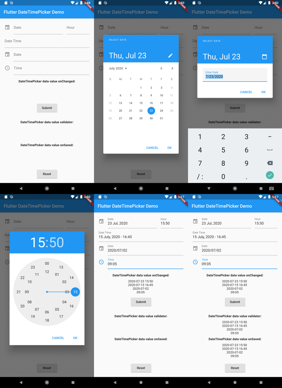
There are four presentations for DateTimePicker and can be defined in the type parameter:
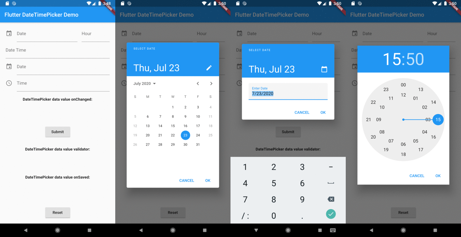
DateTimePickerType.date will present a text field with the action tap showing a datePicker dialog box;DateTimePickerType.time will present a text field with the action tap showing a timePicker dialog box;DateTimePickerType.dateTime will present a text field with the action tap showing a datePicker dialog box then a timePicker dialog box;DateTimePickerType.dateTimeSeparated will display two text fields side by side, the first for date and the second for time. Each displaying their respective dialog box, datePicker and timePicker in the tap action;
DateTimePicker(
type: date,
...
)
initialValue or controller.text can be null, empty or a DateTime string otherwise it will throw an error.
DateTimePicker(
  initialValue: '',
  firstDate: DateTime(2000),
  lastDate: DateTime(2100),
  dateLabelText: 'Date',
  onChanged: (val) => print(val),
  validator: (val) {
    print(val);
    return null;
  },
  onSaved: (val) => print(val),
);
More complete example:
DateTimePicker(
type: DateTimePickerType.dateTimeSeparate,
dateMask: 'd MMM, yyyy',
initialValue: DateTime.now().toString(),
firstDate: DateTime(2000),
lastDate: DateTime(2100),
icon: Icon(Icons.event),
dateLabelText: 'Date',
timeLabelText: "Hour",
selectableDayPredicate: (date) {
if (date.weekday == 6 || date.weekday == 7) {
return false;
}
return true;
},
onChanged: (val) => print(val),
validator: (val) {
print(val);
return null;
},
onSaved: (val) => print(val),
);
The result of val in onChanged, validator and onSaved will be a DateTime String or just a Time String:
- ex.: [2020-07-20 14:30] or [15:30] DateTimePickerType.time;
- month, day, hour and minute will be 2 digits and time always be in 24 hours mode;
- but the presentation in text field can be formated by the dateMask parameter.
Preview