
 v0.4.0
popover
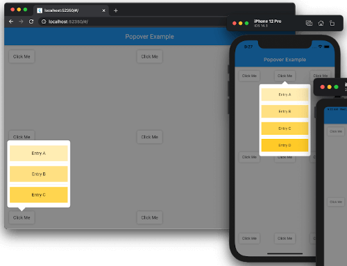
ポップオーバーは、コントロールまたは領域をタップすると、画面の他のコンテンツの上に一時的に表示されるビューです。
687いいね 3.9万30日間ダウンロード160Pub ポイント
AndroidiOSWebmacOSWindowsLinux
Flutter用ポップオーバー。ポップオーバーは、コントロールまたは領域をタップすると、画面の他のコンテンツの上に一時的に表示されるビューです。

{"sdk":"flutter"}{"sdk":"flutter"}3.0.10以下は英語原文のスナップショットです。最新版は GitHub をご覧ください。
Supported platforms
Popover is released under the MIT license.
Effective Dart
PRs welcome!
Current Build Status.
https://codecov.io/gh/minikin/popover/branch/main/graph/badge.svg?token=CHT3D24SOQ
A popover is a transient view that appears above other content onscreen when you tap a control or in an area. Typically, a popover includes an arrow pointing to the location from which it emerged. Popovers can be nonmodal or modal. A nonmodal popover is dismissed by tapping another part of the screen or a button on the popover. A modal popover is dismissed by tapping a Cancel or other button on the popover.
Source: Human Interface Guidelines.
dependencies:
  popover: ^0.4.0
See example/lib/main.dart.
import 'package:flutter/material.dart';
import 'package:popover/popover.dart';

class PopoverExample extends StatelessWidget {
  @override
  Widget build(BuildContext context) {
    return MaterialApp(
      home: Scaffold(
        appBar: AppBar(title: const Text('Popover Example')),
        body: const SafeArea(
          child: Padding(
            padding: EdgeInsets.all(16),
            child: Button(),
          ),
        ),
      ),
    );
  }
}

class Button extends StatelessWidget {
  const Button({Key? key}) : super(key: key);

  @override
  Widget build(BuildContext context) {
    return Container(
      width: 80,
      height: 40,
      decoration: const BoxDecoration(
        color: Colors.white,
        borderRadius: BorderRadius.all(Radius.circular(5)),
        boxShadow: [BoxShadow(color: Colors.black26, blurRadius: 5)],
      ),
      child: GestureDetector(
        child: const Center(child: Text('Click Me')),
        onTap: () {
          showPopover(
            context: context,
            bodyBuilder: (context) => const ListItems(),
            onPop: () => print('Popover was popped!'),
            direction: PopoverDirection.bottom,
            width: 200,
            height: 400,
            arrowHeight: 15,
            arrowWidth: 30,
          );
        },
      ),
    );
  }
}

class ListItems extends StatelessWidget {
  const ListItems({Key? key}) : super(key: key);

  @override
  Widget build(BuildContext context) {
    return Padding(
        padding: const EdgeInsets.symmetric(vertical: 8),
        child: ListView(
          padding: const EdgeInsets.all(8),
          children: [
            InkWell(
              onTap: () {
                Navigator.of(context)
                  ..pop()
                  ..push(
                    MaterialPageRoute<SecondRoute>(
                      builder: (context) => SecondRoute(),
                    ),
                  );
              },
              child: Container(
                height: 50,
                color: Colors.amber[100],
                child: const Center(child: Text('Entry A')),
              ),
            ),
            const Divider(),
            Container(
              height: 50,
              color: Colors.amber[200],
              child: const Center(child: Text('Entry B')),
            ),
            const Divider(),
            Container(
              height: 50,
              color: Colors.amber[300],
              child: const Center(child: Text('Entry C')),
            ),
          ],
        ),
    );
  }
}

class SecondRoute extends StatelessWidget {
  @override
  Widget build(BuildContext context) {
    return Scaffold(
      appBar: AppBar(
        title: const Text('Second Route'),
        automaticallyImplyLeading: false,
      ),
      body: Center(
        child: ElevatedButton(
          onPressed: () => Navigator.pop(context),
          child: const Text('Go back!'),
        ),
      ),
    );
  }
}
To see examples of the following package on a device or simulator:
cd example && flutter run
This project accepts pull requests only.
If you've encountered a bug or have an improvement in mind, please open a PR with a minimal fix or a reproduction in the example app. See CONTRIBUTING.md for the full contribution process.
The source code of the Popover project is available under the MIT license. See the LICENSE file for more info.