パッケージ、リポジトリ、アプリカテゴリを検索

popover のカバー
パッケージ詳細v0.5.1

popover

ポップオーバーは、コントロールまたは領域をタップすると、画面の他のコンテンツの上に一時的に表示されるビューです。

AndroidiOSWebmacOSWindowsLinux
30日間ダウンロード
3.9万
いいね数
688
Pub ポイント
160

パッケージをインストール

flutter pub add popover

パッケージ概要

公開情報に基づく選定ガイドです。参考としてご利用ください。

ポップオーバー パッケージは、ユーザーの操作によってトリガーされたときに他のコンテンツの上に一時的な浮遊ビューを表示するための柔軟でプラットフォーム対応の方法を提供します。ボタンやアイコンなどのコントロールと併用するように設計されており、Android、iOS、Web、macOS、Windows、Linux での滑らかなアニメーションおよび適応型配置をサポートしています。このパッケージは、各プラットフォームのネイティブデザインガイドラインを尊重しながら、一貫した動作を保証します。メインUIフローを妨げることなく、コンテキストメニュー、ツールチップ、または迅速なアクションパネルに最適です。

用途

  • コンテキストメニューの表示
  • クイックアクションパネルを表示しています
  • ツールチップの作成
  • フォーム検証のヒントを提示しています
  • インライン編集オプションの有効化

主な機能

  • クロスプラットフォーム互換性
  • 適応型ポジショニング
  • スムーズなアニメーション
  • カスタマイズ可能なコンテンツ
  • タッチおよびポインターイベントをサポート
  • 画面の境界に応じて調整

適している対象

  • インタラクティブUIを構築する開発者
  • 複数のプラットフォームをターゲットにする Teams
  • コンテキストオーバーレイを必要とするアプリ
  • 再利用可能なポップオーバーを必要とするデザインシステム
  • Material または Cupertino ウィジェットを使用するプロジェクト

注意事項

  • 適切な非表示ジェスチャーの処理が必要です
  • 複雑なレイアウトにはカスタムスタイルが必要になる場合があります
  • 多数の同時ポップオーバーによるパフォーマンスへの影響
  • 限定された組み込みテーマオプション
  • 永続的なコンテンツには適していません

元の README

関連するソースリポジトリの README 原文のスナップショットです。最新の内容はリポジトリをご覧ください。

Popover

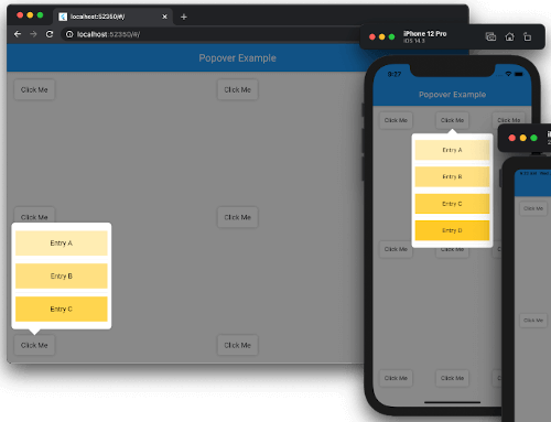
Popover screenshots

Popover for Flutter

Supported platforms Popover is released under the MIT license. Effective Dart PRs welcome!
Current Build Status.

Content

Features

A popover is a transient view that appears above other content onscreen when you tap a control or in an area. Typically, a popover includes an arrow pointing to the location from which it emerged. Popovers can be nonmodal or modal. A nonmodal popover is dismissed by tapping another part of the screen or a button on the popover. A modal popover is dismissed by tapping a Cancel or other button on the popover.

Source: Human Interface Guidelines.

Requirements

  • Dart: 3.9.0+
  • Flutter: 3.35.0+

Install

dependencies:
  popover: ^0.4.0

Example

See example/lib/main.dart.

import 'package:flutter/material.dart';
import 'package:popover/popover.dart';

class PopoverExample extends StatelessWidget {
  @override
  Widget build(BuildContext context) {
    return MaterialApp(
      home: Scaffold(
        appBar: AppBar(title: const Text('Popover Example')),
        body: const SafeArea(
          child: Padding(
            padding: EdgeInsets.all(16),
            child: Button(),
          ),
        ),
      ),
    );
  }
}

class Button extends StatelessWidget {
  const Button({Key? key}) : super(key: key);

  @override
  Widget build(BuildContext context) {
    return Container(
      width: 80,
      height: 40,
      decoration: const BoxDecoration(
        color: Colors.white,
        borderRadius: BorderRadius.all(Radius.circular(5)),
        boxShadow: [BoxShadow(color: Colors.black26, blurRadius: 5)],
      ),
      child: GestureDetector(
        child: const Center(child: Text('Click Me')),
        onTap: () {
          showPopover(
            context: context,
            bodyBuilder: (context) => const ListItems(),
            onPop: () => print('Popover was popped!'),
            direction: PopoverDirection.bottom,
            width: 200,
            height: 400,
            arrowHeight: 15,
            arrowWidth: 30,
          );
        },
      ),
    );
  }
}

class ListItems extends StatelessWidget {
  const ListItems({Key? key}) : super(key: key);

  @override
  Widget build(BuildContext context) {
    return Padding(
        padding: const EdgeInsets.symmetric(vertical: 8),
        child: ListView(
          padding: const EdgeInsets.all(8),
          children: [
            InkWell(
              onTap: () {
                Navigator.of(context)
                  ..pop()
                  ..push(
                    MaterialPageRoute<SecondRoute>(
                      builder: (context) => SecondRoute(),
                    ),
                  );
              },
              child: Container(
                height: 50,
                color: Colors.amber[100],
                child: const Center(child: Text('Entry A')),
              ),
            ),
            const Divider(),
            Container(
              height: 50,
              color: Colors.amber[200],
              child: const Center(child: Text('Entry B')),
            ),
            const Divider(),
            Container(
              height: 50,
              color: Colors.amber[300],
              child: const Center(child: Text('Entry C')),
            ),
          ],
        ),
    );
  }
}

class SecondRoute extends StatelessWidget {
  @override
  Widget build(BuildContext context) {
    return Scaffold(
      appBar: AppBar(
        title: const Text('Second Route'),
        automaticallyImplyLeading: false,
      ),
      body: Center(
        child: ElevatedButton(
          onPressed: () => Navigator.pop(context),
          child: const Text('Go back!'),
        ),
      ),
    );
  }
}

To see examples of the following package on a device or simulator:

cd example && flutter run

Support

This project accepts pull requests only.

If you've encountered a bug or have an improvement in mind, please open a PR with a minimal fix or a reproduction in the example app. See CONTRIBUTING.md for the full contribution process.

License

The source code of the Popover project is available under the MIT license. See the LICENSE file for more info.

カテゴリー

ソースリポジトリ

このパッケージを使用しているプロジェクト