
 v1.2.0
dropdown_textfield
ドロップダウンテキストフィールドは、マテリアルデザインのテキストフィールドです。ドロップダウンボタンは、値のセットから1つの値または複数の値を選択するために使用できるウィジェットです。
181いいね 450030日間ダウンロード150Pub ポイント
AndroidiOSWebmacOSWindowsLinux
カスタムドロップダウン

{"sdk":"flutter"}^1.18.0^2.0.5{"sdk":"flutter"}^4.0.0以下は英語原文のスナップショットです。最新版は GitHub をご覧ください。
A DropdownTextfield is a Material Design TextField. The DropDownButton is a widget that can be used to select one unique value or multiple values from a set of options.
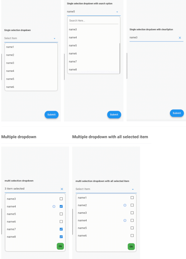
StatelessWidget| Single Dropdown | Single Dropdown with Search Option | Single Dropdown with Clear Option |
|---|---|---|
| Single Dropdown | Single Dropdown with Search Option | Single Dropdown with Clear Option |
| Multiple Dropdown | Multiple Dropdown with All Selected Items |
|---|---|
| Multiple Dropdown | Multiple Dropdown with All Selected Items |
You need to use SingleValueDropDownController for single dropdown and MultiValueDropDownController for multiple dropdown.
dropDownList, it will not display any value.<DropDownValueModel>.DropDownValueModel object for single selection dropdown, and a list of DropDownValueModel objects for multi-selection dropdown.false to disable the text field. Default value is true.true to enable the search option in the dropdown. Currently available only for single selection dropdown.true to display the complete list of selected items in the text field. Otherwise, it will display as "number_of_items selected".enableSearch=true.true to autofocus the search text field. Applicable only if enableSearch=true. Default value is false.false to hide the cursor from the search text field. Applicable only if enableSearch=true.false to hide the clear suffix icon button from the text field.Seeking contributions to improve the DropdownTextfield! If you have ideas for new features, optimizations, or bug fixes, please feel free to open a pull request or issue on our GitHub repository. Your contributions are greatly appreciated and will help make this package even better.