パッケージ、リポジトリ、アプリカテゴリを検索

dropdown_textfield のカバー
パッケージ詳細v1.2.0

dropdown_textfield

ドロップダウンテキストフィールドは、マテリアルデザインのテキストフィールドです。ドロップダウンボタンは、値のセットから1つの値または複数の値を選択するために使用できるウィジェットです。

AndroidiOSWebmacOSWindowsLinux
30日間ダウンロード
5950
いいね数
181
Pub ポイント
140

パッケージをインストール

flutter pub add dropdown_textfield

パッケージ概要

公開情報に基づく選定ガイドです。参考としてご利用ください。

DropdownTextfield は、TextField と DropdownButton を組み合わせた Flutter パッケージであり、マテリアルデザインインターフェース上でリストから1つまたは複数の値を選択できるようにします。テキスト入力フィールド内で直感的なドロップダウン選択体験を提供することで、フォーム入力を強化します。単一および複数値の選択をサポートしており、動的データ入力のシナリオに適しています。Android、iOS、Web、macOS、Windows、Linux などすべての主要プラットフォームで互換性があります。

用途

  • 選択可能なオプションを備えたフォーム入力
  • フォーム内の複数選択ドロップダウン
  • マテリアルデザイン準拠の選択フィールド
  • 動的データフィルタリング
  • 使いやすい値選択インターフェース

主な機能

  • 単一値および複数値の選択
  • マテリアルデザインの統合
  • クロスプラットフォーム互換性
  • カスタマイズ可能なドロップダウン項目
  • 既存のフォームとの簡単な統合

適している対象

  • フォーム中心のアプリを開発する開発者
  • マテリアル準拠のウィジェットを探しているデザイナー
  • 柔軟な選択入力が必要なアプリ
  • クロスプラットフォームのFlutterプロジェクト
  • ドロップダウン機能を必要とするUIコンポーネント

注意事項

  • 複数選択には適切な状態管理が必要です
  • カスタムテーマ用にスタイルの調整が必要になる場合があります
  • 事前に定義された値セットに限定される
  • 非常に大きなデータセットには適していない
  • 親ウィジェットのレイアウト制約に依存する

元の README

関連するソースリポジトリの README 原文のスナップショットです。最新の内容はリポジトリをご覧ください。

Flutter DropdownTextfield

A DropdownTextfield is a Material Design TextField. The DropDownButton is a widget that can be used to select one unique value or multiple values from a set of options.

Key Features

  1. Searchable dropdown
  2. Single & multi-selection
  3. Material dropdown
  4. Easily customizable UI
  5. Easy implementation into StatelessWidget
  6. ToolTip dialogue for multi-selection dropdown items

Examples

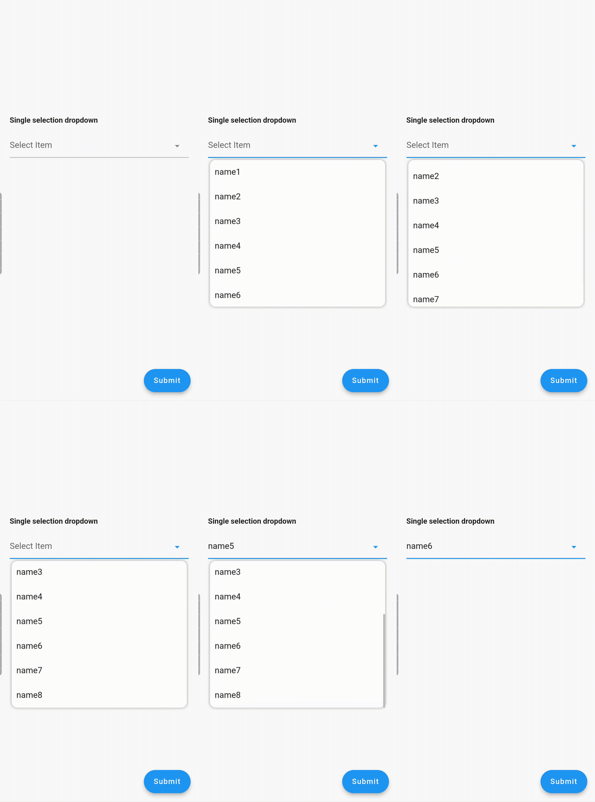
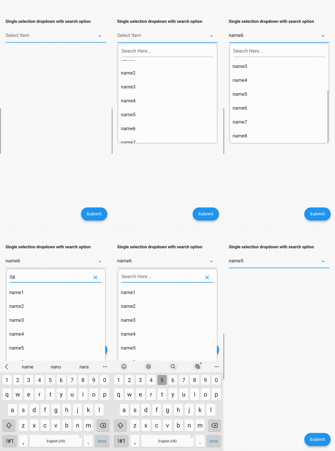
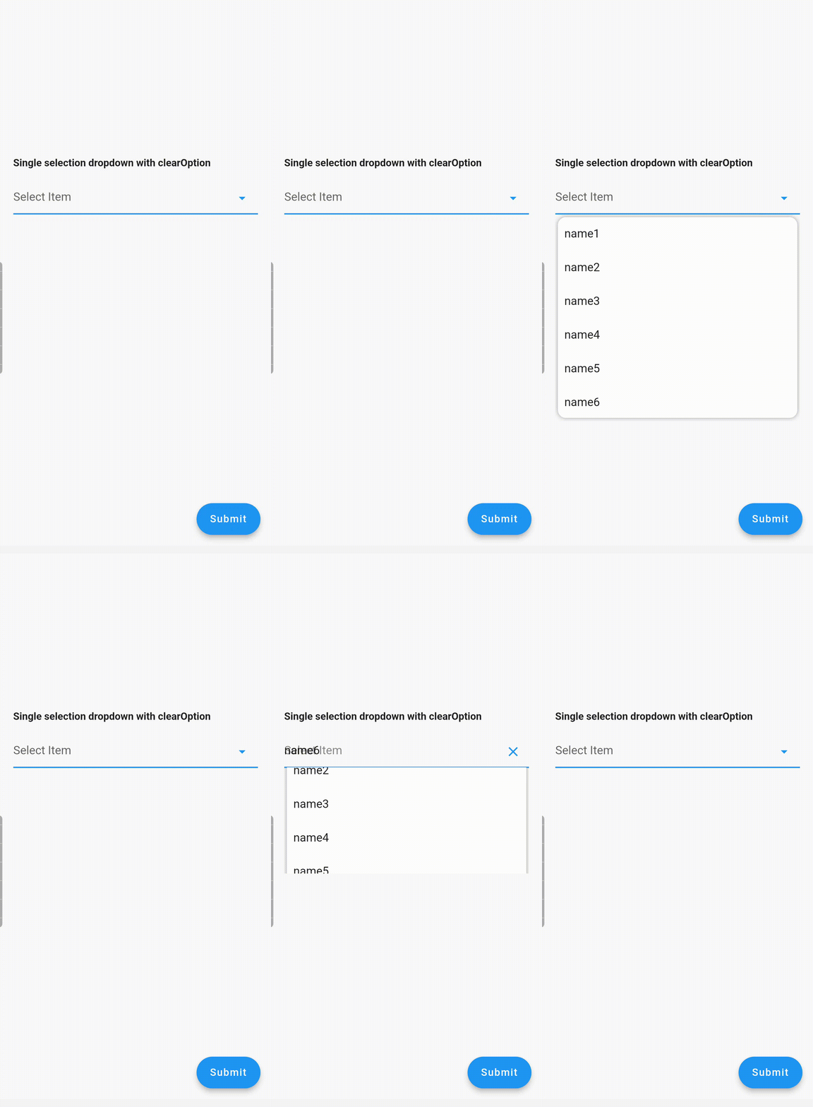
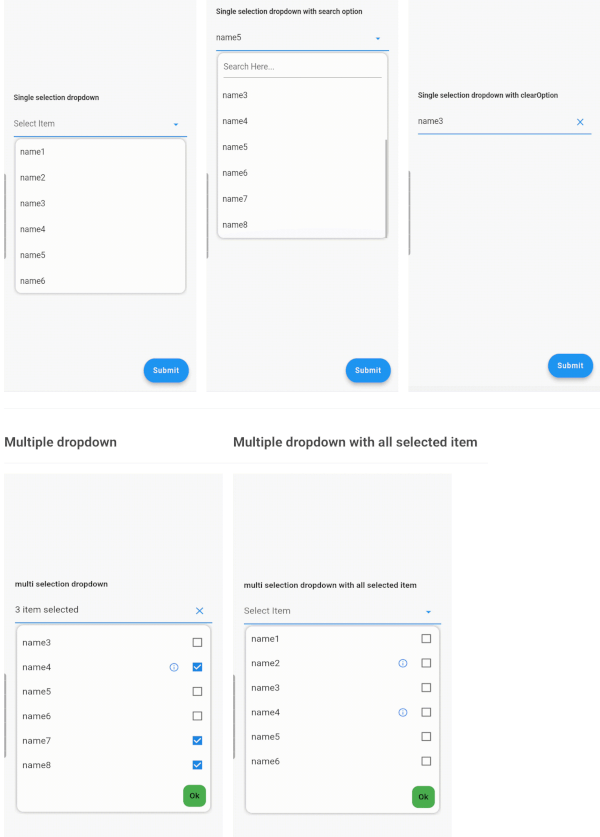
Single Dropdown Single Dropdown with Search Option Single Dropdown with Clear Option
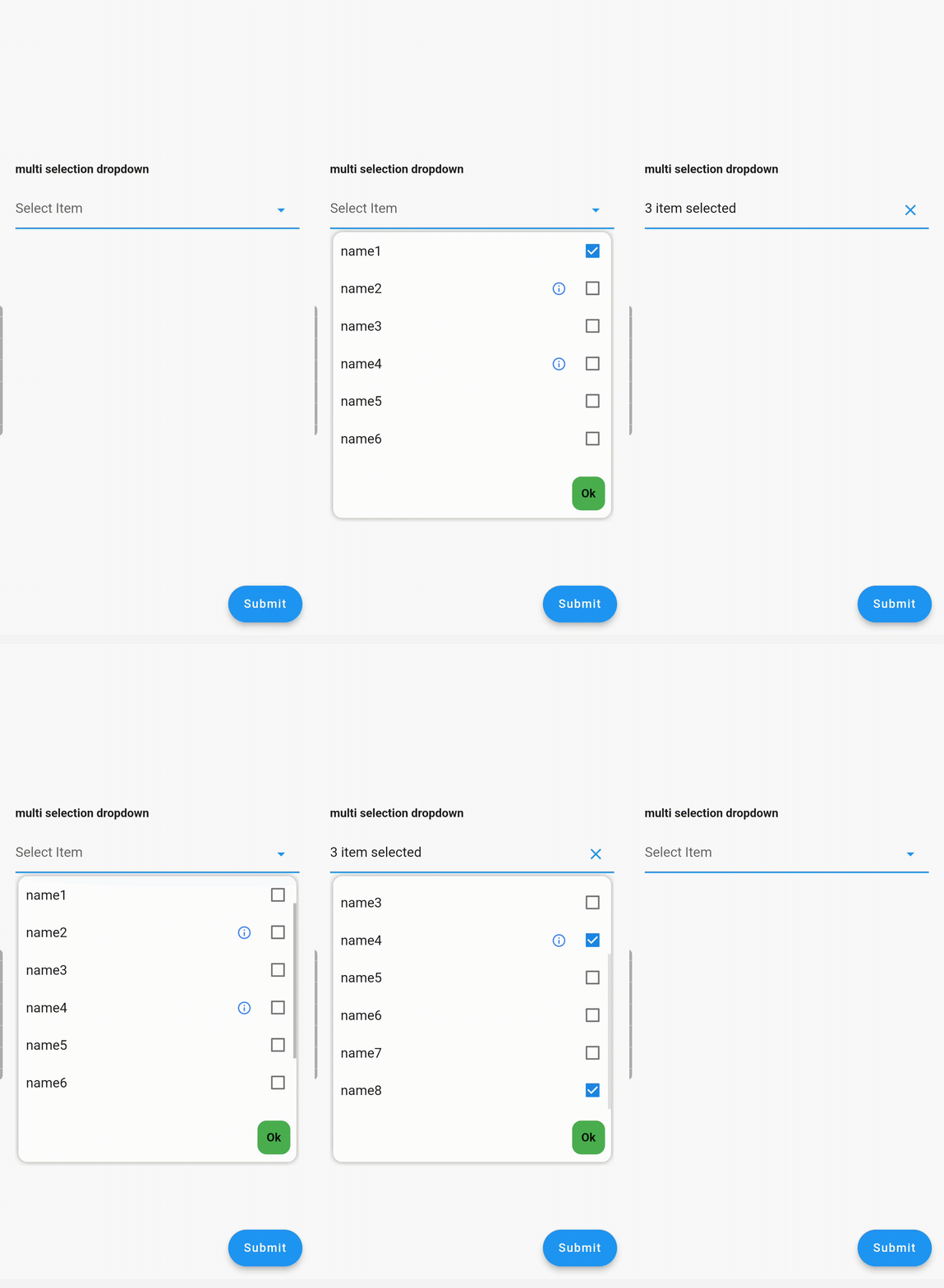
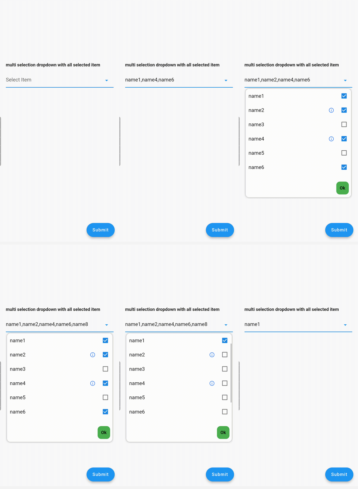
Multiple Dropdown Multiple Dropdown with All Selected Items

Usage

Controllers

You need to use SingleValueDropDownController for single dropdown and MultiValueDropDownController for multiple dropdown.

Properties
  • dropdownRadius: Defines the radius of the dropdown list. Default value is 12.
  • boxDecoration: Add custom BoxDecoration to decorate the dropdown container styling
  • boxMargin: Add custom margins to the dropdown container and override the default vertical: 5, horizontal: 4 margins
  • initialValue: Sets the initial value. If null or not in the dropDownList, it will not display any value.
  • dropDownList: A list of dropdown values of type <DropDownValueModel>.
  • onChanged: Listens for item selection changes. Returns a single DropDownValueModel object for single selection dropdown, and a list of DropDownValueModel objects for multi-selection dropdown.
  • textFieldDecoration: Overrides the default text field decoration.
  • dropDownIconProperty: Customizes the dropdown icon size and color.
  • isEnabled: Set to false to disable the text field. Default value is true.
  • enableSearch: Set to true to enable the search option in the dropdown. Currently available only for single selection dropdown.
  • displayCompleteItem: Set to true to display the complete list of selected items in the text field. Otherwise, it will display as "number_of_items selected".
  • dropDownItemCount: Maximum number of dropdown items to display. Default value is 6.
  • searchKeyboardType: Overrides the default search keyboard type. Applicable only if enableSearch=true.
  • searchTextStyle: Text style for the search text field.
  • searchAutofocus: Set to true to autofocus the search text field. Applicable only if enableSearch=true. Default value is false.
  • searchShowCursor: Set to false to hide the cursor from the search text field. Applicable only if enableSearch=true.
  • clearOption: Set to false to hide the clear suffix icon button from the text field.
  • clearIconProperty: Customizes the clear icon size and color.
  • listSpace: Space between the text field and the list. Default value is 0.
  • listPadding: Padding for dropdown list items.
  • submitButtonText: Text for the multi-dropdown submit button.
  • submitButtonColor: Color of the multi-dropdown submit button.
  • submitButtonTextStyle: Text style for the multi-dropdown submit button.
  • listTextStyle: Text style for dropdown list items.
  • checkBoxProperty: Customizes the properties of multiple checkboxes.

Contributing

Seeking contributions to improve the DropdownTextfield! If you have ideas for new features, optimizations, or bug fixes, please feel free to open a pull request or issue on our GitHub repository. Your contributions are greatly appreciated and will help make this package even better.

カテゴリー

依存関係

依存関係一覧 2 件

ソースリポジトリ

このパッケージを使用しているプロジェクト

データはまだありません。