
 v2.1.0
color_picker_field
Material および Cupertino 向けのカラーピッカー フィールド、色相ベースの円形カラーピッカーを含む
16いいね 28030日間ダウンロード150Pub ポイント
AndroidiOSWebmacOSWindowsLinux
Material および Cupertino 向けのカラーピッカー フィールド、色相ベースの円形カラーピッカーを含む

^1.0.5{"sdk":"flutter"}^2.1.4^2.0.1{"sdk":"flutter"}以下は英語原文のスナップショットです。最新版は GitHub をご覧ください。
Color Picker field for Material and Cupertino, including a Radial Color picker(Hue based)
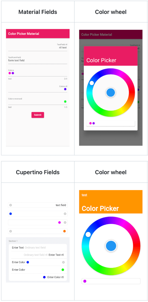
| Material Fields | Color wheel | Remove colors | Saturation and Lightness |
|---|---|---|---|
| https://github.com/talamaska/flutter_color_picker_field/blob/master/screenshots/material_fields.png?raw=true | https://github.com/talamaska/flutter_color_picker_field/blob/master/screenshots/material_color_picker1.png?raw=true | https://github.com/talamaska/flutter_color_picker_field/blob/master/screenshots/material_color_picker2.png?raw=true | https://github.com/talamaska/flutter_color_picker_field/blob/master/screenshots/material_color_picker3.png?raw=true |
| Cupertino Fields | Color wheel | Remove colors | Saturation and Lightness |
|---|---|---|---|
| https://github.com/talamaska/flutter_color_picker_field/blob/master/screenshots/cupertino_fields.png?raw=true | https://github.com/talamaska/flutter_color_picker_field/blob/master/screenshots/cupertino_color_picker1.png?raw=true | https://github.com/talamaska/flutter_color_picker_field/blob/master/screenshots/cupertino_color_picker2.png?raw=true | https://github.com/talamaska/flutter_color_picker_field/blob/master/screenshots/cupertino_color_picker3.png?raw=true |
final ColorPickerFieldController controller = ColorPickerFieldController();
ColorPickerField(
  colors: [],
  defaultColor: Colors.blue,
  onChanged: (Color value) {},
  controller: controller,
  decoration: InputDecoration(
    labelText: 'Colors',
  ),
),
ColorPickerFormField(
  initialValue: [],
  defaultColor: Colors.blue,
  autovalidateMode: AutovalidateMode.onUserInteraction,
  maxColors: 3,
  decoration: InputDecoration(
    labelText: 'Colors',
    helperText: 'test',
  ),
  validator: (List<Color>? value) {
    if (value!.isEmpty) {
      return 'a minimum of 1 color is required';
    }
    return null;
  },
  onChanged: (Color value) {},
),
CupertinoColorPickerField(
  placeholder: 'CupertinoColorPickerField',
  colors: [],
  defaultColor: Colors.blue,
  onChanged: (Color value) {},
  clearButtonMode: ClearButtonVisibilityMode.always,
),
CupertinoFormSection.insetGrouped(
  header: const Text('Section 1'),
  children: [
    // A field with an always showing clear button
    CupertinoColorPickerFormFieldRow(
      prefix: const Text('Enter Color'),
      defaultColor: defaultColor,
      clearButtonMode: ClearButtonVisibilityMode.always,
      placeholder: 'Enter Color',
      onChanged: _onChanged,
      validator: (List<Color>? value) {
        if (value == null || value.isEmpty) {
          return 'Please enter at least one color';
        }
        return null;
      },
    ),

    // A field with a reversed position and order of the chosen colors list
    CupertinoColorPickerFormFieldRow(
      prefix: const Text('Enter Color'),
      defaultColor: defaultColor,
      placeholder: 'Enter Color',
      onChanged: (Color value) {},
      colorListReversed: true,
      validator: (List<Color>? value) {
        if (value == null || value.isEmpty) {
          return 'Please enter at least one color';
        }
        return null;
      },
    ),

    // Forcing Text Direction using Directionality widget,
    // by default the TextDirection will be read from the Localization
    Directionality(
      textDirection: TextDirection.rtl,
      child: CupertinoColorPickerFormFieldRow(
        prefix: const Text('Enter Color rtl'),
        defaultColor: defaultColor,
        placeholder: 'Enter Color rtl',
        onChanged: (Color value) {},
        validator: (List<Color>? value) {
          if (value == null || value.isEmpty) {
            return 'Please enter at least one color';
          }
          return null;
        },
      ),
    ),
  ],
),