

 v1.2.0
simple_tooltip
ツールチップを作成するためのシンプルなライブラリ
78いいね 556030日間ダウンロード130Pub ポイント
AndroidiOSWebmacOSWindowsLinux
victorevox/simple_tooltp open-source repository details.

以下は英語原文のスナップショットです。最新版は GitHub をご覧ください。
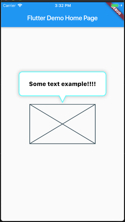
A plugin for creating tooltips with shape of a balloon
You can customize multiple elements
In the dependencies: section of your pubspec.yaml, add the following line:
dependencies:
  simple_tooltip: <latest version>
You can get started really simple, just add

SimpleTooltip(
        tooltipTap: () {
        print("Tooltip tap");
        },
        animationDuration: Duration(seconds: 3),
        show: true,
        tooltipDirection: TooltipDirection.up,
        child: Container(
        width: 200,
        height: 120,
        child: Placeholder(),
        ),
        content: Text(
        "Some text example!!!!",
        style: TextStyle(
            color: Colors.black,
            fontSize: 18,
            decoration: TextDecoration.none,
        ),
        ),
    ),
/// The [child] which the tooltip will target to
  final Widget child;

  /// Sets the tooltip direction
  /// defaults to [TooltipDirection.up]
  final TooltipDirection tooltipDirection;

  /// Defines the content that its placed inside the tooltip ballon
  final Widget content;

  /// If true, it will display the tool , if false it will hide it
  final bool show;

  /// Sets the content padding
  /// defautls to: `const EdgeInsets.symmetric(horizontal: 20, vertical: 16),`
  final EdgeInsets ballonPadding;

  /// sets the duration of the tooltip entrance animation
  /// defaults to [460] milliseconds
  final Duration animationDuration;

  /// [top], [right], [bottom], [left] position the Tooltip absolute relative to the whole screen
  double top, right, bottom, left;

  /// [minWidth], [minHeight], [maxWidth], [maxHeight] optional size constraints.
  /// If a constraint is not set the size will ajust to the content
  double minWidth, minHeight, maxWidth, maxHeight;

  ///
  /// The distance of the tip of the arrow's tip to the center of the target
  final double arrowTipDistance;

  ///
  /// The length of the Arrow
  final double arrowLength;

  ///
  /// the stroke width of the border
  final double borderWidth;

  ///
  /// The minium padding from the Tooltip to the screen limits
  final double minimumOutSidePadding;

  ///
  /// The corder radii of the border
  final double borderRadius;

  ///
  /// The width of the arrow at its base
  final double arrowBaseWidth;

  ///
  /// The color of the border
  final Color borderColor;

  ///
  /// The color of the border
  final Color backgroundColor;

  ///
  /// Set a custom list of [BoxShadow]
  /// defaults to `const BoxShadow(color: const Color(0x45222222), blurRadius: 8, spreadRadius: 2),`
  final List<BoxShadow> customShadows;

  ///
  /// Set a handler for listening to a `tap` event on the tooltip (This is the recommended way to put your logic for dismissing the tooltip)
  final Function() tooltipTap;

  ///
  /// If you want to automatically dismiss the tooltip whenever a user taps on it, set this flag to [true]
  /// For more control on when to dismiss the tooltip please rely on the [show] property and [tooltipTap] handler
  /// defaults to [false]
  final bool hideOnTooltipTap;

  ///
  /// Pass a `RouteObserver` so that the widget will listen for route transition and will hide tooltip when
  /// the widget's route is not active
  final RouteObserver<PageRoute> routeObserver;

This project is a starting point for a Dart package, a library module containing code that can be shared easily across multiple Flutter or Dart projects.
For help getting started with Flutter, view our online documentation, which offers tutorials, samples, guidance on mobile development, and a full API reference.
依存関係一覧 2 件
{"sdk":"flutter"}{"sdk":"flutter"}用途で絞り込み、開発状況を比較し、採用前に元のリポジトリで要件を確認しましょう。
“A repository is the most basic element of GitHub.”
GitHub Docs — About repositories ↗