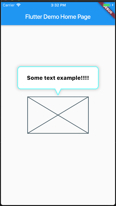
/// The [child] which the tooltip will target tofinalWidget child;
/// Sets the tooltip direction/// defaults to [TooltipDirection.up]finalTooltipDirection tooltipDirection;
/// Defines the content that its placed inside the tooltip ballonfinalWidget content;
/// If true, it will display the tool , if false it will hide itfinalboolshow;
/// Sets the content padding/// defautls to: `const EdgeInsets.symmetric(horizontal: 20, vertical: 16),`finalEdgeInsets ballonPadding;
/// sets the duration of the tooltip entrance animation/// defaults to [460] millisecondsfinalDuration animationDuration;
/// [top], [right], [bottom], [left] position the Tooltip absolute relative to the whole screendouble top, right, bottom, left;
/// [minWidth], [minHeight], [maxWidth], [maxHeight] optional size constraints./// If a constraint is not set the size will ajust to the contentdouble minWidth, minHeight, maxWidth, maxHeight;
////// The distance of the tip of the arrow's tip to the center of the targetfinaldouble arrowTipDistance;
////// The length of the Arrowfinaldouble arrowLength;
////// the stroke width of the borderfinaldouble borderWidth;
////// The minium padding from the Tooltip to the screen limitsfinaldouble minimumOutSidePadding;
////// The corder radii of the borderfinaldouble borderRadius;
////// The width of the arrow at its basefinaldouble arrowBaseWidth;
////// The color of the borderfinalColor borderColor;
////// The color of the borderfinalColor backgroundColor;
////// Set a custom list of [BoxShadow]/// defaults to `const BoxShadow(color: const Color(0x45222222), blurRadius: 8, spreadRadius: 2),`finalList<BoxShadow> customShadows;
////// Set a handler for listening to a `tap` event on the tooltip (This is the recommended way to put your logic for dismissing the tooltip)finalFunction() tooltipTap;
////// If you want to automatically dismiss the tooltip whenever a user taps on it, set this flag to [true]/// For more control on when to dismiss the tooltip please rely on the [show] property and [tooltipTap] handler/// defaults to [false]finalbool hideOnTooltipTap;
////// Pass a `RouteObserver` so that the widget will listen for route transition and will hide tooltip when/// the widget's route is not activefinalRouteObserver<PageRoute> routeObserver;
This project is a starting point for a Dart
package,
a library module containing code that can be shared easily across
multiple Flutter or Dart projects.
For help getting started with Flutter, view our
online documentation, which offers tutorials,
samples, guidance on mobile development, and a full API reference.