

 v1.1.1
square_progress_bar
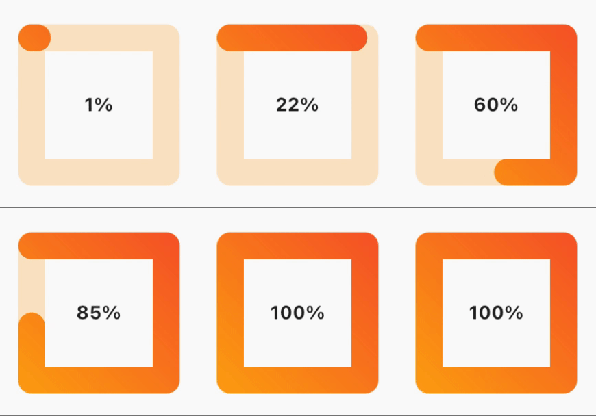
簡単に使用できる四角形のプログレスバーです。0.0 から 1.0 の範囲で進捗を指定するだけで、すぐに使用できます。
29いいね 8330日間ダウンロード150Pub ポイント
AndroidiOSWebmacOSWindowsLinux
yasirdx777/square_progress_bar open-source repository details.

以下は英語原文のスナップショットです。最新版は GitHub をご覧ください。

dependencies:
  square_progress_bar: ^1.1.1
Just provide the progress in a range from 0.0 to 1.0 and you are set to go.
              SquareProgressBar(
                width: 100, // default: max available space
                height: 100, // default: max available space
                progress: _progress, // provide the progress in a range from 0.0 to 1.0
                isAnimation: false, // default: false, animate the progress of the bar
                solidBarColor: Colors.amber, // default: blue, main bar color
                emptyBarColor: Colors.orange.withOpacity(0.2), // default: gray, empty bar color
                strokeWidth: 20, // default: 15, bar width
                barStrokeCap: StrokeCap.round, // default: StrokeCap.round, bar cap shape
                isRtl: false, // default: false, bar start point
                gradientBarColor: const LinearGradient(
                  begin: Alignment.topRight,
                  end: Alignment.bottomLeft,
                  colors: <Color>[Colors.red, Colors.amber],
                  tileMode: TileMode.repeated,
                ), // default: null, if you pass gradient color it will be used instead of solid color for the main bar
                child: Center(
                  child: Text(
                    _percentageLabel,
                    style: const TextStyle(fontWeight: FontWeight.bold),
                  ),
                ),
              )
MIT Free Software, Hell Yeah!
依存関係一覧 3 件
{"sdk":"flutter"}{"sdk":"flutter"}^1.0.0用途で絞り込み、開発状況を比較し、採用前に元のリポジトリで要件を確認しましょう。
“A repository is the most basic element of GitHub.”
GitHub Docs — About repositories ↗