パッケージ、リポジトリ、アプリカテゴリを検索

square_progress_bar のカバー
パッケージ詳細v1.1.1

square_progress_bar

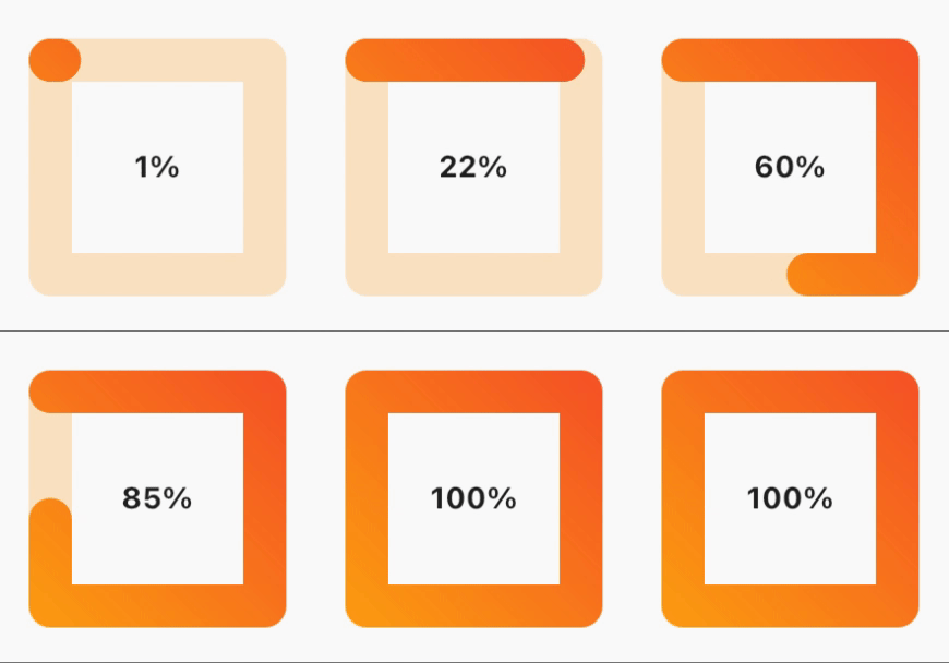
簡単に使用できる四角形のプログレスバーです。0.0 から 1.0 の範囲で進捗を指定するだけで、すぐに使用できます。

AndroidiOSWebmacOSWindowsLinux
30日間ダウンロード
83
いいね数
29
Pub ポイント
150

パッケージをインストール

flutter pub add square_progress_bar

パッケージ概要

公開情報に基づく選定ガイドです。参考としてご利用ください。

Flutterアプリケーション向けのシンプルでカスタマイズ可能な四角形プログレスバーです。0.0から1.0までの進捗値を受け入れており、ロードや完了状態の視覚フィードバックが必要な任意のUIに簡単に統合できます。軽量で、Android、iOS、Web、macOS、Windows、Linuxを含むすべての主要プラットフォームをサポートしています。フォームやファイルアップロード、またはクリーンでモダンなプログレッシブインジケーターが必要なあらゆるシナリオに最適です。

用途

  • フォーム内の読み込みインジケーター
  • ファイルアップロードの進行状況の追跡
  • タスク完了の可視化
  • ダッシュボードの進行状況が表示されます
  • アニメーション付きオンボーディングフロー

主な機能

  • 四角形デザイン
  • 0.0 から 1.0 への進行状況
  • クロスプラットフォーム対応
  • 最小構成
  • カスタマイズ可能な色とサイズ
  • スムーズなアニメーション

適している対象

  • シンプルなプログレス UI
  • 軽量アプリ
  • 一貫したデザインシステム
  • 迅速なプロトタイピング
  • モバイルおよびWebアプリケーション

注意事項

  • 基本的なスタイリングを超えるカスタマイズは限定的
  • 組み込みラベルサポートなし
  • 複雑な進行ワークフローには適していません
  • アニメーションタイミングの手動処理が必要です
  • 外部パッケージの更新に依存しています

元の README

関連するソースリポジトリの README 原文のスナップショットです。最新の内容はリポジトリをご覧ください。

Square progress bar because why not 😎

Build Status

Features

  • Dynamic sizing
  • Animated progress bar
  • Gradient color progress bar
  • Progress bar cap shape customization
  • RTL support
  • ✨Magic✨

alt text

Installation

dependencies:
  square_progress_bar: ^1.1.1

Getting started

Just provide the progress in a range from 0.0 to 1.0 and you are set to go.

Usage

              SquareProgressBar(
                width: 100, // default: max available space
                height: 100, // default: max available space
                progress: _progress, // provide the progress in a range from 0.0 to 1.0
                isAnimation: false, // default: false, animate the progress of the bar
                solidBarColor: Colors.amber, // default: blue, main bar color
                emptyBarColor: Colors.orange.withOpacity(0.2), // default: gray, empty bar color
                strokeWidth: 20, // default: 15, bar width
                barStrokeCap: StrokeCap.round, // default: StrokeCap.round, bar cap shape
                isRtl: false, // default: false, bar start point
                gradientBarColor: const LinearGradient(
                  begin: Alignment.topRight,
                  end: Alignment.bottomLeft,
                  colors: <Color>[Colors.red, Colors.amber],
                  tileMode: TileMode.repeated,
                ), // default: null, if you pass gradient color it will be used instead of solid color for the main bar
                child: Center(
                  child: Text(
                    _percentageLabel,
                    style: const TextStyle(fontWeight: FontWeight.bold),
                  ),
                ),
              )

License

MIT Free Software, Hell Yeah!

カテゴリー

ソースリポジトリ

このパッケージを使用しているプロジェクト

データはまだありません。