
 v0.1.3
user_profile_avatar
シンプルなウィジェットで、円形のプロフィール画像を表示し、画像の読み込み中にネイティブな円形プログレスインジケーターを表示します。
37いいね 4630日間ダウンロード140Pub ポイント
AndroidiOSmacOSWindowsLinux
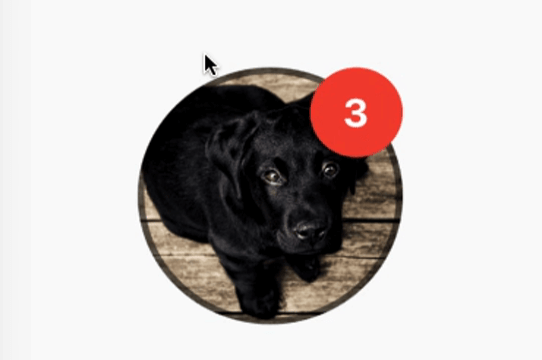
ネットワークから取得した画像を円形のプロフィール画像として表示するシンプルなウィジェットで、画像の読み込み中に円形プログレスインジケーターを表示します。また、通知バブルを表示する機能も備えています。

{"sdk":"flutter"}^3.4.0{"sdk":"flutter"}以下は英語原文のスナップショットです。最新版は GitHub をご覧ください。
A simple widget that display round profile picture where the picture is fetched from network and displays circular progress indicator whilst the image is being loaded. Also, has the ability to display notification bubble.
https://raw.githubusercontent.com/zeshanghayoomi/flutter_user_profile_avatar/master/repo_assets/simulator.gif
UserProfileAvatar(
        avatarUrl: 'https://picsum.photos/id/237/5000/5000',
        onAvatarTap: () {
          print('Avatar Tapped..');
        },
        notificationCount: 10,
        notificationBubbleTextStyle: TextStyle(
          fontSize: 30,
          color: Colors.white,
          fontWeight: FontWeight.bold,
        ),
        avatarSplashColor: Colors.purple,
        radius: 100,
        isActivityIndicatorSmall: false,
        avatarBorderData: AvatarBorderData(
          borderColor: Colors.white,
          borderWidth: 5.0,
        ),
      )
onAvatarTap
Use this to perform any action when the avatar gets tapped.
notificationCount
Pass an int to display the notification bubble. 99+ gets displayed if notification count was larger than 100.
notificationBubbleTextStyle
Used to style the notification count, if null then the default one will be applied.
avatarSplashColor
Splash color when user taps on the avatar.
radius
Use this to size the avatar.
isActivityIndicatorSmall
use this to display small/large circular progress indicator (native) when image is loading, default is true.