パッケージ、リポジトリ、アプリカテゴリを検索

user_profile_avatar のカバー
パッケージ詳細v0.1.3

user_profile_avatar

シンプルなウィジェットで、円形のプロフィール画像を表示し、画像の読み込み中にネイティブな円形プログレスインジケーターを表示します。

AndroidiOSmacOSWindowsLinux
30日間ダウンロード
77
いいね数
37
Pub ポイント
140

パッケージをインストール

flutter pub add user_profile_avatar

パッケージ概要

公開情報に基づく選定ガイドです。参考としてご利用ください。

画像の読み込み中にネイティブ風の円形プログレスインジケーターを表示するように設計されたFlutterウィジェットです。画像の取得と視覚フィードバックをスムーズに処理することで、アプリ内のユーザーアバターの実装を簡素化します。このウィジェットは、Android、iOS、macOS、Windows、Linuxの各プラットフォームで一貫した外観を保証し、チャットインターフェースやユーザープロフィール、および円形アバターと滑らかな読み込み状態が必要なUIに最適です。

用途

  • ユーザーのプロフィールが表示されます
  • チャットインターフェース
  • ソーシャルメディアアプリのアバター
  • 認証画面
  • ダッシュボードユーザーカード

主な機能

  • 円形プロフィール画像のレンダリング
  • ネイティブな円形プログレスインジケーター
  • クロスプラットフォーム互換性
  • シンプルなAPI統合
  • 自動画像ロード状態管理

適している対象

  • チャットアプリを開発する開発者
  • クリーンなアバターが必要なUIデザイナー
  • ユーザー認証付きアプリ
  • クロスプラットフォームのモバイルおよびデスクトップアプリ
  • プロフィール画像に最小限のボイラープレートが必要なプロジェクト

注意事項

  • リモート画像のためにはインターネット接続が必要です
  • 基本的なスタイリングを超えるカスタマイズは限られている
  • 外部画像読み込みロジックに依存しています
  • 非円形のアバター設計には適していません
  • 高トラフィックのアプリではパフォーマンス向上のために追加のキャッシュが必要になる場合があります

元の README

関連するソースリポジトリの README 原文のスナップショットです。最新の内容はリポジトリをご覧ください。

Flutter User Profile Avatar

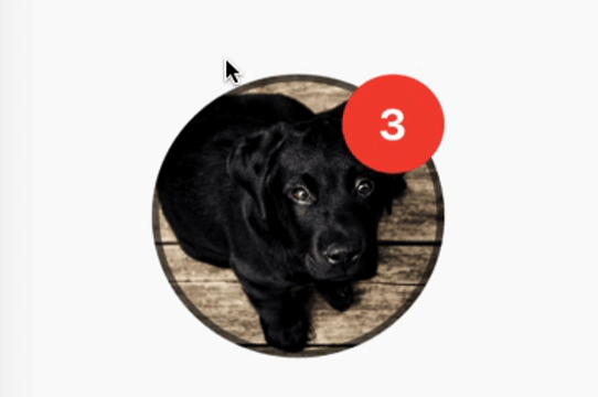
A simple widget that display round profile picture where the picture is fetched from network and displays circular progress indicator whilst the image is being loaded. Also, has the ability to display notification bubble.


How to use


UserProfileAvatar(
        avatarUrl: 'https://picsum.photos/id/237/5000/5000',
        onAvatarTap: () {
          print('Avatar Tapped..');
        },
        notificationCount: 10,
        notificationBubbleTextStyle: TextStyle(
          fontSize: 30,
          color: Colors.white,
          fontWeight: FontWeight.bold,
        ),
        avatarSplashColor: Colors.purple,
        radius: 100,
        isActivityIndicatorSmall: false,
        avatarBorderData: AvatarBorderData(
          borderColor: Colors.white,
          borderWidth: 5.0,
        ),
      )

Properties

  • avatarUrl
    The url for the image, if this set to null or empty then an empty user avatar gets displayed by default.


  • onAvatarTap
    Use this to perform any action when the avatar gets tapped.

  • notificationCount
    Pass an int to display the notification bubble. 99+ gets displayed if notification count was larger than 100.

  • notificationBubbleTextStyle
    Used to style the notification count, if null then the default one will be applied.

  • avatarSplashColor
    Splash color when user taps on the avatar.

  • radius
    Use this to size the avatar.

    • minimum default radius is 15
    • maximum default radius is 150
  • isActivityIndicatorSmall
    use this to display small/large circular progress indicator (native) when image is loading, default is true.


  • avatarBorderData
    Use this to apply border width and color of the avatar.

カテゴリー

依存関係

依存関係一覧 1 件

ソースリポジトリ

このパッケージを使用しているプロジェクト

データはまだありません。