
 v1.1.0
sliding_switch
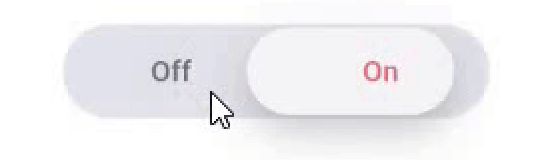
슬라이딩 스위치 - 간단한 스위치 위젯입니다. 원하는 너비, 색상, 텍스트 등을 완전히 사용자 정의할 수 있습니다. 선택 상태도 유지합니다.
33좋아요 47230일 다운로드130Pub 점수
AndroidiOSWebmacOSWindowsLinux
CodeAppRun/sliding_switch open-source repository details.

{"sdk":"flutter"}{"sdk":"flutter"}아래는 영문 원문 스냅샷입니다. 최신 내용은 GitHub에서 확인하세요.
Sliding Switch - A simple switch widget. It can be fully customized with desired width, colors, text etc. It also maintains selection state.
In the pubspec.yaml of your flutter project, add the following dependency:
dependencies:
  ...
  sliding_switch: "latest"
Import it:
import 'package:sliding_switch/sliding_switch.dart';
SlidingSwitch(
 value: false,
 width: 250,
 onChanged: (bool value) {
   print(value);
 },
)
sliding switch
SlidingSwitch(
 value: false,
 width: 250,
 onChanged: (bool value) {
   print(value);
 },
 height : 55,
 animationDuration : const Duration(milliseconds: 400),
 onTap:(){},
 onDoubleTap:(){},
 onSwipe:(){},
 textOff : "Female",
 textOn : "Male",
 iconOff: Icons.human-female,
 iconOn: Icons.human-male,
 contentSize: 17,
 colorOn : const Color(0xffdc6c73),
 colorOff : const Color(0xff6682c0),
 background : const Color(0xffe4e5eb),
 buttonColor : const Color(0xfff7f5f7),
 inactiveColor : const Color(0xff636f7b),
),
If iconOn or iconOff are not null, they will be displayed in lieu of the respective textOn and textOff. The values for textOn and textOff are used as semantic labels for the icons for accessibility. The icons in the example are not in the default material icon set, but are from [Material Design Icons] (https://materialdesignicons.com/), available on pub.dev here.
contentSize drives the height of the text or icons.
Licensed Under the MIT License.