패키지, 저장소 및 앱 카테고리 검색

sliding_switch 표지
패키지 상세v1.1.0

sliding_switch

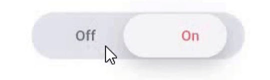
슬라이딩 스위치 - 간단한 스위치 위젯입니다. 원하는 너비, 색상, 텍스트 등을 완전히 사용자 정의할 수 있습니다. 선택 상태도 유지합니다.

AndroidiOSWebmacOSWindowsLinux
30일 다운로드
731
좋아요
33
Pub 점수
130

패키지 설치

flutter pub add sliding_switch

패키지 개요

공개 정보를 바탕으로 생성한 선택 가이드입니다.

SlidingSwitch는 Flutter용 사용자 정의 가능한 스위치 위젯으로, 사용자가 슬라이딩 동작을 통해 두 가지 상태를 전환할 수 있게 해줍니다. 너비, 색상, 텍스트 레이블 및 애니메이션에 대한 완전한 커스터마이징을 지원합니다. 재구성 시 선택 상태를 유지하여 일관된 사용자 경험을 보장합니다. 간단함과 유연성을 고려해 설계되었으며, Android, iOS, Web, macOS, Windows, Linux 플랫폼에서 원활하게 작동합니다. 앱의 설정, 선호 사항 및 케이스 전환에 이상적입니다.

사용 사례

  • 사용자 선호 설정 전환
  • 설정 패널
  • on/off 스위치
  • 폼 컨트롤
  • 다크 모드 전환기

주요 기능

  • 완전히 사용자 정의 가능한 외관
  • 상태 지속성
  • 크로스 플랫폼 지원
  • 부드러운 슬라이딩 애니메이션
  • 텍스트 레이블 지원
  • 사용자 지정 가능한 너비 및 색상

적합한 대상

  • 간단한 토글 UI
  • 사용자 정의 가능한 폼 요소
  • 다중 플랫폼 앱
  • 선호 설정
  • 경량 스위치 컴포넌트

고려 사항

  • 이중 상태 전환에 제한됨
  • 내장된 접근성 기능 없음
  • 복잡한 시나리오에서는 상태를 수동으로 처리해야 합니다
  • 다중 선택에 적합하지 않음

원본 README

연결된 소스 저장소의 README 원문 스냅샷입니다. 최신 내용은 저장소에서 확인하세요.

sliding_switch

Sliding Switch - A simple switch widget. It can be fully customized with desired width, colors, text etc. It also maintains selection state.

Live Demo (Codeapprun)

codeapprun.io

Getting Started

In the pubspec.yaml of your flutter project, add the following dependency:

dependencies:
  ...
  sliding_switch: "latest"

Import it:

import 'package:sliding_switch/sliding_switch.dart';

Usage Examples

Minimum sliding switch configuration
SlidingSwitch(
 value: false,
 width: 250,
 onChanged: (bool value) {
   print(value);
 },
)

sliding switch

sliding switch other configurations
SlidingSwitch(
 value: false,
 width: 250,
 onChanged: (bool value) {
   print(value);
 },
 height : 55,
 animationDuration : const Duration(milliseconds: 400),
 onTap:(){},
 onDoubleTap:(){},
 onSwipe:(){},
 textOff : "Female",
 textOn : "Male",
 iconOff: Icons.human-female,
 iconOn: Icons.human-male,
 contentSize: 17,
 colorOn : const Color(0xffdc6c73),
 colorOff : const Color(0xff6682c0),
 background : const Color(0xffe4e5eb),
 buttonColor : const Color(0xfff7f5f7),
 inactiveColor : const Color(0xff636f7b),
),

If iconOn or iconOff are not null, they will be displayed in lieu of the respective textOn and textOff. The values for textOn and textOff are used as semantic labels for the icons for accessibility. The icons in the example are not in the default material icon set, but are from [Material Design Icons] (https://materialdesignicons.com/), available on pub.dev here.

contentSize drives the height of the text or icons.

Licensed Under the MIT License.

Inspiration

Jitu Raut

카테고리

소스 저장소

이 패키지를 사용하는 프로젝트

아직 데이터가 없습니다.