
 v1.0.4
animated_notch_bottom_bar
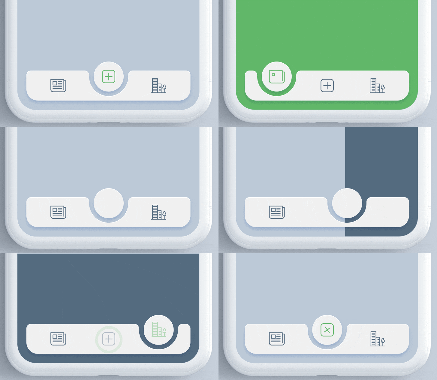
이 패키지는 어떤 위젯을 자식으로 사용하여 애니메이션 효과가 있는 노치 하단 탐색 바를 구현하는 데 도움을 줍니다.
422좋아요 5.1천30일 다운로드150Pub 점수
AndroidiOSWebmacOSWindowsLinux
Flutter용 TabBar 컴포넌트

{"sdk":"flutter"}{"sdk":"flutter"}아래는 영문 원문 스냅샷입니다. 최신 내용은 GitHub에서 확인하세요.
animated_notch_bottom_bar version Flutter Website Dart Website https://img.shields.io/badge/platform-android-blue https://img.shields.io/badge/platform-iOS-blue https://img.shields.io/badge/platform-Web-deepskyblue https://img.shields.io/badge/platform-Mac-deepskyblue https://img.shields.io/badge/platform-Linux-deepskyblue https://img.shields.io/badge/platform-Windows-deepskyblue https://app.codacy.com/project/badge/Grade/dc683c9cc61b499fa7cdbf54e4d9ff35 https://img.shields.io/github/license/Mindinventory/animated_notch_bottom_bar MIT License
A Flutter package for animating the position of selected item in bottomNavigationBar with notch like design. Inspired by react-native-tabbar-interaction plugin.
Add the dependency in pubspec.yaml:
dependencies:
  ...
  animated_notch_bottom_bar: ^1.0.0
Place AnimatedNotchBottomBar in the bottomNavigationBar parameter of a Scaffold widget and provide NotchBottomBarController to AnimatedNotchBottomBar.
bottomNavigationBar:  AnimatedNotchBottomBar(
  notchBottomBarController: _controller,
  ...
)
Widget as bottom bar itemYou can also set any animated widget.
bottomNavigationBar:  AnimatedNotchBottomBar(
  pageController: _pageController,
  bottomBarItems: [
    const BottomBarItem(
        inActiveItem: Icon(
           Icons.home_filled,
            color: Colors.blueGrey,
        ),
        activeItem: Icon(
          Icons.home_filled,
          color: Colors.blueAccent,
        ),
        itemLabel: 'Page 1',
  ),
    const BottomBarItem(
        inActiveItem: Icon(
            Icons.star,
            color: Colors.blueGrey,
          ),
        activeItem: Icon(
            Icons.star,
            color: Colors.blueAccent,
        ),
        itemLabel: 'Page 2',
  ),

     ///svg item
    BottomBarItem(
        inActiveItem: SvgPicture.asset(
          'assets/search_icon.svg',
           color: Colors.blueGrey,
       ),
       activeItem: SvgPicture.asset(
          'assets/search_icon.svg',
           color: Colors.black,
       ),
       itemLabel: 'Page 3',
    ),
     ...
)
bottomNavigationBar:  AnimatedNotchBottomBar(
     ...
     removeMargins: true,
     ...
)
bottomNavigationBar:  AnimatedNotchBottomBar(
     ...
     bottomBarWidth: 500.0,
     bottomBarHeight: 62.0,
     ...
)
bottomNavigationBar:  AnimatedNotchBottomBar(
     ...
     durationInMilliSeconds: 300,
     ...
)
bottomNavigationBar:  AnimatedNotchBottomBar(
     ...
     showLabel: true,
     itemLabelStyle: TextStyle(
                      color: Colors.black,
                      fontSize: 16.0
                    ),
     ...
)
bottomNavigationBar:  AnimatedNotchBottomBar(
     ...
      notchColor: Colors.black87,
     ...
)
bottomNavigationBar:  AnimatedNotchBottomBar(
     ...
     notchGradient: const LinearGradient(
        begin: Alignment.topRight,
        end: Alignment.bottomLeft,
        colors: [
          Colors.red,
          Colors.green,
        ],
     ),
     ...
)
bottomNavigationBar:  AnimatedNotchBottomBar(
     ...
     showBottomRadius = false,
     showTopRadius = false,
     ...
)
bottomNavigationBar:  AnimatedNotchBottomBar(
     ...
     elevation = 2.0,
     ...
)
bottomNavigationBar:  AnimatedNotchBottomBar(
    ...
    showBlurBottomBar: true,
    blurOpacity: 0.2,
    blurFilterX: 5.0,
    blurFilterY: 10.0,
    ...
)
Starting with version 1.0.0 of the package, NotchBottomBarController have been added for control the animation instead of PageController. The pageController field has been removed and notchBottomBarController is required now.
notchBottomBarController - The controller which allows you to control the page.bottomBarItems - Navigation items, required more than one item and less than six.onTap - Required to listen when an item is tapped it provides the selected item's index.color - The bottom bar's background color.removeMargins - To remove side and bottom margins by default it's false.bottomBarWidth - To provide width for web and desktop app.durationInMilliSeconds - To set duration time in MilliSeconds.showLabel: To show or hide the label under bottom bar item.itemLabelStyle - The bottom bar's item text style.showShadow - If false the bottom bar's elevation will be removed.showBlurBottomBar - If true the bottom bar will look blur.blurOpacity - To set opacity of blur effect.blurFilterX - Creates an image filter that applies a Gaussian blur at x axis.blurFilterY - Creates an image filter that applies a Gaussian blur at y axis.notchColor - Customizable notch's color.notchGradient - Add Gradient to notch.showTopRadius - If set false the top corner radius will be removed.showBottomRadius - If set false the top corner radius will be removed.elevation - Set elevation of bottom bar.bottomBarHeight - To set height of bottom bar.title - the bottom bar item labelactiveItem - the selected item.inActiveItem - the inactive item.Contribution towards our repository is always welcome, we request contributors to create a pull request to the main branch only.
Animated Notch Bottom Bar is MIT-licensed.
We’d be really happy if you send us links to your projects where you use our component. Just send an email to sales@mindinventory.com and do let us know if you have any questions or suggestion regarding our work.