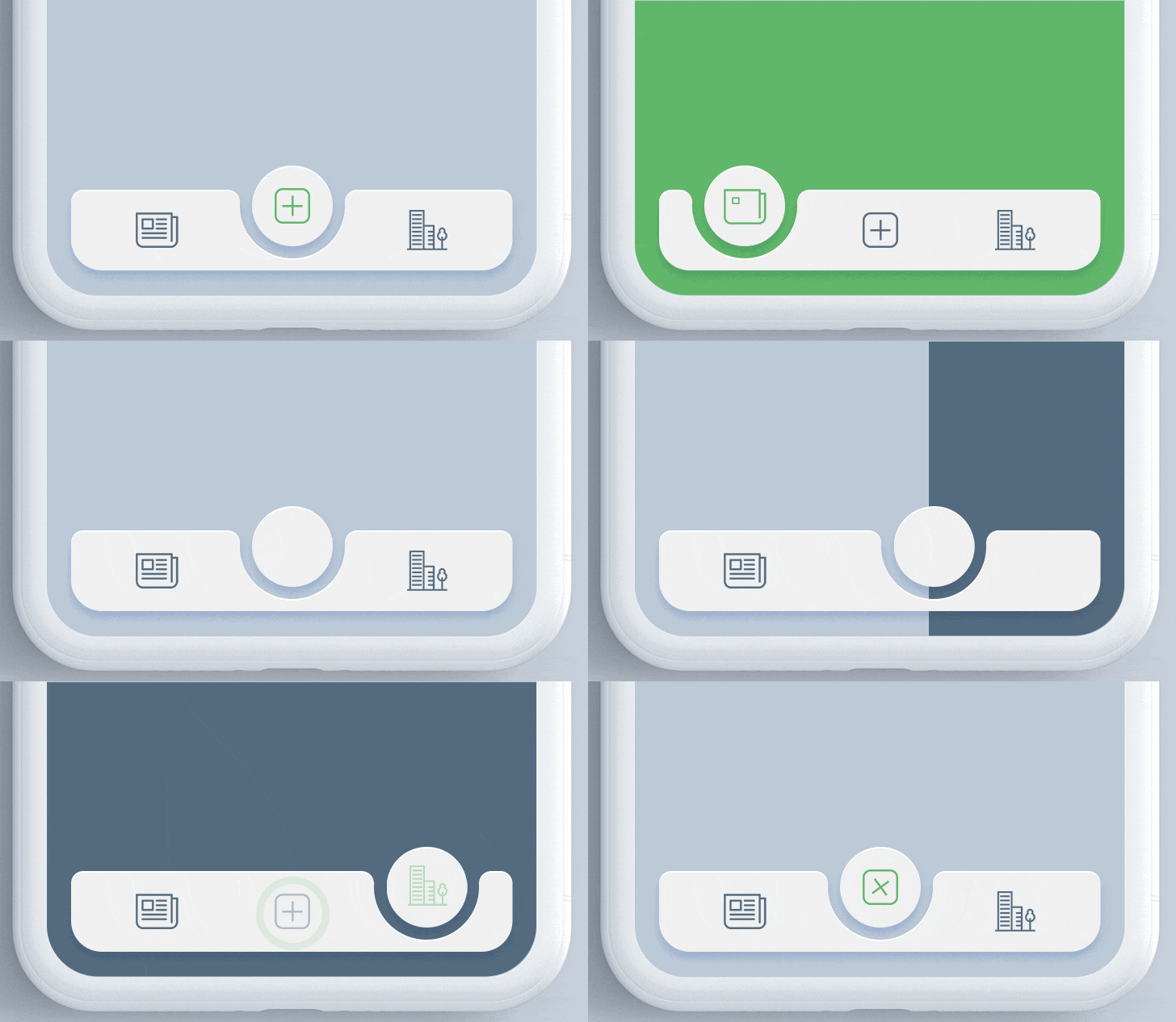
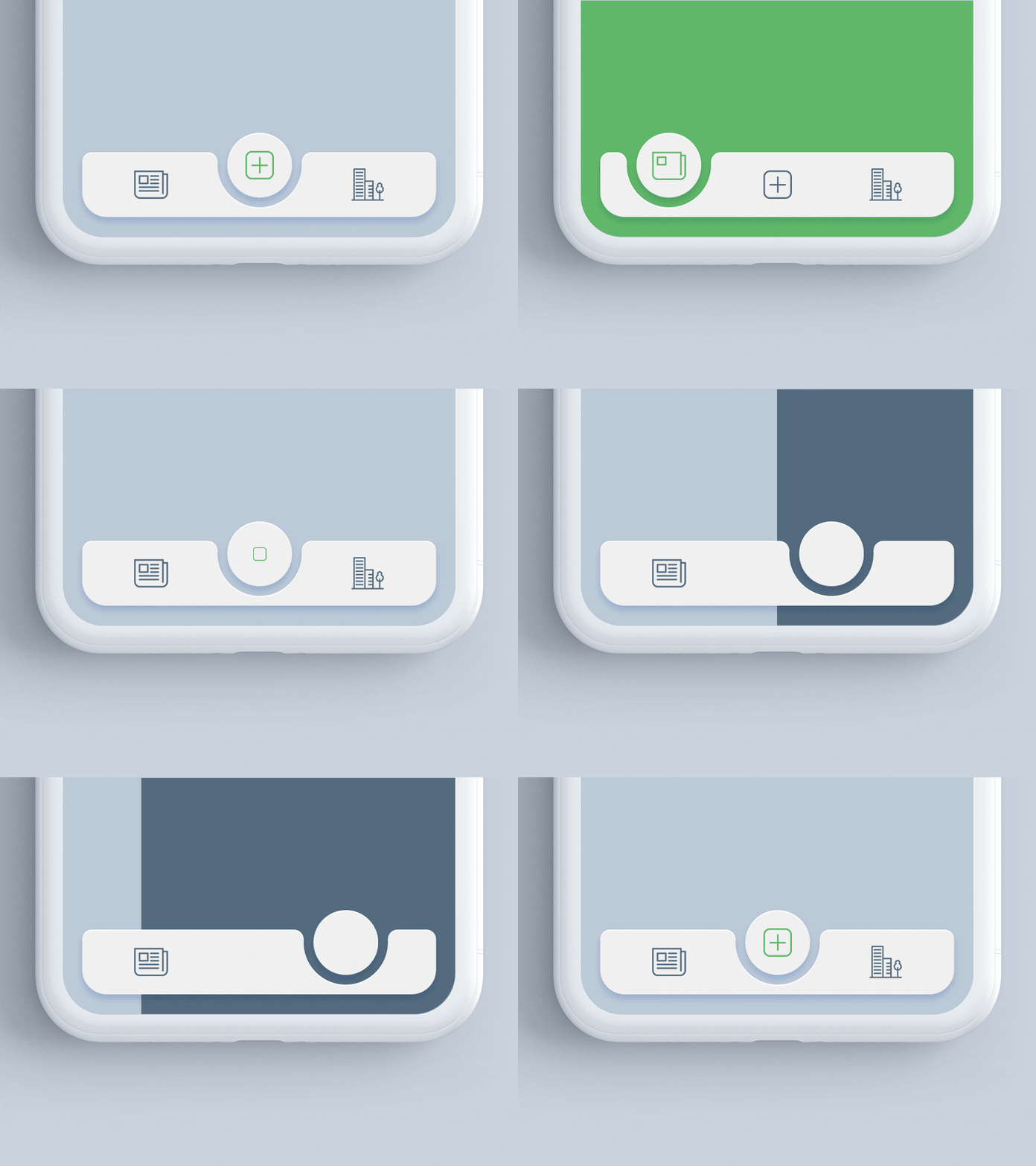
animated_notch_bottom_bar 패키지는 사용자 정의 위젯을 자식으로 사용할 수 있는 동적 노치 효과를 갖춘 시각적으로 매력적인 하단 네비게이션 바를 개발자가 만들 수 있도록 해줍니다. 부드러운 애니메이션과 현대적인 디자인 미학을 통해 사용자 경험을 향상시킵니다. 안드로이드, iOS, 웹, 맥OS, 윈도우, 리눅스 등 여러 플랫폼에서 호환되며, 크로스플랫폼 애플리케이션에 유연성을 제공합니다. 이 패키지는 통합 및 커스터마이징이 간편하여, 매력적인 UI 상호작용을 중시하는 앱에 적합합니다.
사용 사례
현대적인 앱 인터페이스 만들기
내비게이션 UX 향상
사용자 정의 하단 바 디자인
크로스 플랫폼 앱 빌드
애니메이션 전환 추가
노치 기반 레이아웃 구현
주요 기능
애니메이션 노치 효과
사용자 정의 가능한 자식 위젯
크로스 플랫폼 지원
부드러운 애니메이션
간편한 통합
반응형 디자인
적합한 대상
모바일 및 웹 앱 개발자
UI/UX 디자이너
현대적인 탐색이 필요한 앱
애니메이션 컴포넌트를 찾는 개발자
사용자 정의 하단 탐색이 있는 프로젝트
크로스 플랫폼 Flutter 프로젝트
고려 사항
구형 기기에서 성능 최적화가 필요할 수 있습니다
노치 모양에 대한 사용자 정의 제한
부모 컨테이너 제약 조건에 따라 다름
간단한 탐색 요구 사항에 적합하지 않습니다
애니메이션은 미니멀리즘 디자인에서 방해가 될 수 있습니다
전체 UI 테마와 정밀하게 일치시켜야 합니다
원본 README
연결된 소스 저장소의 README 원문 스냅샷입니다. 최신 내용은 저장소에서 확인하세요.
Animated Notch Bottom Bar
A Flutter package for animating the position of selected item in bottomNavigationBar with notch like design. Inspired by react-native-tabbar-interaction plugin.
Features :
Supports any widget as as a bottom bar children.
Animates the notch toward selected item.
Create an optimized bottom navigation bar with beautiful animation.
Supports blur effect like iOS Tab View.
Getting Started
Add the dependency in pubspec.yaml:
dependencies:...animated_notch_bottom_bar:^1.0.0
Basic Usage
Place AnimatedNotchBottomBar in the bottomNavigationBar parameter of a Scaffold widget and provide NotchBottomBarController to AnimatedNotchBottomBar.
Starting with version 1.0.0 of the package, NotchBottomBarController have been added for control the animation instead of PageController. The pageController field has been removed and notchBottomBarController is required now.
AnimatedNotchBottomBar
notchBottomBarController - The controller which allows you to control the page.
bottomBarItems - Navigation items, required more than one item and less than six.
onTap - Required to listen when an item is tapped it provides the selected item's index.
color - The bottom bar's background color.
removeMargins - To remove side and bottom margins by default it's false.
bottomBarWidth - To provide width for web and desktop app.
durationInMilliSeconds - To set duration time in MilliSeconds.
showLabel: To show or hide the label under bottom bar item.
itemLabelStyle - The bottom bar's item text style.
showShadow - If false the bottom bar's elevation will be removed.
showBlurBottomBar - If true the bottom bar will look blur.
blurOpacity - To set opacity of blur effect.
blurFilterX - Creates an image filter that applies a Gaussian blur at x axis.
blurFilterY - Creates an image filter that applies a Gaussian blur at y axis.
notchColor - Customizable notch's color.
notchGradient - Add Gradient to notch.
showTopRadius - If set false the top corner radius will be removed.
showBottomRadius - If set false the top corner radius will be removed.
elevation - Set elevation of bottom bar.
bottomBarHeight - To set height of bottom bar.
BottomBarItems
title - the bottom bar item label
activeItem - the selected item.
inActiveItem - the inactive item.
Guideline for contributors
Contribution towards our repository is always welcome, we request contributors to create a pull request to the main branch only.
We’d be really happy if you send us links to your projects where you use our component. Just send an email to sales@mindinventory.com and do let us know if you have any questions or suggestion regarding our work.