
 v0.0.4
floating_bottom_bar
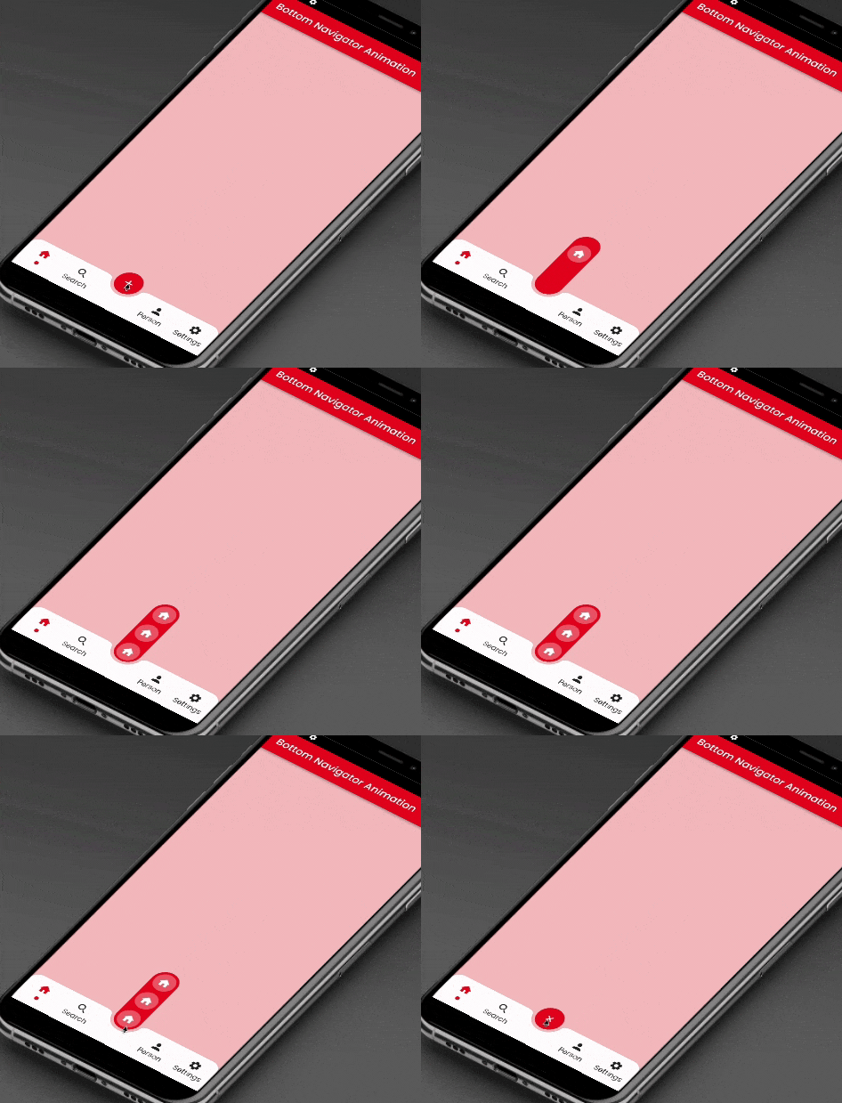
이 패키지는 중심과 하단 탭 버튼에 위치한 플로팅 액션 버튼에 슬라이딩 애니메이션을 제공합니다.
113좋아요 32430일 다운로드150Pub 점수
AndroidiOSWebmacOSWindowsLinux
이 패키지는 AnimatedContainer와 SlideTransition를 사용하여 중앙에 플로팅 액션 버튼과 하단 네비게이션 바의 아이콘을 애니메이션 처리합니다.

{"sdk":"flutter"}^2.0.9{"sdk":"flutter"}^3.0.1아래는 영문 원문 스냅샷입니다. 최신 내용은 GitHub에서 확인하세요.
This package will animate a floating action button at the center and icons at the bottomNavigationBar using AnimatedContainer and SlideTransition respectively.
Floating Bottom Bar
    bottomNavigationBar: AnimatedBottomNavigationBar(
      barColor: Colors.white,
      controller: FloatingBottomBarController(initialIndex: 1),
      bottomBar: [
        BottomBarItem(
          icon: const Icon(Icons.home, size: example.Dimens.iconNormal),
          iconSelected: const Icon(Icons.home,
              color: example.AppColors.cherryRed,
              size: example.Dimens.iconNormal),
          title: example.Strings.home,
          dotColor: example.AppColors.cherryRed,
          onTap: (value) {
            setState(() {
              index = value;
            });
            log('Home $value');
          },
        ),
        BottomBarItem(
          icon:
              const Icon(Icons.photo, size: example.Dimens.iconNormal),
          iconSelected: const Icon(Icons.photo,
              color: example.AppColors.cherryRed,
              size: example.Dimens.iconNormal),
          title: example.Strings.search,
          dotColor: example.AppColors.cherryRed,
          onTap: (value) {
            setState(() {
              index = value;
            });
            log('Search $value');
          },
        ),
        BottomBarItem(
          icon:
              const Icon(Icons.person, size: example.Dimens.iconNormal),
          iconSelected: const Icon(Icons.person,
              color: example.AppColors.cherryRed,
              size: example.Dimens.iconNormal),
          title: example.Strings.person,
          dotColor: example.AppColors.cherryRed,
          onTap: (value) {
            setState(() {
              index = value;
            });
            log('Profile $value');
          },
        ),
        BottomBarItem(
          icon: const Icon(Icons.settings,
              size: example.Dimens.iconNormal),
          iconSelected: const Icon(Icons.settings,
              color: example.AppColors.cherryRed,
              size: example.Dimens.iconNormal),
          title: example.Strings.settings,
          dotColor: example.AppColors.cherryRed,
          onTap: (value) {
            setState(() {
              index = value;
            });
            log('Settings $value');
          },
        ),
      ],
      bottomBarCenterModel: BottomBarCenterModel(
        centerBackgroundColor: example.AppColors.cherryRed,
        centerIcon: const FloatingCenterButton(
          child: Icon(
            Icons.add,
            color: AppColors.white,
          ),
        ),
        centerIconChild: [
          FloatingCenterButtonChild(
            child: const Icon(
              Icons.home,
              color: AppColors.white,
            ),
            onTap: () => log('Item1'),
          ),
          FloatingCenterButtonChild(
            child: const Icon(
              Icons.access_alarm,
              color: AppColors.white,
            ),
            onTap: () => log('Item2'),
          ),
          FloatingCenterButtonChild(
            child: const Icon(
              Icons.ac_unit_outlined,
              color: AppColors.white,
            ),
            onTap: () => log('Item3'),
          ),
        ],
      ),
    ),
This property takes List as a parameter which are use to show the icons in the bottomNavigationBar.
BottomBarCenterModel class is model class for bottom menu. It takes icon, iconSelected, title, titleStyle as parameters.
FloatingBottomBarController is used to give the initial index to the bottom bar to have the pre selected item form the bottom bar.
Contribution towards our repository is always welcome, we request contributors to create a pull request to the develop branch only.
It would be great for us if the reporter can share the below things to understand the root cause of the issue.
Animated Segment is MIT-licensed.
We’d be really happy if you send us links to your projects where you use our component. Just send an email to sales@mindinventory.com And do let us know if you have any questions or suggestion regarding our work.