

 v0.2.4
circular_countdown_timer
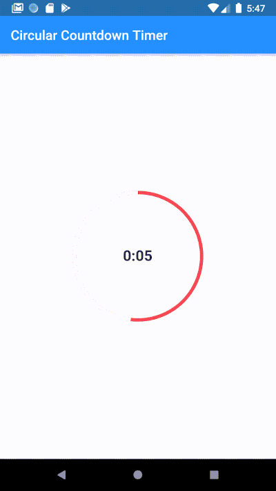
Circular Countdown Timer를 사용하여 애니메이션형 원형 카운트다운을 만드세요.
617좋아요 3만30일 다운로드140Pub 점수
AndroidiOSWebmacOSWindowsLinux
Circular Countdown Timer를 사용하여 애니메이션 원형 카운트다운 만들기

아래는 영문 원문 스냅샷입니다. 최신 내용은 GitHub에서 확인하세요.
Make an animated circular countdown using Circular Countdown Timer.
To use this plugin, add circular_countdown_timer as a dependency in your pubspec.yaml file.
CircularCountDownTimer(
     duration: 10,
     initialDuration: 0,
     controller: CountDownController(),
     width: MediaQuery.of(context).size.width / 2,
     height: MediaQuery.of(context).size.height / 2,
     ringColor: Colors.grey[300]!,
     ringGradient: null,
     fillColor: Colors.purpleAccent[100]!,
     fillGradient: null,
     backgroundColor: Colors.purple[500],
     backgroundGradient: null,
     strokeWidth: 20.0,
     strokeCap: StrokeCap.round,
     textStyle: TextStyle(
         fontSize: 33.0, color: Colors.white, fontWeight: FontWeight.bold),
     textAlign: TextAlign.center,
     textFormat: CountdownTextFormat.S,
     isReverse: false,
     isReverseAnimation: false,
     isTimerTextShown: true,
     autoStart: false,
     onStart: () {
        debugPrint('Countdown Started');
     },
     onComplete: () {
        debugPrint('Countdown Ended');
     },
     onChange: (String timeStamp) {
        debugPrint('Countdown Changed $timeStamp');
     },
     timeFormatterFunction: (defaultFormatterFunction, duration) {
        if (duration.inSeconds == 0) {
           return "Start";
        } else {
           return Function.apply(defaultFormatterFunction, [duration]);
        }
     },
 );
| Name | Type | Default Value | Description |
|---|---|---|---|
key |
Key |
null | Key for Countdown Timer. |
duration |
int |
null | Countdown duration in Seconds. |
initialDuration |
int |
0 | Countdown initial elapsed Duration in Seconds. |
controller |
CountDownController |
null | Controls (i.e Start, Pause, Resume, Restart) the Countdown Timer. |
width |
double |
null | Width of the Countdown Widget. |
height |
double |
null | Height of the Countdown Widget. |
ringColor |
Color |
null | Ring Color for Countdown Widget. |
ringGradient |
Gradient |
null | Ring Gradient for Countdown Widget. Note that ringColor will not be effective if gradient is provided. |
fillColor |
Color |
null | Filling Color for Countdown Widget. |
fillGradient |
Gradient |
null | Filling Gradient for Countdown Widget. Note that fillColor will not be effective if gradient is provided. |
backgroundColor |
Color |
null | Background Color for Countdown Widget. |
backgroundGradient |
Gradient |
null | Background Gradient for Countdown Widget. Note that backgroundColor will not be effective if gradient is provided. |
strokeWidth |
double |
5.0 | Border Thickness of the Countdown Ring. |
strokeCap |
StrokeCap |
StrokeCap.butt | Begin and end contours with a flat edge and no extension. |
textStyle |
TextStyle |
TextStyle(fontSize: 16.0,color: Colors.black,) | Text Style for Countdown Text. |
textFormat |
String |
null | Format for the Countdown Text. |
isReverse |
bool |
false | Handles Countdown Timer (true for Reverse Countdown (max to 0), false for Forward Countdown (0 to max)). |
isReverseAnimation |
bool |
false | Handles Animation Direction (true for Reverse Animation, false for Forward Animation). |
isTimerTextShown |
bool |
true | Handles visibility of the Countdown Text. |
autoStart |
bool |
true | Handles the timer start. |
onStart |
VoidCallback |
null | This Callback will execute when the Countdown Starts. |
onComplete |
VoidCallback |
null | This Callback will execute when the Countdown Ends. |
onChange |
ValueChanged<String> |
null | This Callback will execute when the Countdown Changes. |
timeFormatterFunction |
Function(Function(Duration duration) defaultFormatterFunction,Duration duration) |
null | This Callback allows you to format the current duration to any String in Countdown Widget. |


의존성 목록 3 개
{"sdk":"flutter"}{"sdk":"flutter"}^3.0.0사용 목적에 따라 검색하고 개발 활동을 비교한 뒤 원본 저장소에서 요구 사항을 확인하세요.
“A repository is the most basic element of GitHub.”
GitHub Docs — About repositories ↗