

 v1.0.8
flexible_dropdown
스크림을 탭하거나 스와이프하여 드롭다운을 닫을 수 있으며, 헤더(바리어)를 투명하게 설정합니다
15좋아요 10830일 다운로드150Pub 점수
AndroidiOSWebmacOSWindowsLinux
TrangLeQuynh/flexible_dropdown open-source repository details.

아래는 영문 원문 스냅샷입니다. 최신 내용은 GitHub에서 확인하세요.


Customize dropdown
Auto scroll to selected item position
Support BarrierShape.headerTrans to highlight the content above the flexible dropdown button
Allows the dropdown to be dismissed by tapping | panning the scrim or by pressing the escape key on the keyboard.
Allow to choose the Animation Type
First, add flexible_dropdown as a dependency in your pubspec.yaml file.
dependencies:
  flexible_dropdown: ^1.0.7
FlexibleDropdown(
  overlayChild: Container(
    height: 160,
    width: double.infinity,
    color: Colors.deepPurple,
  ),
  barrierColor: Colors.black38.withOpacity(.2),
  barrierShape: BarrierShape.headerTrans,
  textDirection: TextDirection.ltr,
  offset: Offset.zero,
  duration: const Duration(milliseconds: 400),
  animationType: AnimationType.size,
  animationAlignment: Alignment.topCenter,
  child: Container(
    decoration: BoxDecoration(
      borderRadius: BorderRadius.circular(6),
      color: Colors.blueAccent.withOpacity(.2),
    ),
    child: Padding(
      padding: const EdgeInsets.symmetric(vertical: 10, horizontal: 20),
      child: Text(
        title,
        style: const TextStyle(fontSize: 14, fontWeight: FontWeight.w500),
      ),
    ),
  ),
)
Usage to close the flexible dropdown:
Navigator.pop(context);
| scale | scaleX | scaleY |
|---|---|---|
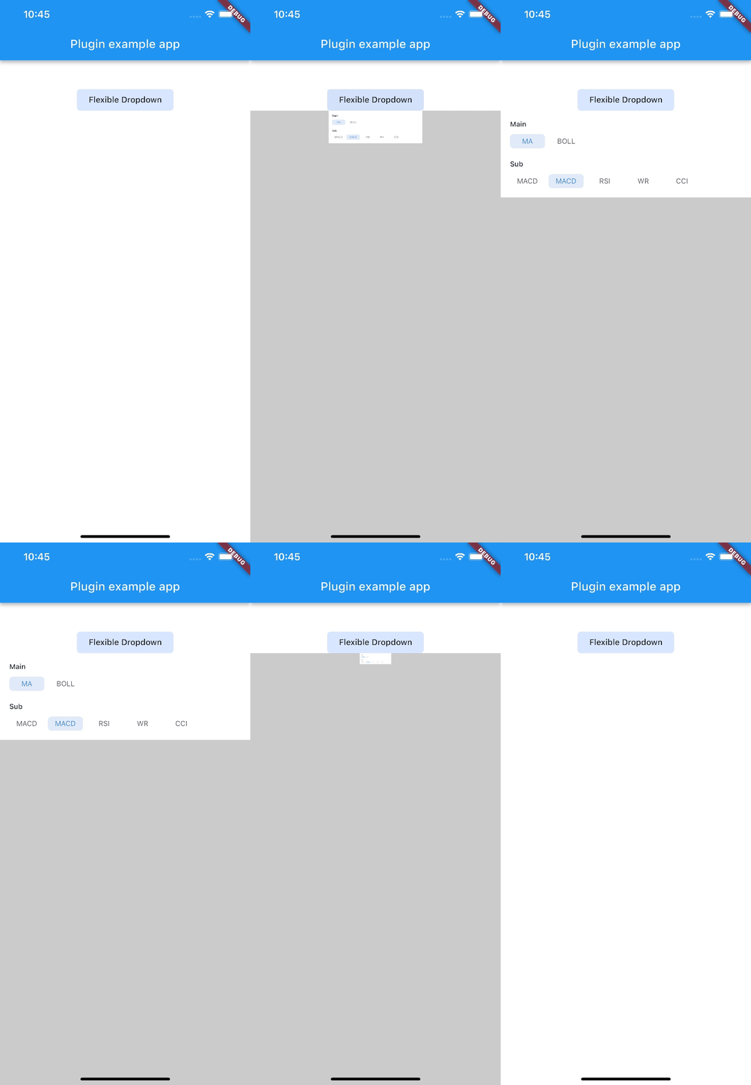 |
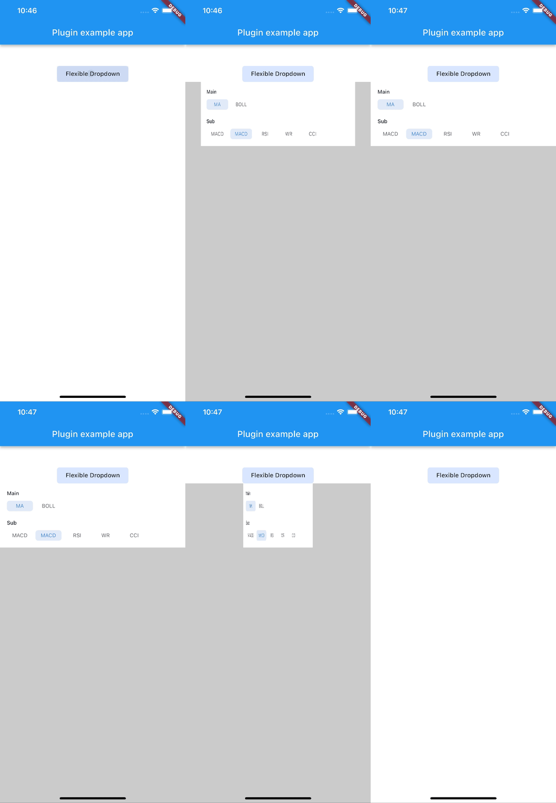 |
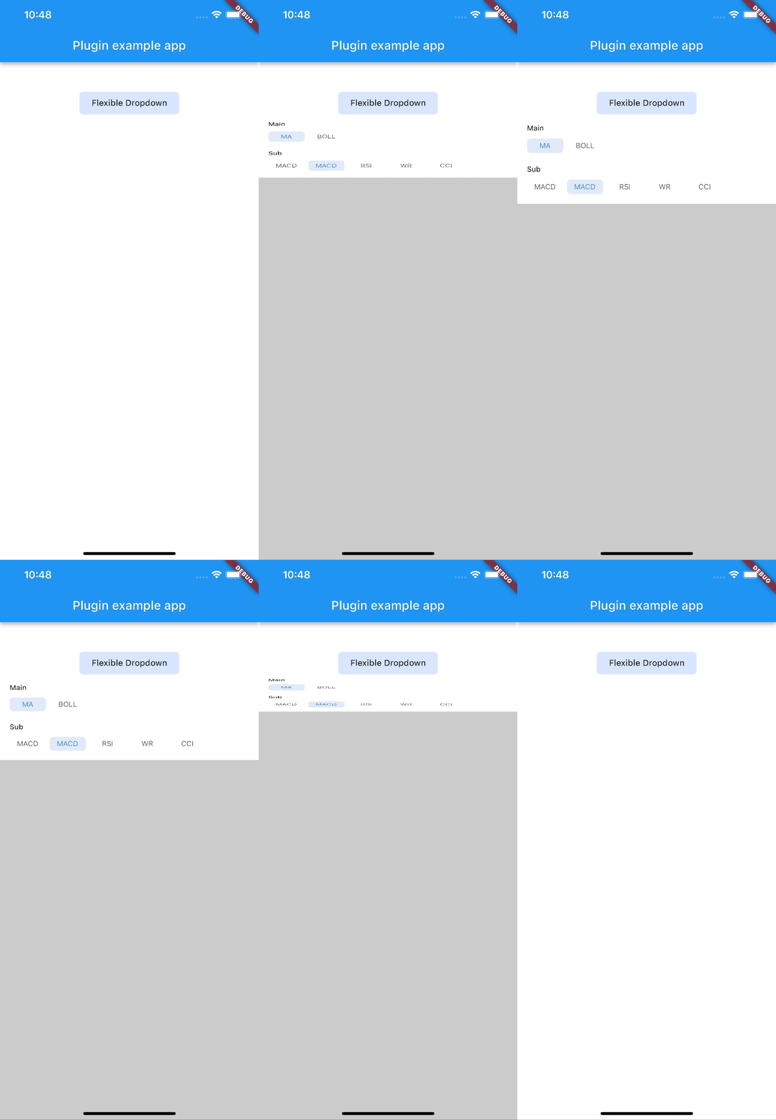 |
| size | slide | fade |
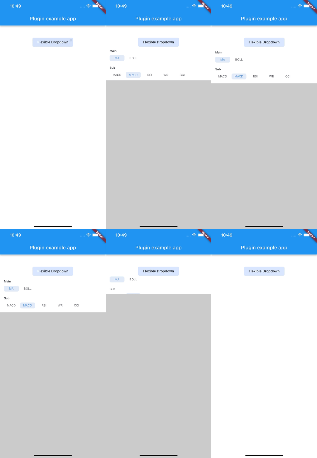 |
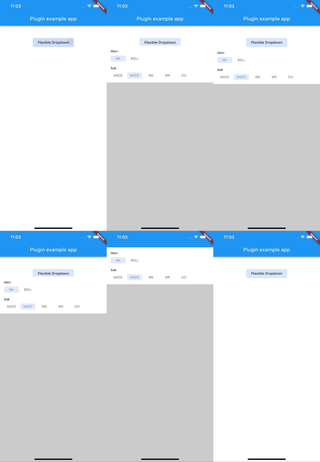 |
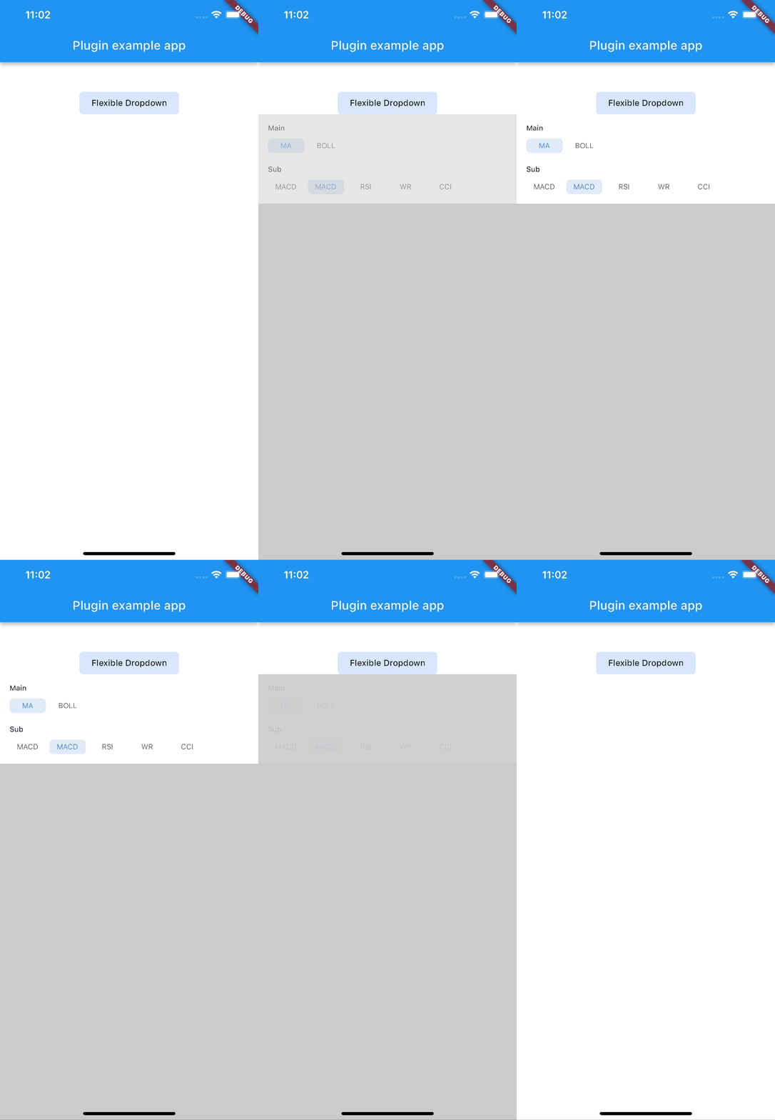 |
| rotate | ||
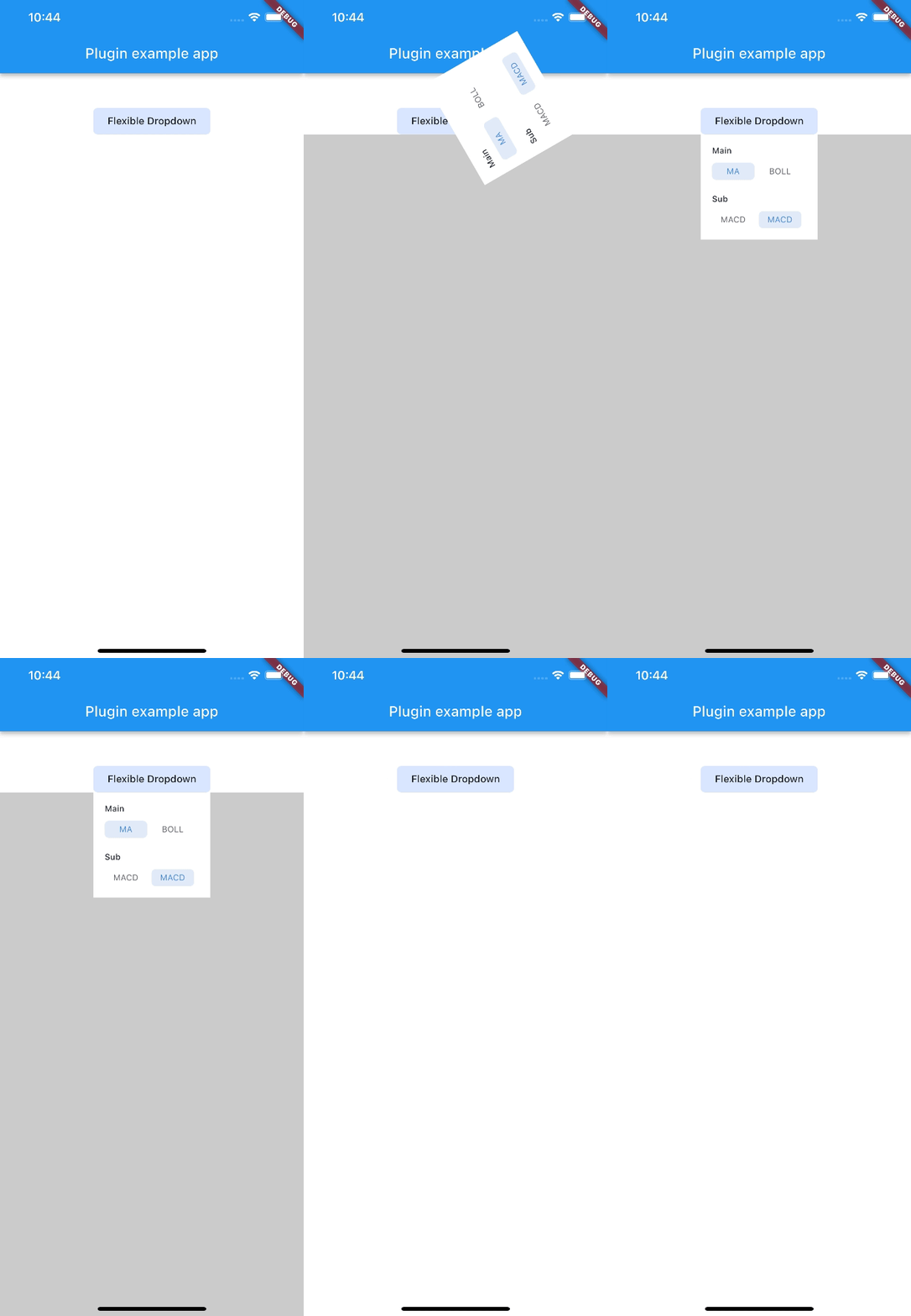 |
Note:
AnimationType.sizeis only suitable for width ofoverlayChildis full screen width.
의존성 목록 4 개
{"sdk":"flutter"}^2.0.2{"sdk":"flutter"}^2.0.0사용 목적에 따라 검색하고 개발 활동을 비교한 뒤 원본 저장소에서 요구 사항을 확인하세요.
“A repository is the most basic element of GitHub.”
GitHub Docs — About repositories ↗