패키지, 저장소 및 앱 카테고리 검색

flexible_dropdown 표지
패키지 상세v1.0.8

flexible_dropdown

스크림을 탭하거나 스와이프하여 드롭다운을 닫을 수 있으며, 헤더(바리어)를 투명하게 설정합니다

AndroidiOSWebmacOSWindowsLinux
30일 다운로드
108
좋아요
15
Pub 점수
150

패키지 설치

flutter pub add flexible_dropdown

패키지 개요

공개 정보를 바탕으로 생성한 선택 가이드입니다.

드롭다운 기능을 향상시키는 플러터 패키지로, 스크림을 탭하거나 스와이프하여 닫을 수 있으며, 장벽 효과가 있는 투명한 헤더를 지원합니다. 표준 드롭다운과 비교해 사용자 제어성과 부드러운 상호작용을 제공합니다. 여러 플랫폼에서 사용자 정의 가능하고 제스처 반응형 드롭다운 메뉴가 필요한 앱에 적합합니다. 이 패키지는 가볍고 pub.dev를 통해 쉽게 통합할 수 있습니다.

사용 사례

  • 사용자 정의 드롭다운 닫기
  • 제스처 기반 드롭다운 탐색
  • 투명한 헤더 디자인
  • 크로스 플랫폼 드롭다운 컴포넌트
  • 양식 및 선택 인터페이스의 사용자 경험 개선

주요 기능

  • 스크림을 터치하여 닫기
  • 팬-해제 제스처
  • 투명 헤더 지원
  • 백드롭의 장벽 효과
  • 크로스 플랫폼 호환성

적합한 대상

  • 인터랙티브 드롭다운을 찾는 개발자
  • 직관적인 사용자 제스처를 요구하는 앱
  • 시각적 명확성에 집중하는 디자이너
  • 다중 플랫폼 Flutter 애플리케이션
  • 드롭다운이 포함된 폼 중심의 UI

고려 사항

  • 제스처 충돌을 신중하게 처리해야 합니다
  • 복잡한 레이아웃의 경우 맞춤 스타일링이 필요할 수 있습니다
  • 기본 사용법 외에 문서가 제한적
  • 간단한 정적 드롭다운에 적합하지 않음
  • 많은 항목과 함께 가능한 성능 영향

원본 README

연결된 소스 저장소의 README 원문 스냅샷입니다. 최신 내용은 저장소에서 확인하세요.

Flexible Dropdown Package

Features

  • Customize dropdown

  • Auto scroll to selected item position

  • Support BarrierShape.headerTrans to highlight the content above the flexible dropdown button

  • Allows the dropdown to be dismissed by tapping | panning the scrim or by pressing the escape key on the keyboard.

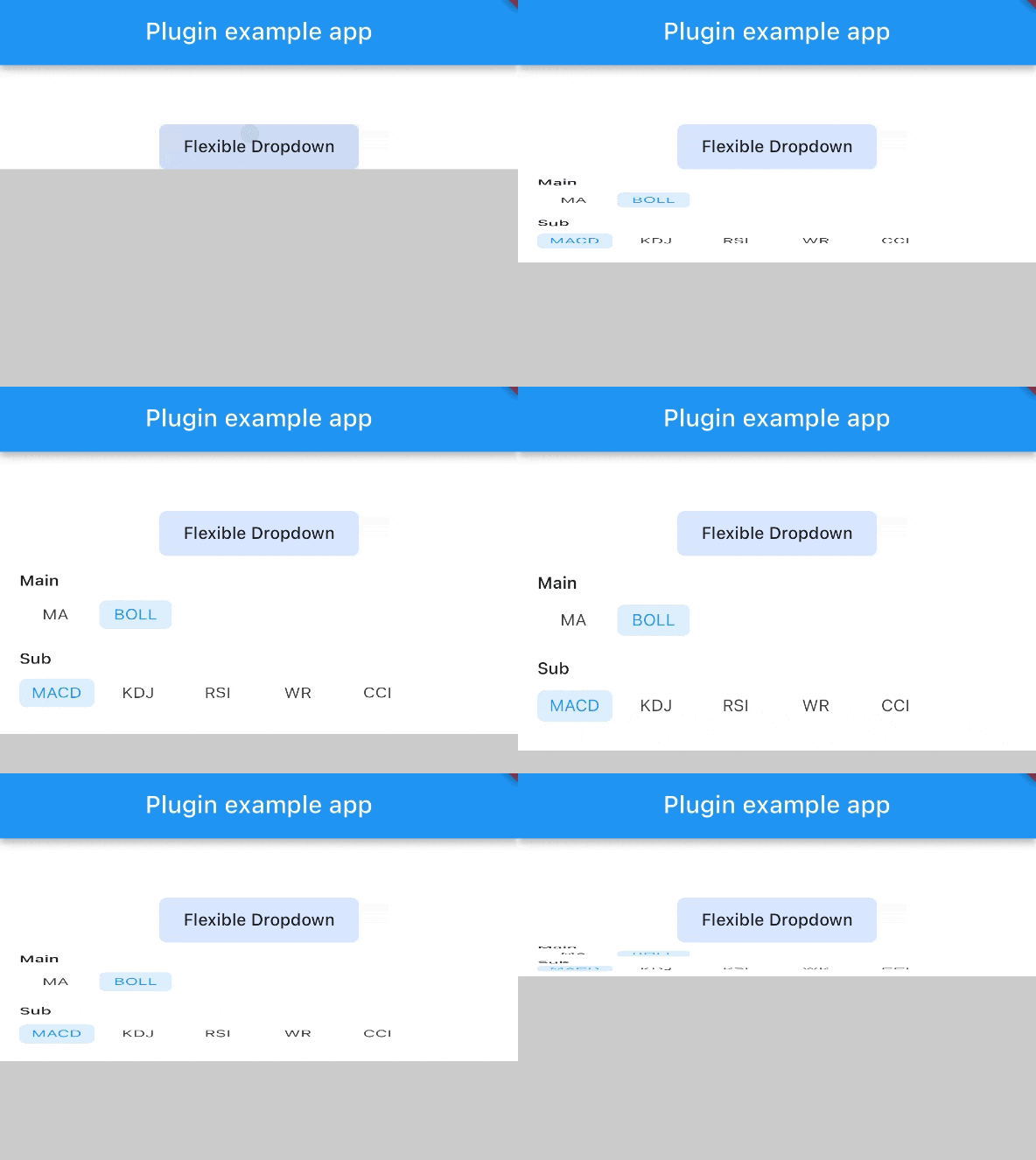
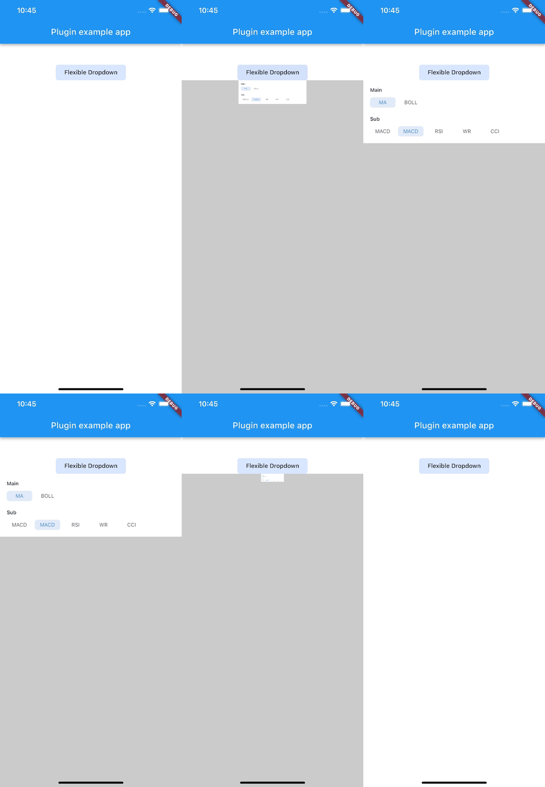
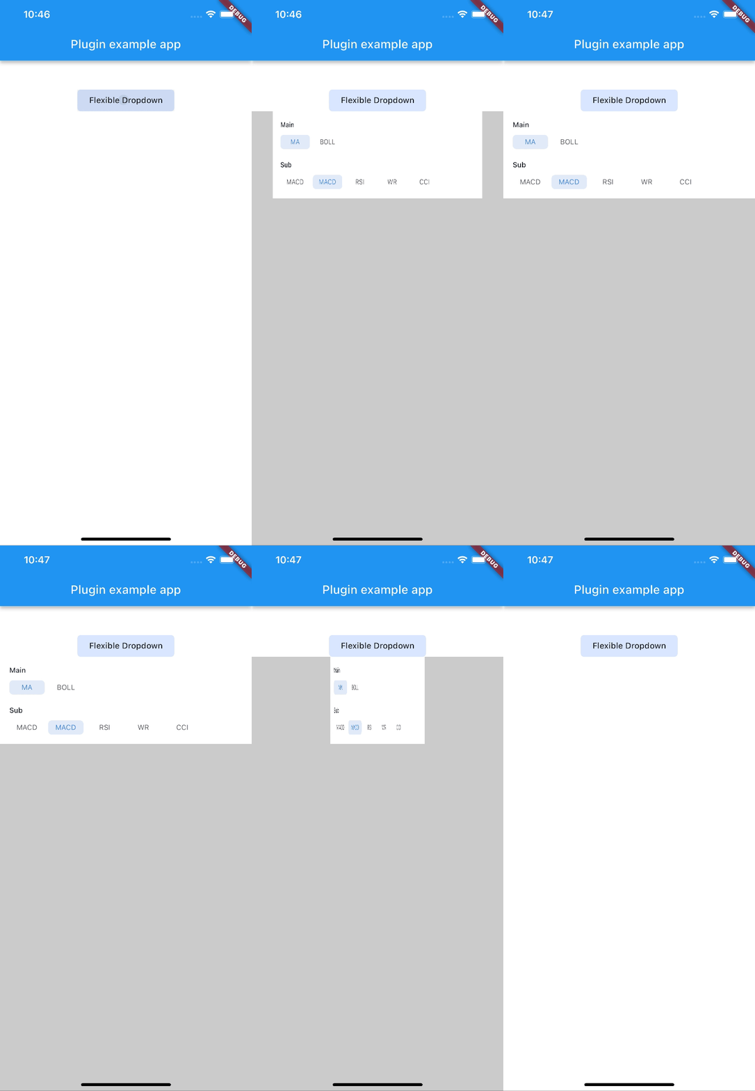
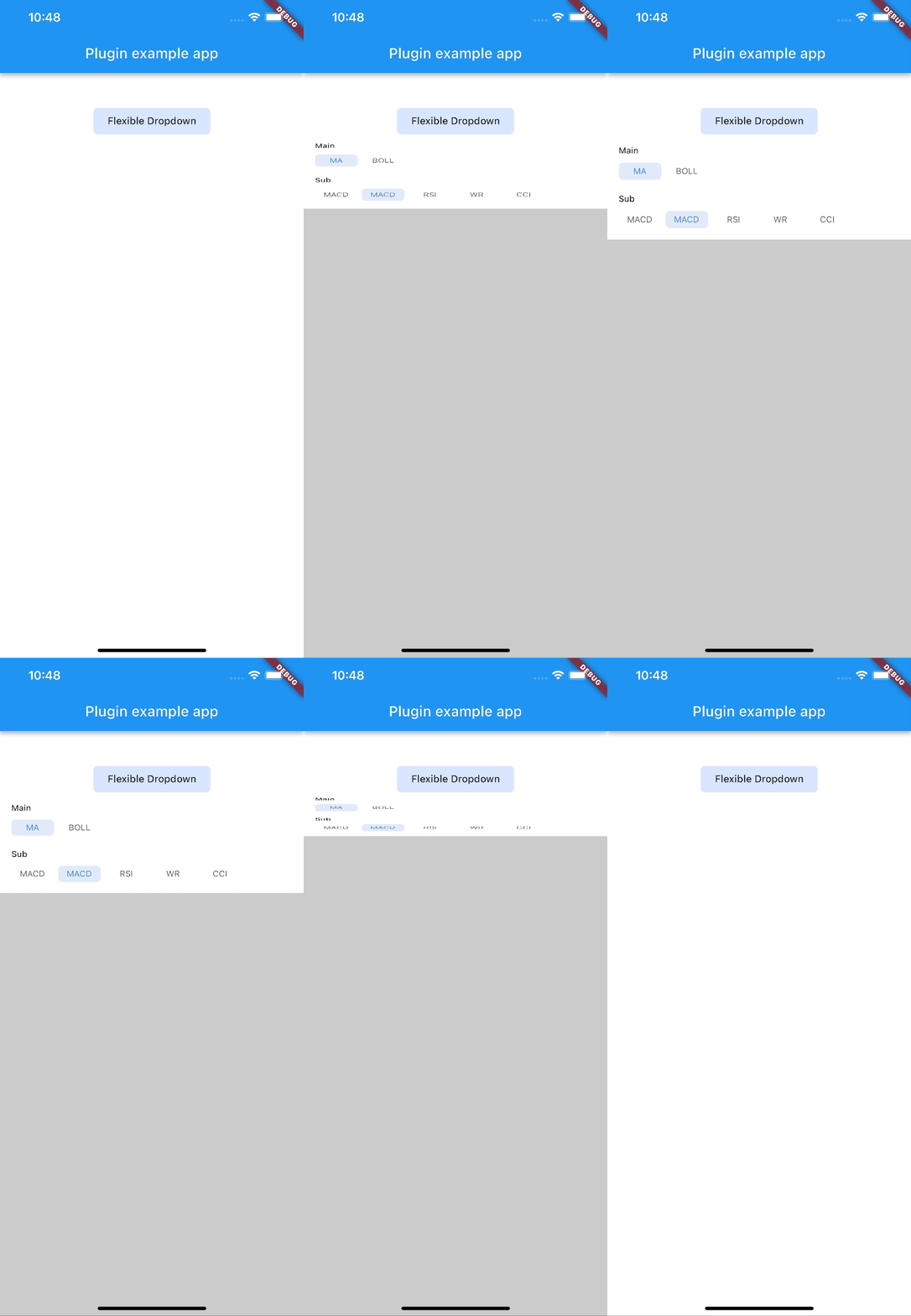
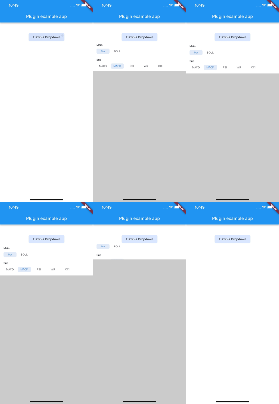
  • Allow to choose the Animation Type

Installation

First, add flexible_dropdown as a dependency in your pubspec.yaml file.

dependencies:
  flexible_dropdown: ^1.0.7

Usage

FlexibleDropdown(
  overlayChild: Container(
    height: 160,
    width: double.infinity,
    color: Colors.deepPurple,
  ),
  barrierColor: Colors.black38.withOpacity(.2),
  barrierShape: BarrierShape.headerTrans,
  textDirection: TextDirection.ltr,
  offset: Offset.zero,
  duration: const Duration(milliseconds: 400),
  animationType: AnimationType.size,
  animationAlignment: Alignment.topCenter,
  child: Container(
    decoration: BoxDecoration(
      borderRadius: BorderRadius.circular(6),
      color: Colors.blueAccent.withOpacity(.2),
    ),
    child: Padding(
      padding: const EdgeInsets.symmetric(vertical: 10, horizontal: 20),
      child: Text(
        title,
        style: const TextStyle(fontSize: 14, fontWeight: FontWeight.w500),
      ),
    ),
  ),
)

Usage to close the flexible dropdown:

Navigator.pop(context);

Animation Type

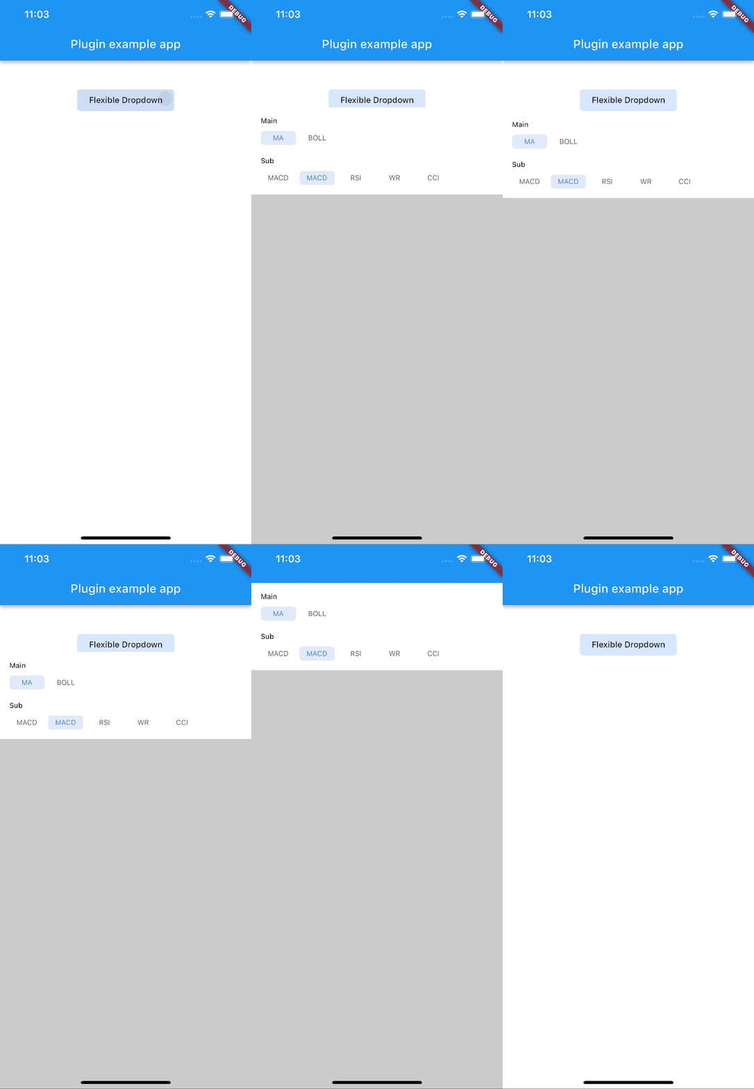
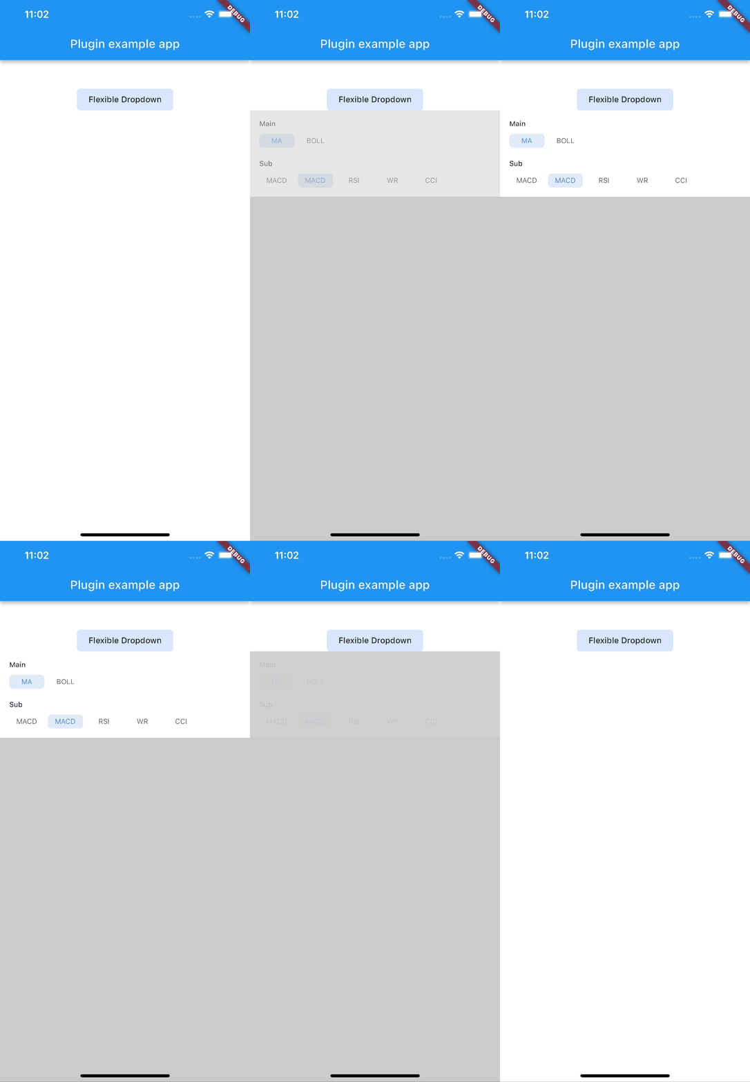
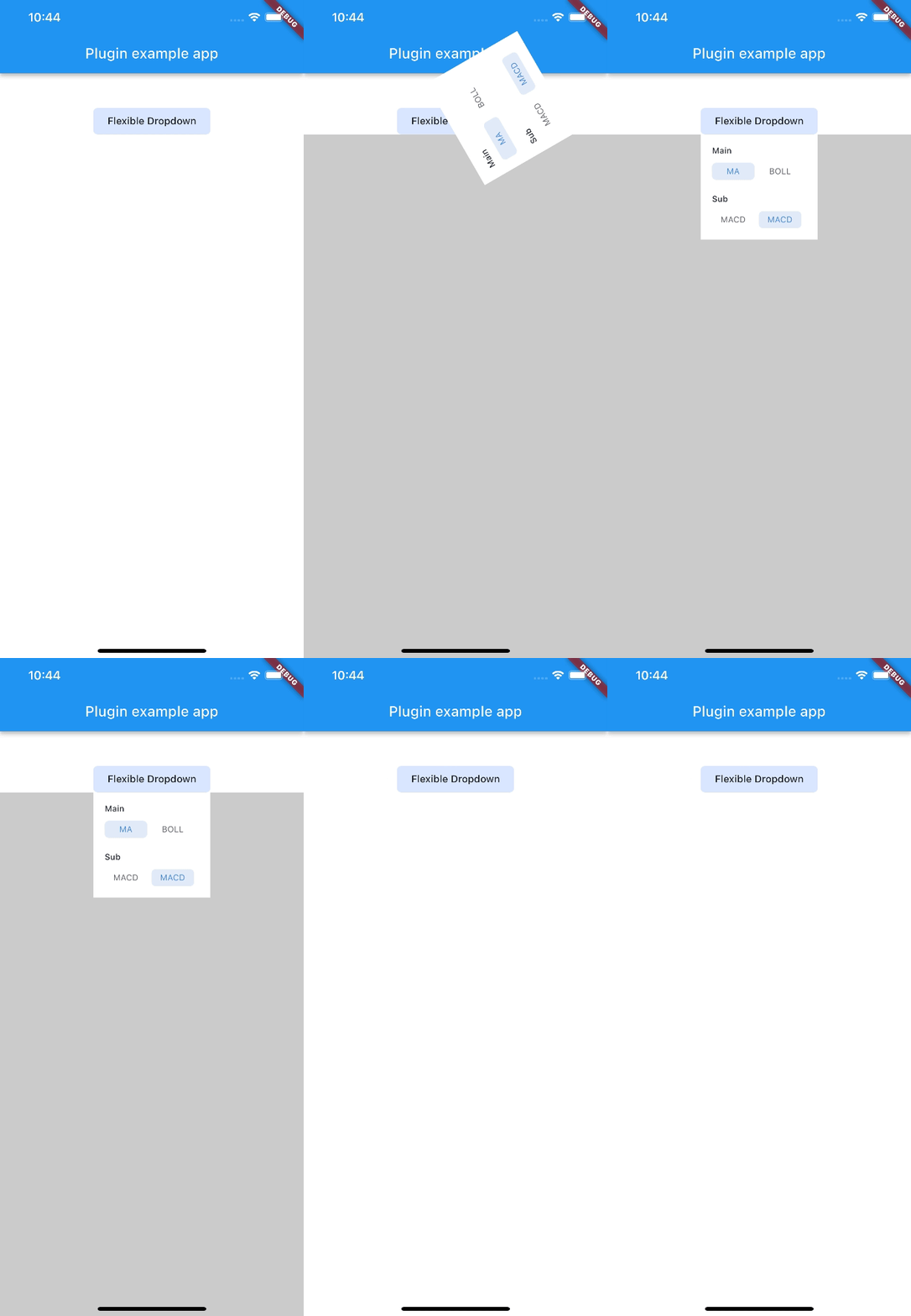
scale scaleX scaleY
size slide fade
rotate

Note: AnimationType.size is only suitable for width of overlayChild is full screen width.

카테고리

의존성

의존성 목록 1 개

  • plugin_platform_interface^2.0.2

소스 저장소

이 패키지를 사용하는 프로젝트

아직 데이터가 없습니다.