
 v0.0.8
square_progress_indicator
원본 플러터 CircularProgressIndicator 위젯과 유사한 사용자 정의 가능한 사각형 진행률 표시기를 만들 수 있습니다.
30좋아요 5천30일 다운로드160Pub 점수
AndroidiOSWebmacOSWindowsLinux
기본 플러터 CircularProgressIndicator 위젯과 유사하게 완전히 사용자 정의 가능한 사각형 또는 직사각형 진행률 인디케이터를 생성할 수 있는 라이브러리입니다!

{"sdk":"flutter"}{"sdk":"flutter"}^5.0.0아래는 영문 원문 스냅샷입니다. 최신 내용은 GitHub에서 확인하세요.
Create fully customizable square or rectangle progress indicators like native flutter CircularProgressIndicator widget!
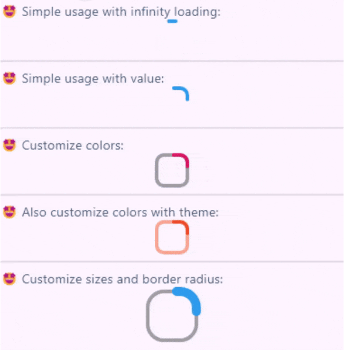
Full example of SquareProgressIndicator
You can check the example project web export on this link: https://amir14a.github.io/square_progress_indicator/ Thanks to Github!❤️
Simple usage:
const SquareProgressIndicator(),
Customize usage:
SquareProgressIndicator(
    value: _value,
    width: 100,
    height: 100,
    borderRadius: 0,
    startPosition: StartPosition.leftCenter,
    strokeCap: StrokeCap.square,
    clockwise: true,
    color: Colors.purple,
    emptyStrokeColor: Colors.purple.withOpacity(.5),
    strokeWidth: 16,
    emptyStrokeWidth: 16,
    strokeAlign: SquareStrokeAlign.center,
    child: Text("${(_value * 100).toStringAsFixed(0)}%"),
),
| Parameter | Type | Default | Info |
|---|---|---|---|
value |
double? | null |
The value of the progress, it should be between 0 and 1. don't pass it to use Indeterminate mode |
width |
double | 38 |
The width of rectangle that the progress line is drawn around it. |
height |
double | 38 |
The height of rectangle that the progress line is drawn around it. |
borderRadius |
double | 8 |
The border radius of the rectangle, it is applied to all four corners. |
color |
Color? | progressIndicatorTheme.color |
The color of the progress line. |
emptyStrokeColor |
Color? | progressIndicatorTheme.circularTrackColor |
The color of the line behind the progress line which show for reminding progress. |
strokeWidth |
double | 4 |
The width of the progress line. |
emptyStrokeWidth |
double | 4 |
The width of the line behind the progress line which show for reminding progress. |
clockwise |
boolean | true |
The direction of turn of progress line, if you pass false, the progress line will be reversed, default value is true. |
startPosition |
double | 0 (StartPosition.topCenter) |
Start position of progress line relative to the topCenter, you can pass a value from [StartPosition] class or custom double value you need. |
strokeAlign |
SquareStrokeAlign | SquareStrokeAlign.inside |
The stroke align of the progress line, pass a value from [SquareStrokeAlign] and read it's documents. see: https://api.flutter.dev/flutter/painting/BorderSide/strokeAlign.html |
strokeCap |
StrokeCap? | StrokeCap.round |
The stroke cap of the progress line and empty line, see: https://api.flutter.dev/flutter/dart-ui/StrokeCap.html |
child |
Widget? | null |
The child widget, it can be a text or everything you need. |
Feel free to create issue or pull requests in github repository!