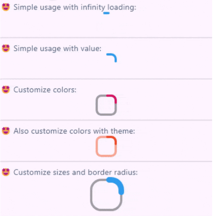
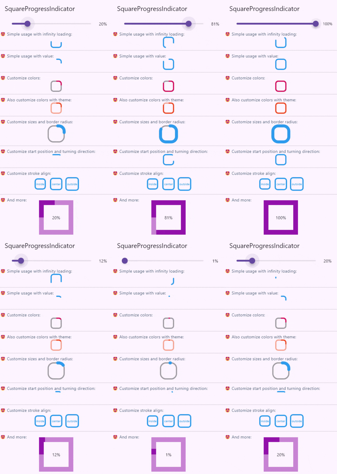
플러터용 사용자 정의 가능한 사각형 진행률 표시 위젯으로, 네이티브 CircularProgressIndicator에서 영감을 받았습니다. 사용자 지정 색상, 선 두께 및 애니메이션을 지원하며 원형 진행률 표시기의 현대적이고 컴팩트한 대안을 제공합니다. UI에 사각형 디자인이 더 잘 어울리는 앱의 로딩 상태에 적합합니다. 이 패키지는 가볍고 안드로이드, iOS, 웹, 맥OS, 윈도우, 리눅스를 포함한 모든 주요 플랫폼과 호환됩니다.
사용 사례
양식 내 로딩 표시기
대시보드에서 진행 상황 표시
모바일 앱에서의 사용자 정의 로딩 애니메이션
원형 프로그레스 바를 사각형으로 교체
마테리얼 디자인 앱에서 UI 일관성 향상
주요 기능
사각형 디자인
사용자 지정 가능한 색상 및 선 두께
부드러운 애니메이션
크로스 플랫폼 호환성
Flutter와의 간편한 통합
확장 가능한 스타일 옵션
적합한 대상
대체 진행 상태 표시기를 찾는 개발자
사각형 테마 인터페이스에 집중하는 UI 디자이너
일관된 로딩 시각 효과가 필요한 앱
다중 플랫폼을 대상으로 하는 Flutter 프로젝트
현대적인 미학을 갖춘 Material Design 프로젝트
고려 사항
정사각형 기하학으로 제한
복잡한 애니메이션을 위해 추가 스타일링이 필요할 수 있습니다
순환형 진행 상황 요구에 적합하지 않습니다
Flutter의 렌더링 성능에 따라 다릅니다
정사각형 형태가 디자인 언어와 일치하는 맥락에서 가장 효과적으로 사용됨
원본 README
연결된 소스 저장소의 README 원문 스냅샷입니다. 최신 내용은 저장소에서 확인하세요.
Create fully customizable square or rectangle progress indicators like native flutter CircularProgressIndicator widget!
The value of the progress, it should be between 0 and 1. don't pass it to use Indeterminate mode
width
double
38
The width of rectangle that the progress line is drawn around it.
height
double
38
The height of rectangle that the progress line is drawn around it.
borderRadius
double
8
The border radius of the rectangle, it is applied to all four corners.
color
Color?
progressIndicatorTheme.color
The color of the progress line.
emptyStrokeColor
Color?
progressIndicatorTheme.circularTrackColor
The color of the line behind the progress line which show for reminding progress.
strokeWidth
double
4
The width of the progress line.
emptyStrokeWidth
double
4
The width of the line behind the progress line which show for reminding progress.
clockwise
boolean
true
The direction of turn of progress line, if you pass false, the progress line will be reversed, default value is true.
startPosition
double
0 (StartPosition.topCenter)
Start position of progress line relative to the topCenter, you can pass a value from [StartPosition] class or custom double value you need.
strokeAlign
SquareStrokeAlign
SquareStrokeAlign.inside
The stroke align of the progress line, pass a value from [SquareStrokeAlign] and read it's documents. see: https://api.flutter.dev/flutter/painting/BorderSide/strokeAlign.html
strokeCap
StrokeCap?
StrokeCap.round
The stroke cap of the progress line and empty line, see: https://api.flutter.dev/flutter/dart-ui/StrokeCap.html
child
Widget?
null
The child widget, it can be a text or everything you need.