
 v3.1.0
slider_button
어떤 이벤트를 활성화/비활성화하기 위한 사용자 정의 가능한 슬라이더 버튼 위젯입니다.
392좋아요 5.2천30일 다운로드150Pub 점수
AndroidiOS
슬라이더 버튼 위젯을 생성하기 위한 플러터 패키지입니다.

아래는 영문 원문 스냅샷입니다. 최신 내용은 GitHub에서 확인하세요.
Open Source Love
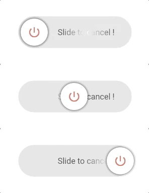
This package provides an easy implementation of a Slider Button to cancel current transaction or screen. Highly customizable iphone alike looking widget.
https://github.com/anirudhsharma392/Slider-Button/blob/master/screenshots/buttons.gif?raw=true
radius to switch between circular and rectangular slider.vibrationFlag).buttonSize, buttonWidth, height, width for full control.disable: true to grey out and prevent sliding (with tooltip).rightToLeftLocale: true for right-to-left slide direction.dismissThresholds).useGlassEffect, glassBlurSigma, glassBorderColor, glassBorderWidth).This is a Circle type widget. You just need to define the border radius to swap between rectangle and circle type widget.
https://github.com/anirudhsharma392/Slider-Button/blob/master/screenshots/button_3.gif?raw=true
This is a Rectangle type widget.
https://github.com/anirudhsharma392/Slider-Button/blob/master/screenshots/button_2.gif?raw=true
import 'package:slider_button/slider_button.dart';
SliderButton(
      action: () async{
        ///Do something here OnSlide
        return true; //return false if you want to avoid dismissing the widget in the tree.
      },

      ///Put label over here
      label: Text(
        "Slide to cancel !",
        style: TextStyle(
            color: Color(0xff4a4a4a),
            fontWeight: FontWeight.w500,
            fontSize: 17),
      ),
      icon: Center(
          child: Icon(
        Icons.power_settings_new,
        color: Colors.white,
        size: 40.0,
        semanticLabel: 'Text to announce in accessibility modes',
      )),

      ///Change All the color and size from here.
      width: 230,
      radius: 10,
      buttonColor: Color(0xffd60000),
      backgroundColor: Color(0xff534bae),
      highlightedColor: Colors.white,
      baseColor: Colors.red,
    );
There are several options that allow for more control:
| Properties | Default | Description |
|---|---|---|
action |
— | (required) Define an action after sliding; return true to dismiss, false to keep. |
buttonKey |
null | Custom key for the button. Useful for dynamic labels. |
child |
null | Your own widget for a fully customizable slider button. |
vibrationFlag |
false | Enable haptic vibration on successful slide. |
height |
70 | Height of the widget. |
width |
270 | Width of the widget. |
buttonSize |
null (→ 60) | Size of the sliding button (square). Must be ≤ height. |
buttonWidth |
null | Width of the button when not squared (e.g. wide sliders). |
backgroundColor |
Color(0xffe0e0e0) | Background color of the track. |
baseColor |
Colors.black87 | Shimmer base color for the label. |
highlightedColor |
Colors.white | Shimmer highlight color for the label. |
buttonColor |
Colors.white | Color of the sliding button. |
label |
null | Widget used as the label (e.g. Text). |
alignLabel |
Alignment(0.6, 0) | Alignment of the label. |
boxShadow |
null | Shadow for the sliding button. |
icon |
null | Widget shown on the sliding button (e.g. icon or text). |
shimmer |
true | Enable or disable shimmer effect on the label. |
dismissThresholds |
0.75 | Drag threshold (0.0–1.0); e.g. 0.75 = 75% of width to dismiss. |
disable |
false | When true, disables sliding and shows disabled state with tooltip. |
rightToLeftLocale |
false | When true, slide direction is right-to-left (for RTL locales). |
useGlassEffect |
false | When true, track uses frosted glass (blur + translucency). |
glassBlurSigma |
20 | Blur strength for the glass track when useGlassEffect is true. |
glassBorderColor |
null | Border color for the glass track (e.g. white); null = no border. |
glassBorderWidth |
1.0 | Border width for the glass track when glassBorderColor is set. |