부드러운 슬라이딩 제스처를 통해 이벤트를 활성화하거나 비활성화하기 위해 설계된 사용자 정의 가능한 슬라이더 버튼 위젯입니다. Flutter로 구현되어 있으며, 설정 전환, 기능 활성화 또는 작업 확인에 적합한 깔끔하고 상호작용이 풍부한 인터페이스를 제공합니다. 사용자 정의 스타일, 애니메이션 및 다중 플랫폼에서의 반응형 동작을 지원합니다. 가볍고 기존의 Flutter 애플리케이션에 쉽게 통합할 수 있습니다. 폼, 선호도 설정 및 온보딩 흐름과 같이 직관적인 사용자 인터랙션이 중요한 경우에 이상적입니다.
사용 사례
앱 설정 전환
기능 켜기/끄기
사용자 온보딩 확인
폼 입력 활성화
선호도 스위치
주요 기능
사용자 정의 가능한 외관
부드러운 슬라이딩 애니메이션
반응형 터치 피드백
간편한 통합
크로스 플랫폼 호환성
적합한 대상
간단한 토글 인터페이스
설정 패널
온보딩 화면
모바일 앱 개발자
사용자 인터페이스 중심 프로젝트
고려 사항
기본 토글 기능에 제한됨
상태를 수동으로 처리해야 함
복잡한 상호작용에 적합하지 않음
내장된 접근성 기능이 최소한
기본적으로 다크 모드를 지원하지 않습니다
원본 README
연결된 소스 저장소의 README 원문 스냅샷입니다. 최신 내용은 저장소에서 확인하세요.
Slider Button v3.1.0
This package provides an easy implementation of a Slider Button to cancel current transaction or screen.
Highly customizable iphone alike looking widget.
Null safety supported
Features
Circle or rectangle — Use radius to switch between circular and rectangular slider.
Shimmer label — Optional shimmer effect on the label (customizable colors).
Vibration — Optional haptic feedback on successful slide (vibrationFlag).
Customizable size — buttonSize, buttonWidth, height, width for full control.
Disabled state — Use disable: true to grey out and prevent sliding (with tooltip).
RTL support — Use rightToLeftLocale: true for right-to-left slide direction.
Dismiss threshold — Control how far the user must slide to confirm (dismissThresholds).
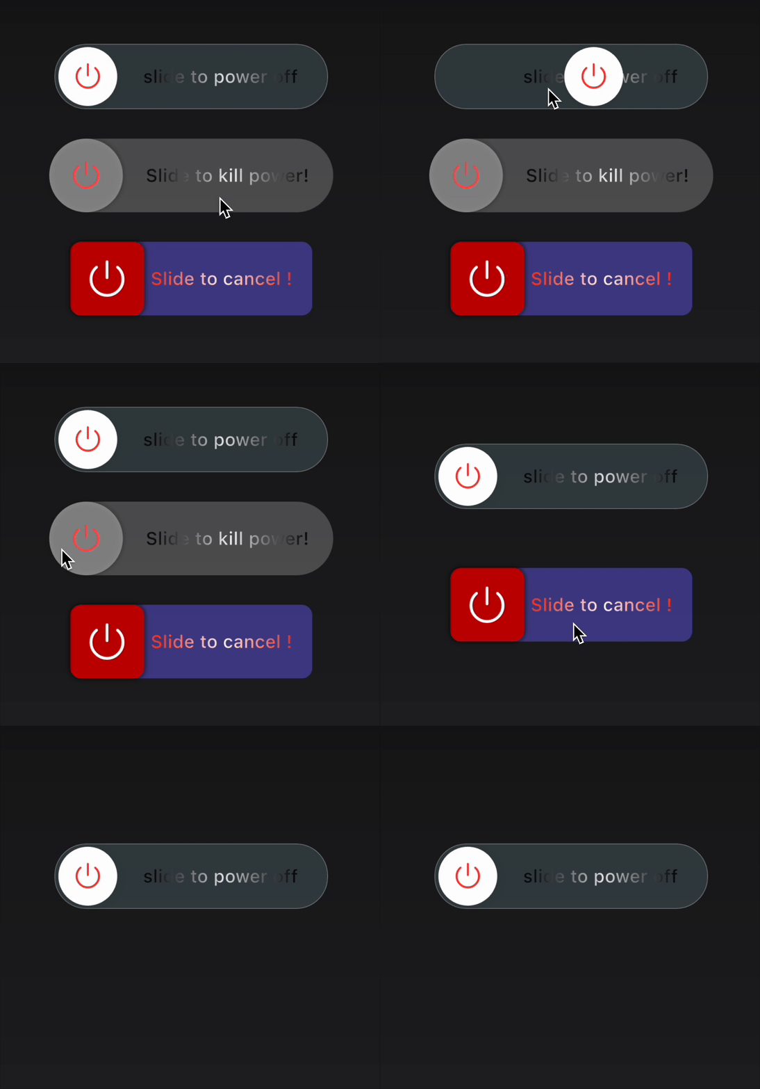
Glass effect — Frosted glass track with blur and optional white border (useGlassEffect, glassBlurSigma, glassBorderColor, glassBorderWidth).
How to use
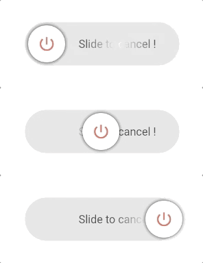
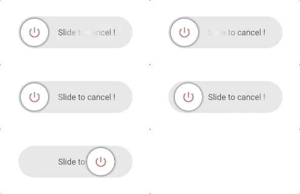
Type 1
This is a Circle type widget.
You just need to define the border radius to swap between rectangle and circle type widget.
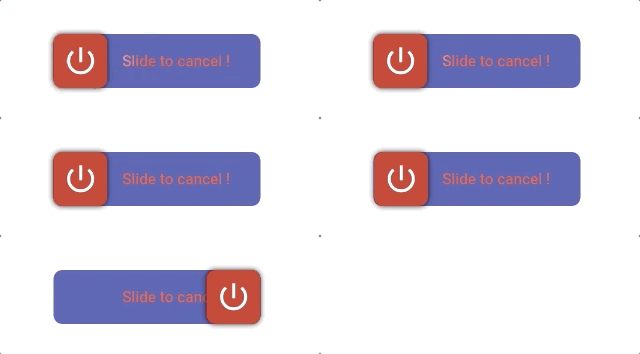
Type 2
This is a Rectangle type widget.
import'package:slider_button/slider_button.dart';
SliderButton(
action: () async{
///Do something here OnSlidereturntrue; //return false if you want to avoid dismissing the widget in the tree.
},
///Put label over here
label: Text(
"Slide to cancel !",
style: TextStyle(
color: Color(0xff4a4a4a),
fontWeight: FontWeight.w500,
fontSize: 17),
),
icon: Center(
child: Icon(
Icons.power_settings_new,
color: Colors.white,
size: 40.0,
semanticLabel: 'Text to announce in accessibility modes',
)),
///Change All the color and size from here.
width: 230,
radius: 10,
buttonColor: Color(0xffd60000),
backgroundColor: Color(0xff534bae),
highlightedColor: Colors.white,
baseColor: Colors.red,
);
Custom Usage
There are several options that allow for more control:
Properties
Default
Description
action
—
(required) Define an action after sliding; return true to dismiss, false to keep.
buttonKey
null
Custom key for the button. Useful for dynamic labels.
child
null
Your own widget for a fully customizable slider button.
vibrationFlag
false
Enable haptic vibration on successful slide.
height
70
Height of the widget.
width
270
Width of the widget.
buttonSize
null (→ 60)
Size of the sliding button (square). Must be ≤ height.
buttonWidth
null
Width of the button when not squared (e.g. wide sliders).
backgroundColor
Color(0xffe0e0e0)
Background color of the track.
baseColor
Colors.black87
Shimmer base color for the label.
highlightedColor
Colors.white
Shimmer highlight color for the label.
buttonColor
Colors.white
Color of the sliding button.
label
null
Widget used as the label (e.g. Text).
alignLabel
Alignment(0.6, 0)
Alignment of the label.
boxShadow
null
Shadow for the sliding button.
icon
null
Widget shown on the sliding button (e.g. icon or text).
shimmer
true
Enable or disable shimmer effect on the label.
dismissThresholds
0.75
Drag threshold (0.0–1.0); e.g. 0.75 = 75% of width to dismiss.
disable
false
When true, disables sliding and shows disabled state with tooltip.
rightToLeftLocale
false
When true, slide direction is right-to-left (for RTL locales).
useGlassEffect
false
When true, track uses frosted glass (blur + translucency).
glassBlurSigma
20
Blur strength for the glass track when useGlassEffect is true.
glassBorderColor
null
Border color for the glass track (e.g. white); null = no border.
glassBorderWidth
1.0
Border width for the glass track when glassBorderColor is set.
👍 Contribution
Fork it
Create your feature branch (git checkout -b my-new-feature)
Commit your changes (git commit -m 'Add some feature')
Push to the branch (git push origin my-new-feature)