
 v1.4.2+1
menu_button
드롭다운 목록에서 항목을 쉽게 선택할 수 있도록 사용자 정의 가능한 메뉴 버튼 위젯
134좋아요 3230일 다운로드70Pub 점수
플랫폼 정보 없음
아름다운 디자인과 사용이 간편한 팝업 메뉴 버튼 위젯을 표시하기 위한 플러터 플러그인입니다.

{"sdk":"flutter"}{"sdk":"flutter"}아래는 영문 원문 스냅샷입니다. 최신 내용은 GitHub에서 확인하세요.
Pub Package License
Flutter widget to display a popup menu button very simply and easily customizable.
Add menu_button: ^1.4.2+1 in your pubspec.yaml dependencies. And import it:
import 'package:menu_button/menu_button.dart';
The widget has a lot of properties to customize it, we will see here the ones needed to get a "basic" menu button.
Firstly we have to declare a variable to keep the selected item (selectedKey) and a list that contains all the items we want to display in this menu button.
Here we will make a list of strings that we will call keys and that contains the values Low, Medium & High.
String selectedKey;

List<String> keys = <String>[
  'Low',
  'Medium',
  'High',
];
Now that we have these two elements we can start using the MenuButton<T> widget.
MenuButton<String>(
  child: normalChildButton,
  items: keys,
  itemBuilder: (String value) => Container(
   height: 40,
   alignment: Alignment.centerLeft,
   padding: const EdgeInsets.symmetric(vertical: 0.0, horizontal: 16),
   child: Text(value),
  ),
  toggledChild: Container(
    child: normalChildButton,
  ),
  onItemSelected: (String value) {
    setState(() {
      selectedKey = value;
    });
  },
  onMenuButtonToggle: (bool isToggle) {
    print(isToggle);
  },
)
And finally here is an example of the child widget used for the MenuButton above:
final Widget normalChildButton = SizedBox(
  width: 93,
  height: 40,
  child: Padding(
    padding: const EdgeInsets.only(left: 16, right: 11),
    child: Row(
      mainAxisAlignment: MainAxisAlignment.spaceBetween,
      children: <Widget>[
        Flexible(
          child: Text(selectedKey, overflow: TextOverflow.ellipsis)
        ),
        const SizedBox(
          width: 12,
          height: 17,
          child: FittedBox(
            fit: BoxFit.fill,
            child: Icon(
              Icons.arrow_drop_down,
              color: Colors.grey,
            ),
          ),
        ),
      ],
    ),
  ),
);
Of course you can make your own according to your needs.
| Parameter | Description |
|---|---|
child |
A widget to display the default button to trigger the menu button |
items |
The list that contains all values that you want to display on the menu button |
itemBuilder |
A widget to design each item of the menu button |
onItemSelected |
Function triggered when an item is selected |
onMenuButtonToggle |
Function triggered when menu button is triggered (true if displayed, false if not) |
toggledChild |
Same as child but when the menu button is opened |
| Parameter | Description |
|---|---|
crossTheEdge |
By default false you can set it to true if you want the button to expand |
divider |
A custom divider between each items |
decoration |
A custom decoration for menu button |
edgeMargin |
By default 0 add a custom value to prevent the button to not touch the edge, check the example edge_menu_button.dart for more information |
itemBackgroundColor |
By default Colors.white add custom Colors to customize the background of every items |
label |
Add a widget to display a custom label as MaterialDesign on top of the button, check label_menu_button.dart for more information |
labelDecoration |
If you use a label you can set a custom LabelDecoration |
menuButtonBackgroundColor |
By default Colors.white add custom Colors to customize the background of the menu button |
popupHeight |
By default popupHeight is automatically calculated but if you need a custom height use this property |
scrollPhysics |
By default items are not scrollable (NeverScrollableScrollPhysics), add a ScrollPhysics to enable it, for instance AlwaysScrollableScrollPhysics |
showSelectedItemOnList |
By default true, set it to false if you don't want the selected items in the list |
For a more detail example please take a look at the example folder.
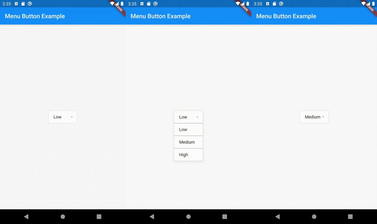
Menu button with 3 items:
https://raw.githubusercontent.com/huextrat/menu_button/master/example/new_example.gifIf something is missing, feel free to open a ticket or contribute!