패키지, 저장소 및 앱 카테고리 검색

menu_button 표지
패키지 상세v1.4.2+1

menu_button

드롭다운 목록에서 항목을 쉽게 선택할 수 있도록 사용자 정의 가능한 메뉴 버튼 위젯

30일 다운로드
72
좋아요
134
Pub 점수
70

패키지 설치

flutter pub add menu_button

패키지 개요

공개 정보를 바탕으로 생성한 선택 가이드입니다.

menu_button 패키지는 Flutter용 사용자 정의 가능한 드롭다운 메뉴 버튼 위젯을 제공하여 사용자가 목록에서 항목을 쉽게 선택할 수 있도록 합니다. 제한된 공간이 필요한 폼이나 설정에 적합한 깔끔하고 직관적인 인터페이스를 제공합니다. 외관, 동작 및 애니메이션의 커스터마이징을 지원하여 다양한 디자인 요구에 대응할 수 있습니다. 기존의 Flutter 앱과 원활하게 통합되며, 복잡한 구현 없이도 사용자 상호작용을 향상시킵니다.

사용 사례

  • 드롭다운 옵션을 가진 폼 입력
  • 설정 패널 및 옵션 선택
  • 사용자 정의 가능한 탐색 메뉴
  • 모바일 친화적인 드롭다운 인터페이스
  • 간소화된 데이터 입력 워크플로우

주요 기능

  • 매우 사용자 정의 가능한 외관
  • 부드러운 전환 애니메이션
  • Flutter UI와의 간편한 통합
  • 사용자 정의 항목 빌더를 지원합니다
  • 접근성 있고 반응형 디자인

적합한 대상

  • 인터랙티브 폼을 구축하는 개발자
  • 유연한 드롭다운 컴포넌트를 찾는 디자이너
  • 경량 메뉴 솔루션을 필요로 하는 앱
  • 사용자 경험을 우선시하는 프로젝트
  • 크로스 플랫폼 앱에 플러터를 사용하는 팀

고려 사항

  • 제한된 플랫폼별 스타일 옵션
  • 내장된 검증 지원 없음
  • 선택 콜백을 수동으로 처리해야 합니다
  • 매우 긴 목록에 최적화되지 않음
  • 고급 기능을 위해 외부 종속성에 의존합니다

원본 README

연결된 소스 저장소의 README 원문 스냅샷입니다. 최신 내용은 저장소에서 확인하세요.

menu_button

Pub Package License

Flutter widget to display a popup menu button very simply and easily customizable.

Resources

Installations

Add menu_button: ^1.4.2+1 in your pubspec.yaml dependencies. And import it:

import 'package:menu_button/menu_button.dart';

Usage

The widget has a lot of properties to customize it, we will see here the ones needed to get a "basic" menu button.

Firstly we have to declare a variable to keep the selected item (selectedKey) and a list that contains all the items we want to display in this menu button.

Here we will make a list of strings that we will call keys and that contains the values Low, Medium & High.

String selectedKey;

List<String> keys = <String>[
  'Low',
  'Medium',
  'High',
];

Now that we have these two elements we can start using the MenuButton<T> widget.

MenuButton<String>(
  child: normalChildButton,
  items: keys,
  itemBuilder: (String value) => Container(
   height: 40,
   alignment: Alignment.centerLeft,
   padding: const EdgeInsets.symmetric(vertical: 0.0, horizontal: 16),
   child: Text(value),
  ),
  toggledChild: Container(
    child: normalChildButton,
  ),
  onItemSelected: (String value) {
    setState(() {
      selectedKey = value;
    });
  },
  onMenuButtonToggle: (bool isToggle) {
    print(isToggle);
  },
)

And finally here is an example of the child widget used for the MenuButton above:

final Widget normalChildButton = SizedBox(
  width: 93,
  height: 40,
  child: Padding(
    padding: const EdgeInsets.only(left: 16, right: 11),
    child: Row(
      mainAxisAlignment: MainAxisAlignment.spaceBetween,
      children: <Widget>[
        Flexible(
          child: Text(selectedKey, overflow: TextOverflow.ellipsis)
        ),
        const SizedBox(
          width: 12,
          height: 17,
          child: FittedBox(
            fit: BoxFit.fill,
            child: Icon(
              Icons.arrow_drop_down,
              color: Colors.grey,
            ),
          ),
        ),
      ],
    ),
  ),
);

Of course you can make your own according to your needs.

Basic Parameters

Parameter Description
child A widget to display the default button to trigger the menu button
items The list that contains all values that you want to display on the menu button
itemBuilder A widget to design each item of the menu button
onItemSelected Function triggered when an item is selected
onMenuButtonToggle Function triggered when menu button is triggered (true if displayed, false if not)
toggledChild Same as child but when the menu button is opened

More Parameters

Parameter Description
crossTheEdge By default false you can set it to true if you want the button to expand
divider A custom divider between each items
decoration A custom decoration for menu button
edgeMargin By default 0 add a custom value to prevent the button to not touch the edge, check the example edge_menu_button.dart for more information
itemBackgroundColor By default Colors.white add custom Colors to customize the background of every items
label Add a widget to display a custom label as MaterialDesign on top of the button, check label_menu_button.dart for more information
labelDecoration If you use a label you can set a custom LabelDecoration
menuButtonBackgroundColor By default Colors.white add custom Colors to customize the background of the menu button
popupHeight By default popupHeight is automatically calculated but if you need a custom height use this property
scrollPhysics By default items are not scrollable (NeverScrollableScrollPhysics), add a ScrollPhysics to enable it, for instance AlwaysScrollableScrollPhysics
showSelectedItemOnList By default true, set it to false if you don't want the selected items in the list

For a more detail example please take a look at the example folder.

Example

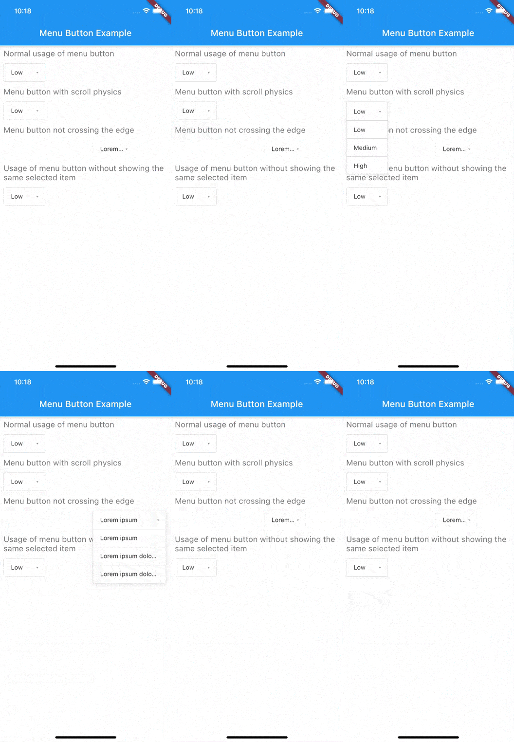
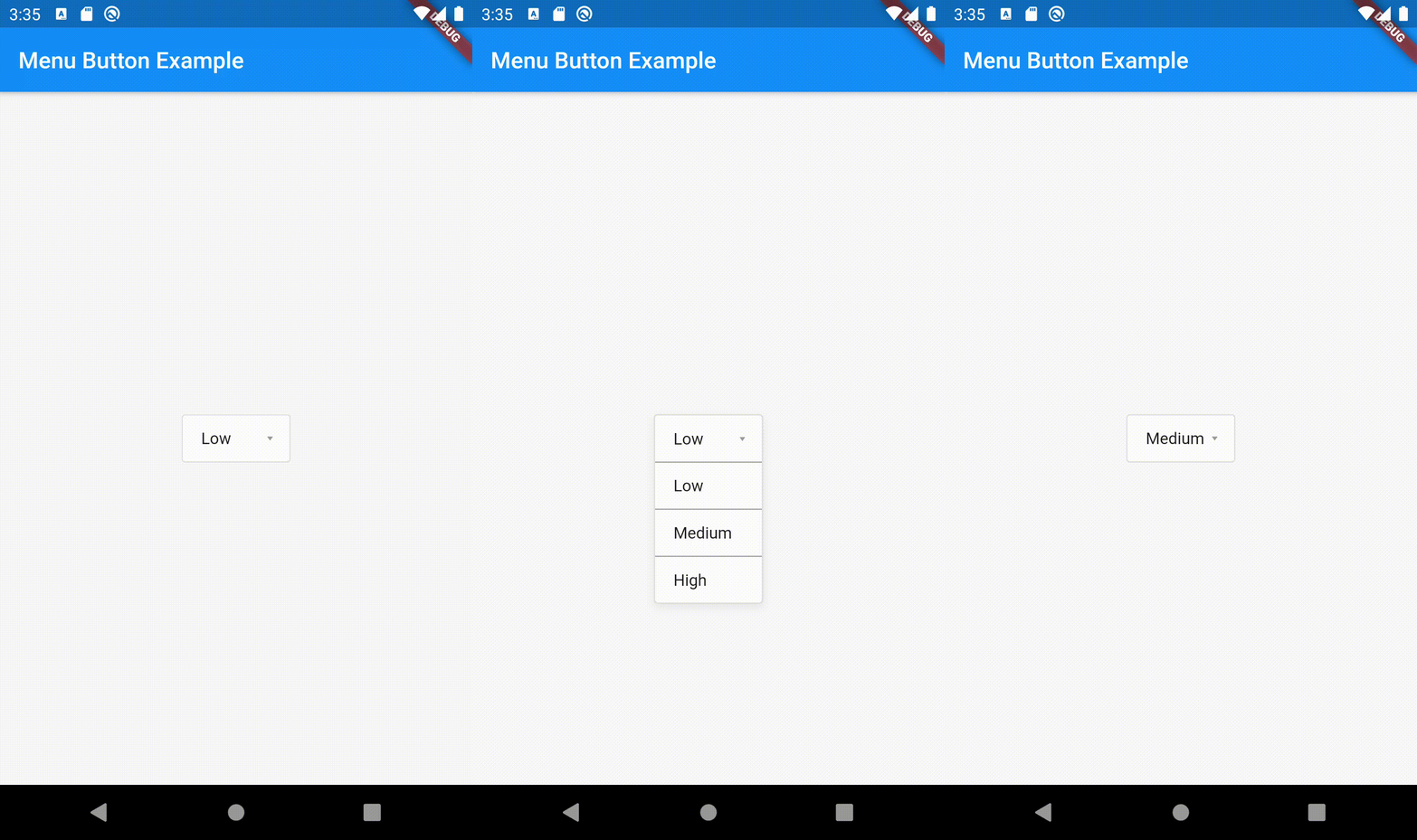
Menu button with 3 items:


If something is missing, feel free to open a ticket or contribute!

카테고리

소스 저장소

이 패키지를 사용하는 프로젝트