
 v2.1.1
cool_dropdown
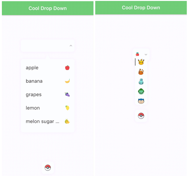
사용자 정의 가능한 멋진 드롭다운 UI. 선택한 항목, 드롭다운 박스의 BoxDecoration 및 드롭다운 입력을 사용자 정의할 수 있습니다.
209좋아요 2.5천30일 다운로드150Pub 점수
AndroidiOSWebmacOSWindowsLinux
joo6077/cool_dropdown open-source repository details.

{"sdk":"flutter"}{"sdk":"flutter"}^4.0.0아래는 영문 원문 스냅샷입니다. 최신 내용은 GitHub에서 확인하세요.
pub package version https://img.shields.io/badge/pub-cool_dropdown-6771e4.svg https://img.shields.io/badge/build-passing-6FCC76.svg https://img.shields.io/badge/license-MIT-blueviolet.svg https://img.shields.io/badge/platform-flutter-ff69b4.svg https://img.shields.io/badge/paypal-donate-blue.svg
All customizable style(font, fontsize. color, icon, result, dropdown decoration...).
Auto scroll to selected item position.
Dropdown is automatically placed. It's based on the position of the result on the screen(top/bottom).
Marquee effect.
Customizable animation.
Error handling.
"COOL"
command:
$ flutter pub add cool_dropdown
pubspec.yaml:
dependencies:
  cool_dropdown: ^(latest)
| Option | Type | Default | Description |
|---|---|---|---|
| dropdownList | List<CoolDropdownItem> | [] | Dropdown item list. |
| defaultItem | CoolDropdownItem? | null | Default item of the dropdown. |
| onChange | Function(T) | required | When user selects one of the items, you will get T type value. |
| onOpen | Function(bool) | null | When user either open or close the dropdown, you will get bool value. |
| resultOptions | ResultOptions | - | |
| dropdownOptions | DropdownOptions | - | Check below. |
| dropdownItemOptions | DropdownItemOptions | - | Check below. |
| dropdownTriangleOptions | DropdownTriangleOptions | - | Check below. |
| dropdownController | DropdownController | required | Check below. |
| Option | Type | Default | Description |
|---|---|---|---|
| width | double | 220 | |
| height | double | 50 | |
| space | double | 10 | Space between (label + icon) and arrow icon. |
| padding | EdgeInsets | EdgeInsets.zero | |
| alignment | Alignment | Alignment.center | Alignment of (label + icon). |
| render | ResultRender | ResultRender.all | Set the order of the result elements to render. |
| boxDecoration | BoxDecoration | BoxDecoration of the result box. | |
| openBoxDecoration | BoxDecoration | BoxDecoration of when result box is open. | |
| errorBoxDecoration | BoxDecoration | BoxDecoration of when result box is on error. | |
| textStyle | TextStyle | TextStyle of the label in result box. | |
| placeholderTextStyle | TextStyle | TextStyle of the placeholder in result box. | |
| textOverflow | TextOverFlow | TextOverflow of the label in result box. | |
| isMarquee | bool | false | A marquee effect when the label overflows. |
| duration | Duration | Duration(milliseconds: 300) | When dropdown value is changed. |
| marqueeDuration | Duration | Duration(milliseconds: 6000) | Duration of the marquee effect |
| backDuration | Duration | Duration(milliseconds: 800) | Reverse animation duration of the marquee effect |
| pauseDuration | Duration | Duration(milliseconds: 800) | Pause duration after marquee effect. |
| Option | Type | Default | Description |
|---|---|---|---|
| width | double? | result width | Dropdown width. |
| height | double | 50 | Dropdown height. |
| top | double | 0 | Top position of the dropdown. |
| left | double | 0 | Left position of the dropdown. |
| color | Color | Colors.white | Dropdown color. |
| borderRadius | BorderRadius | BorderRadius.all(Radius.circular(10)) | BorderRadius of the dropdown. |
| shadow | List | [] | BoxShadow list of the dropdown. |
| animationType | DropdownAnimationType | DropdownAnimationType.scale | Animation type of the dropdown. |
| align | DropdownAlign | DropdownAlign.center | The alignment of the dropdown. If the dropdown and result box are different sizes, the dropdown will be aligned to the result box. |
| align | SelectedItemAlign | SelectedItemAlign.center | The scroll alignment of the selected item in the dropdown. |
| gap | DropdownGap | DropdownGap.zero | The gap between the dropdown and dropdown items. |
| padding | EdgeInsets | EdgeInsets.zero | |
| duration | Duration | Duration(milliseconds: 300) | Duration of the dropdown scroll animation. |
| curve | Curve | Curves.easeInOut | Curve of the dropdown scroll animation. |
| Option | Type | Default | Description |
|---|---|---|---|
| height | double | 50 | Dropdown item height. |
| padding | EdgeInsets | EdgeInsets.symmetric(horizontal: 10) | Padding of the dropdown item. |
| alignment | Alignment | Alignment.centerLeft | Vertical alignment of the dropdown item. |
| mainAxisAlignment | MainAxisAlignment | MainAxisAlignment.start | Horizontal alignment of the dropdown item(label + icon). |
| render | DropdownItemRender | DropdownItemRender.all | Set the order of the dropdown item elements to render. |
| boxDecoration | BoxDecoration | BoxDecoration of the result box. | |
| selectedBoxDecoration | BoxDecoration | BoxDecoration of when dropdown item is selected. | |
| textStyle | TextStyle | TextStyle of the label in dropdown item. | |
| selectedTextStyle | TextStyle | Selected TextStyle of the label in dropdown item. | |
| textOverflow | TextOverFlow | TextOverflow of the label in dropdown item. | |
| isMarquee | bool | false | A marquee effect when the label overflows. |
| duration | Duration | Duration(milliseconds: 300) | When dropdown value is changed. |
| marqueeDuration | Duration | Duration(milliseconds: 6000) | Duration of the marquee effect |
| backDuration | Duration | Duration(milliseconds: 800) | Reverse animation duration of the marquee effect |
| pauseDuration | Duration | Duration(milliseconds: 800) | Pause duration after marquee effect. |
| Option | Type | Default | Description |
|---|---|---|---|
| width | double | 10 | Triangle width of the dropdown. |
| height | double | 10 | Triangle height of the dropdown. |
| left | double | 0 | Left position of the triangle. |
| borderRadius | BorderRadius | 0 | BorderRadius of the triangle. |
| align | DropdownTriangleAlign | DropdownTriangleAlign.center | Alignment of the triangle on the dropdown. |
| Option | Type | Default | Description |
|---|---|---|---|
| duration | Duration | Duration(milliseconds: 500) | Dropdown staggered animation duration. |
| errorDuration | Duration | Duration(milliseconds: 500) | Result box decoration error animation duration. |
| resultArrowInterval | Interval | Interval(0.0, 0.5, curve: Curves.easeOut) | Result arrow animation interval. |
| resultBoxInterval | Interval | Interval(0.0, 0.5, curve: Curves.easeOut) | Result box animation interval. |
| showDropdownInterval | Interval | Interval(0.5, 1.0, curve: Curves.easeOut) | Show dropdown animation interval. |
| showErrorCurve | Curve | Curves.easeIn | Show error animation curve. |
| open | method | - | Open the dropdown. |
| close | method | - | Close the dropdown. |
| error | method | - | Occur an error of the dropdown. |
| resetError | method | - | Reset an error of the dropdown. |
| resetValue | method | - | Reset the value of the dropdown. |