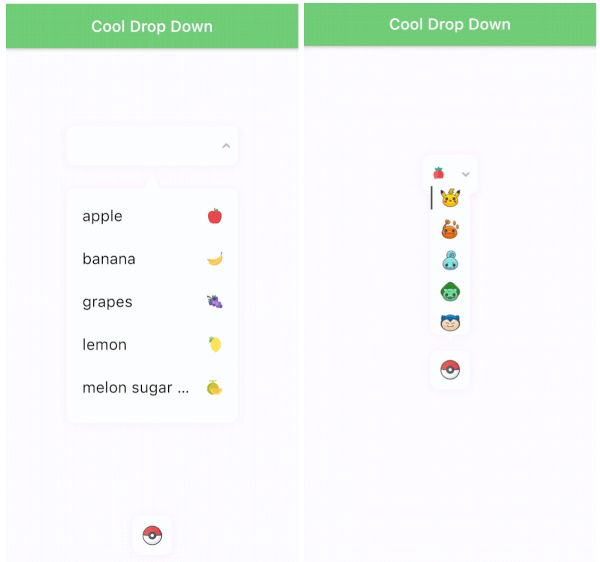
Flutter용 사용자 지정 가능한 드롭다운 UI 컴포넌트로, 개발자가 선택된 항목의 외관, 드롭다운 박스의 BoxDecoration 및 입력 필드를 맞춤 설정할 수 있습니다. 안드로이드, iOS, 웹, 맥OS, 윈도우, 리눅스 등 다양한 플랫폼을 지원합니다. 부드러운 애니메이션과 유연한 스타일링 옵션으로 사용자 경험을 향상시키며, 폼 및 선택 인터페이스에 적합합니다. 간단함과 커스터마이징을 고려해 제작되어 기존 Flutter 프로젝트에 원활하게 통합됩니다.
사용 사례
사용자 정의 드롭다운이 있는 폼 입력
사용자 선호도 선택기
동적 옵션 선택기
모바일 및 웹 인터페이스 개선
사용자 정의 가능한 UI 컴포넌트
주요 기능
사용자 정의 가능한 선택 항목 스타일
드롭다운용 구성 가능한 BoxDecoration
확장 가능한 입력 필드 디자인
크로스 플랫폼 호환성
부드러운 애니메이션 전환
Flutter 폼과의 간편한 통합
적합한 대상
스타일링된 드롭다운을 찾는 개발자
다양한 플랫폼 간에 일관된 UI가 필요한 프로젝트
복잡한 폼 상호작용을 가진 앱
디자인 중심의 플러터 애플리케이션
맞춤 설정과 유연성을 우선시하는 팀
고려 사항
BoxDecoration 및 Flutter 레이아웃에 대한 이해가 필요합니다
경계 사례를 위해 추가적인 스타일링이 필요할 수 있습니다
제한된 내장 검증
간단한부터 중간 정도의 복잡성의 드롭다운 요구 사항에 가장 적합
원본 README
연결된 소스 저장소의 README 원문 스냅샷입니다. 최신 내용은 저장소에서 확인하세요.
Cool drop down
Features
All customizable style(font, fontsize. color, icon, result, dropdown decoration...).
Auto scroll to selected item position.
Dropdown is automatically placed. It's based on the position of the result on the screen(top/bottom).
Marquee effect.
Customizable animation.
Error handling.
"COOL"
Samples
Installing
command:
$ flutter pub add cool_dropdown
pubspec.yaml:
dependencies:
  cool_dropdown: ^(latest)
Cool Dropdown options
Option
Type
Default
Description
dropdownList
List<CoolDropdownItem>
[]
Dropdown item list.
defaultItem
CoolDropdownItem?
null
Default item of the dropdown.
onChange
Function(T)
required
When user selects one of the items, you will get T type value.
onOpen
Function(bool)
null
When user either open or close the dropdown, you will get bool value.
resultOptions
ResultOptions
-
dropdownOptions
DropdownOptions
-
Check below.
dropdownItemOptions
DropdownItemOptions
-
Check below.
dropdownTriangleOptions
DropdownTriangleOptions
-
Check below.
dropdownController
DropdownController
required
Check below.
Result Options(result<v1.3.0> -> ResultOptions<v.2.0.0>)