
 v2.3.0
custom_radio_grouped_button
사용자 정의 라디오 버튼 및 그룹화된 체크박스 버튼
156좋아요 1.3천30일 다운로드140Pub 점수
AndroidiOSWebmacOSWindowsLinux
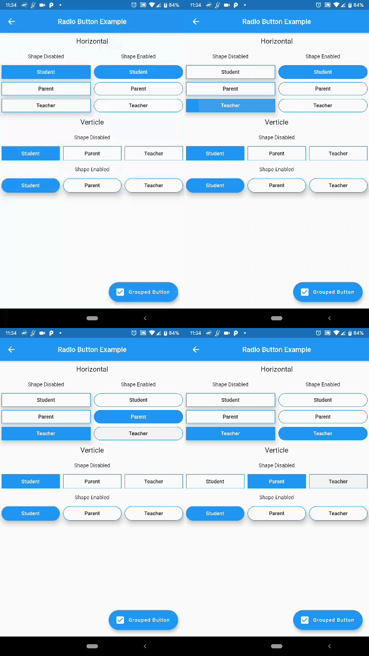
체크박스와 라디오 버튼을 훨씬 더 깔끔하고 쉽게 만들어주는 사용자 정의 플러터 위젯.

{"sdk":"flutter"}{"sdk":"flutter"}아래는 영문 원문 스냅샷입니다. 최신 내용은 GitHub에서 확인하세요.
Custom Radio Buttons and Grouped Check Box Button
Custom Flutter widgets that makes Checkbox and Radio Buttons much cleaner and easier
Add the following to your pubspec.yaml file:
dependencies:
  custom_radio_grouped_button: any
CustomRadioButton(
  elevation: 0,
  absoluteZeroSpacing: true,
  unSelectedColor: Theme.of(context).canvasColor,
  buttonLables: [
    'Student',
    'Parent',
    'Teacher',
  ],
  buttonValues: [
    "STUDENT",
    "PARENT",
    "TEACHER",
  ],
  buttonTextStyle: ButtonTextStyle(
      selectedColor: Colors.white,
      unSelectedColor: Colors.black,
      textStyle: TextStyle(fontSize: 16)),
  radioButtonValue: (value) {
    print(value);
  },
  selectedColor: Theme.of(context).accentColor,
),
CustomCheckBoxGroup(
  buttonTextStyle: ButtonTextStyle(
    selectedColor: Colors.red,
    unSelectedColor: Colors.orange,
    textStyle: TextStyle(
      fontSize: 16,
    ),
    selectedTextStyle: TextStyle(
      fontSize: 20,
      fontWeight: FontWeight.w700,
    ),
  ),
  unSelectedColor: Theme.of(context).canvasColor,
  buttonLables: [
    "M",
    "T",
    "W",
    "T",
    "F",
    "S",
    "S",
  ],
  buttonValuesList: [
    "Monday",
    "Tuesday",
    "Wednesday",
    "Thursday",
    "Friday",
    "Saturday",
    "Sunday",
  ],
  checkBoxButtonValues: (values) {
    print(values);
  },
  spacing: 0,
  defaultSelected: "Monday",
  horizontal: false,
  enableButtonWrap: false,
  width: 40,
  absoluteZeroSpacing: false,
  selectedColor: Theme.of(context).accentColor,
  padding: 10,
);
You can acces the widget's state using Key now
Example: Create a key for the CustomRadioButton widget
final key = new GlobalKey<CustomRadioButtonState<T>>();
now to change the value of the widget pass the value to the selectButton method
key.currentState.selectButton(<value>);
Similarly for the CustomCheckBoxGroup widget
final key = new GlobalKey<CustomCheckBoxGroupState<T>>();

key.currentState.selectButton(<value>);