패키지, 저장소 및 앱 카테고리 검색

custom_radio_grouped_button 표지
패키지 상세v2.3.0

custom_radio_grouped_button

사용자 정의 라디오 버튼 및 그룹화된 체크박스 버튼

AndroidiOSWebmacOSWindowsLinux
30일 다운로드
1.2천
좋아요
156
Pub 점수
140

패키지 설치

flutter pub add custom_radio_grouped_button

패키지 개요

공개 정보를 바탕으로 생성한 선택 가이드입니다.

여러 플랫폼을 지원하는 사용자 정의 가능한 라디오 버튼과 그룹화된 체크박스 버튼을 제공하는 Flutter 패키지입니다. 개발자가 시각적으로 독특하고 상호작용이 가능한 선택 컴포넌트를 만들 수 있게 해주며, 폼 및 사용자 선호도 설정에 이상적입니다. 유연한 스타일링, 간편한 통합, 그리고 Android, iOS, Web, macOS, Windows, Linux에서 반응형 동작을 제공합니다. 구현의 단순성과 함께 UI 일관성을 강화합니다.

사용 사례

  • 단일 선택을 포함한 폼 입력
  • 사용자 선호 설정
  • 설문조사 또는 퀴즈 인터페이스
  • 사용자 정의 가능한 UI 컴포넌트
  • 다중 플랫폼 애플리케이션

주요 기능

  • 사용자 지정 가능한 버튼 스타일
  • 그룹화 선택 로직
  • 라디오 및 체크박스 모드 모두 지원
  • 다중 플랫폼에 걸친 반응형 디자인
  • 기존 플러터 프로젝트와의 간편한 통합

적합한 대상

  • 양식을 개발하는 개발자
  • 사용자 정의 컨트롤을 찾는 UI 디자이너
  • 크로스플랫폼 앱 개발자
  • 상호작용 선택 위젯이 필요한 프로젝트

고려 사항

  • 선택 상태를 수동으로 처리해야 합니다
  • 제한된 내장 검증
  • 복잡한 레이아웃을 위해 추가 스타일링이 필요할 수 있습니다
  • 매우 큰 옵션 목록에 최적화되지 않음
  • 고급 기능을 위해 외부 종속성에 의존합니다

원본 README

연결된 소스 저장소의 README 원문 스냅샷입니다. 최신 내용은 저장소에서 확인하세요.

custom_radio_grouped_button

Pub

Custom Radio Buttons and Grouped Check Box Button

Custom Flutter widgets that makes Checkbox and Radio Buttons much cleaner and easier

Installing

Add the following to your pubspec.yaml file:

dependencies:
  custom_radio_grouped_button: any

Creating Radio Button

CustomRadioButton(
  elevation: 0,
  absoluteZeroSpacing: true,
  unSelectedColor: Theme.of(context).canvasColor,
  buttonLables: [
    'Student',
    'Parent',
    'Teacher',
  ],
  buttonValues: [
    "STUDENT",
    "PARENT",
    "TEACHER",
  ],
  buttonTextStyle: ButtonTextStyle(
      selectedColor: Colors.white,
      unSelectedColor: Colors.black,
      textStyle: TextStyle(fontSize: 16)),
  radioButtonValue: (value) {
    print(value);
  },
  selectedColor: Theme.of(context).accentColor,
),

Creating Grouped Button

CustomCheckBoxGroup(
  buttonTextStyle: ButtonTextStyle(
    selectedColor: Colors.red,
    unSelectedColor: Colors.orange,
    textStyle: TextStyle(
      fontSize: 16,
    ),
    selectedTextStyle: TextStyle(
      fontSize: 20,
      fontWeight: FontWeight.w700,
    ),
  ),
  unSelectedColor: Theme.of(context).canvasColor,
  buttonLables: [
    "M",
    "T",
    "W",
    "T",
    "F",
    "S",
    "S",
  ],
  buttonValuesList: [
    "Monday",
    "Tuesday",
    "Wednesday",
    "Thursday",
    "Friday",
    "Saturday",
    "Sunday",
  ],
  checkBoxButtonValues: (values) {
    print(values);
  },
  spacing: 0,
  defaultSelected: "Monday",
  horizontal: false,
  enableButtonWrap: false,
  width: 40,
  absoluteZeroSpacing: false,
  selectedColor: Theme.of(context).accentColor,
  padding: 10, 
);

Changing values Programiically

You can acces the widget's state using Key now

Example: Create a key for the CustomRadioButton widget

final key = new GlobalKey<CustomRadioButtonState<T>>();

now to change the value of the widget pass the value to the selectButton method

key.currentState.selectButton(<value>);

Similarly for the CustomCheckBoxGroup widget

final key = new GlobalKey<CustomCheckBoxGroupState<T>>();

key.currentState.selectButton(<value>);

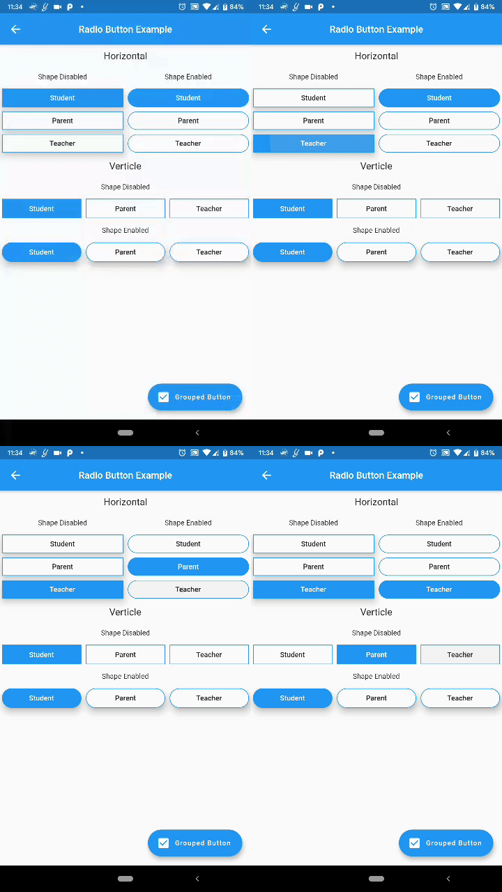
Screenshots

Grouped Button Grouped Button

카테고리

소스 저장소

이 패키지를 사용하는 프로젝트

아직 데이터가 없습니다.