
 v1.0.3
day_month_picker
이 패키지를 사용하면 원하는 월과 날짜를 쉽게 선택할 수 있습니다! 피커에서 간단한 날짜 선택 프로세스를 선택하세요 — 연도는 필요하지 않습니다. 즐기세요!
29좋아요 10330일 다운로드150Pub 점수
AndroidiOSWebmacOSWindowsLinux
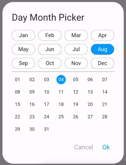
다이얼로그에서 월과 그 달의 날짜를 선택하는 데 도움이 되는 저장소입니다. 사용자에게 연도 옵션을 표시하고 싶지 않은 경우에 적합합니다.
아래는 영문 원문 스냅샷입니다. 최신 내용은 GitHub에서 확인하세요.
The DayMonthPicker widget is a customizable Flutter component that allows users to select a specific day and month from a dialog interface. It is particularly useful in forms or applications where date input is needed without year.
Easy selection of months and days Customizable appearance Built-in support for existing day and month values Callback function to handle changes
const DayMonthPicker({
  Key? key,
  this.surfaceTintColor,
  this.titleTextStyle,
  this.selectedMonthBgColor = Colors.blue,
  this.unSelectedMonthBgColor = Colors.white,
  this.selectedDayBgColor = Colors.blue,
  this.unSelectedDayBgColor = Colors.white,
  this.title = "Date Month Picker",
  this.selectedMonthTextStyle = const TextStyle(color: Colors.white, fontSize: 14),
  this.unSelectedMonthTextStyle = const TextStyle(color: Colors.black, fontSize: 14),
  this.selectedDayTextStyle = const TextStyle(color: Colors.white, fontSize: 12),
  this.unSelectedDayTextStyle = const TextStyle(color: Colors.black, fontSize: 12),
  this.child = const Padding(
    padding: EdgeInsets.all(8.0),
    child: Text("Month Picker"),
  ),
  this.cancelTextStyle = const TextStyle(color: Colors.grey, fontSize: 16),
  this.okTextStyle = const TextStyle(color: Colors.blue, fontSize: 16),
  this.existingDay,
  this.existingMonth,
  required this.onChange,
});
Short and useful examples for package users.
DayMonthPicker(onChange: (DayMonth? dayMonth){
        if(dayMonth != null) {
          print("Day: ${dayMonth.day}");
          print("Month: ${dayMonth.month}");
        }
      }),
@override
Widget build(BuildContext context) {
  return Scaffold(
    appBar: AppBar(title: Text('Day Month Picker Example')),
    body: Center(
      child: DayMonthPicker(
        onChange: (dayMonth) {
          // Do something with the selected day and month
          print('Selected Day: ${dayMonth.day}, Month: ${dayMonth.month}');
        },
      ),
    ),
  );
}

의존성 목록 3 개
{"sdk":"flutter"}{"sdk":"flutter"}^3.0.0사용 목적에 따라 검색하고 개발 활동을 비교한 뒤 원본 저장소에서 요구 사항을 확인하세요.
“A repository is the most basic element of GitHub.”
GitHub Docs — About repositories ↗